关于传染病SEIR模型,接下来我们分为以下几块内容讨论:一传染病的数学模型原理,二.R语言代码实现,三.常见错误以及相关其他模型的讨论(马尔萨斯模型和logistic模型)。
一.SEIR模型原理:(来自网络,侵权联系删除)
把人群分为四类分别为S,E,I,R类
4、R 类,康复者 (Recovered),指被隔离或因病愈而具有免疫力的人。如免疫期有限,R 类成员可以重新变为 S 类

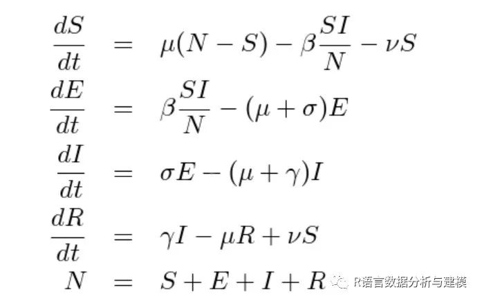
最后获得的微分方程如图所示,推导过程可以自己试试看,这里不详细展开了
二.R语言代码实现
主要运用了两个包ggplot2,以及ggsci
N = 50000 设定为总人数
E = 0 潜伏期者(新冠可能不太合适,因为潜伏期也有传染性)
I = 1 已经感染的人数,设定为1
S = N-I 容易感染人群
R = 0 康复人群
r = 20 每天接触易感染者的人数
B = 0.2 传染系数(数据来源于官网的论文)
a = 0.07 潜伏期发病概率(1/14)
y = 0.07 恢复系数(1/14)
T = 150 时间观察的周期
for (i in 1:(T-1)){
S[i+1] = S[i] - r*B*S[i]*I[i]/N
E[i+1] = E[i] + r*B*S[i]*I[i]/N - a*E[i]
I[i+1] = I[i] + a*E[i] - y*I[i]
R[i+1] = R[i] + y*I[i]
}
seir <- data.frame(S, E, I, R)
seir$date<-seq(1,150,1)
head(seir,10)
inflection_point<-subset(seir[,"date"],I==max(I))
inflection_num<-ceiling(max(I))
install.packages("tidyr")
library(tidyr)
seir_long<-gather(seir,condition,num,S:R)
head(seir_long,10)
library(ggplot2)
library(ggsci)
theme2<-theme_bw()+theme(panel.border=element_blank(),
panel.grid.major=element_blank(),
panel.grid.minor=element_blank(),
legend.title=element_text(family='Arial',size=12,colour='black'),
legend.text=element_text(family='Arial',size=12,colour='black'),
legend.position="bottom",
legend.background =element_blank(),
axis.line= element_line(colour = "darkgrey",size=0.5),
axis.title=element_text(family="Arial",size=12,colour='black'),
axis.text=element_text(family="Arial",size=10,colour='black'),
plot.title=element_text(family='Arial',size=20,colour='black',hjust=0.5),
plot.caption=element_text(family='Arial',size=12,colour='black'))
label<-paste("the date of pic : the",inflection_point,"the number of infected person : ",inflection_num,"人",sep=" ")
ggplot(seir_long)+
geom_line(aes(x=date,y=num,group=condition,colour=condition),size=1.2)+
geom_vline(xintercept=inflection_point,linetype=2,colour="darkgrey",size=1)+
geom_hline(yintercept=inflection_num,linetype=2,colour="darkgrey",size=1)+
geom_label(label=label,x=90,y=3400,size=4,family='Arial') +
scale_color_npg()+
labs(x="time ",y="person",title="SEIR model",caption="Copyright:wutong")+
theme2
运行上面的程序可以得到图形如下:

三.常见错误:
1.坐标轴的中文标示不显示,网络上我找了两个方式都没有用处,设置主题格式:
theme(text=element_text(family="STKaiti",size=14))
还有一种是设置词云图,但是这两种方式对我都不适用,希望知道其缘由的麻烦告知我哈。
四.马尔萨斯模型和logistic模型
(1)数学原理:假设一个生物种群数量为N(t),自然增长率为r,那么单位时间内的生物种群增加量
N(t +△t)-N(t)=r*N(t)△t
进行求解:{ dN(t)/dt=r.N(t)
N(0)=N。然后两边都乘以exp(-rt)
得到dN(t)/dt*exp(-rt)-r.exp(-rt)*NN(t)=0
d(N*exp(-rt))/dt=0
N(t)=c.exp(rt)
当t=0时,N(0)=N。因此N(t)=N。*exp(rt)
但是注意有缺陷,这个模型没有考虑自然灾害,天敌等因素,种群会达到一个最大的生存数量k,他就停止生长了。因此就引进r(1-N(t)/k)来进行描述,模型就进行改进了。
{dN/dt=r*(1-N(t)/k)N
N(0)=N。
KdN/(K-N)N=rdt
注意:K/(K-N)N=1/K-N+1/N
因此(1/K-N+1/N)dN=rdt,
积分得ln(N/K-N)=rt+C
N(t)=K/(1+(K/N。-1)*exp(-rt))
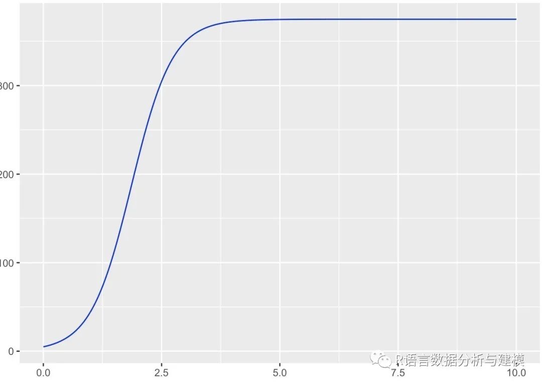
引入例子,5个草履虫在四天的数量到达375个,生长率为230.9%
因此模型:N(t)=375/1+74exp(-2.309t)
R语言的代码如下:
x <- seq(from = 0, to = 10, by = 0.01)
y = 375/(1+74*exp(-2.309*x))
library(ggplot2)
p <- ggplot(data = NULL, mapping = aes(x = x,y = y))
p + geom_line(colour = 'blue')
+ annotate('text', x = 1, y = 0.3, label ='null', parse = TRUE)
+ ggtitle('logistic曲线')