Python画图
Python常用的绘图工具包括:matplotlib
, seaborn
, plotly
等,以及一些其他专用于绘制某类图如词云图等的包,描绘绘图轨迹的turtle
包等。本章节将会使用一些例子由易到难的阐述绘图的经典小例子,目前共收录10
个。
1 turtle绘制奥运五环图
turtle绘图的函数非常好用,基本看到函数名字,就能知道它的含义,下面使用turtle,仅用15行代码来绘制奥运五环图。
1 导入库
import turtle
复制代码复制
2 定义画圆函数
def drawCircle(x,y,c='red'):
p.pu()# 抬起画笔
p.goto(x,y) # 绘制圆的起始位置
p.pd()# 放下画笔
p.color(c)# 绘制c色圆环
p.circle(30,360) #绘制圆:半径,角度
复制代码复制
3 画笔基本设置
p = turtle
p.pensize(3) # 画笔尺寸设置3
复制代码复制
4 绘制五环图
调用画圆函数
drawCircle(0,0,'blue')
drawCircle(60,0,'black')
drawCircle(120,0,'red')
drawCircle(90,-30,'green')
drawCircle(30,-30,'yellow')
p.done()复制
2 turtle绘制漫天雪花
导入模块
导入 turtle
库和 python的 random
import turtle as p
import random复制
绘制雪花
def snow(snow_count):
p.hideturtle()
p.speed(500)
p.pensize(2)
for i in range(snow_count):
r = random.random()
g = random.random()
b = random.random()
p.pencolor(r, g, b)
p.pu()
p.goto(random.randint(-350, 350), random.randint(1, 270))
p.pd()
dens = random.randint(8, 12)
snowsize = random.randint(10, 14)
for _ in range(dens):
p.forward(snowsize) # 向当前画笔方向移动snowsize像素长度
p.backward(snowsize) # 向当前画笔相反方向移动snowsize像素长度
p.right(360 / dens) # 顺时针移动360 / dens度复制
绘制地面
def ground(ground_line_count):
p.hideturtle()
p.speed(500)
for i in range(ground_line_count):
p.pensize(random.randint(5, 10))
x = random.randint(-400, 350)
y = random.randint(-280, -1)
r = -y / 280
g = -y / 280
b = -y / 280
p.pencolor(r, g, b)
p.penup() # 抬起画笔
p.goto(x, y) # 让画笔移动到此位置
p.pendown() # 放下画笔
p.forward(random.randint(40, 100)) # 眼当前画笔方向向前移动40~100距离复制
主函数
def main():
p.setup(800, 600, 0, 0)
# p.tracer(False)
p.bgcolor("black")
snow(30)
ground(30)
# p.tracer(True)
p.mainloop()
main()复制
3 wordcloud词云图
import hashlib
import pandas as pd
from wordcloud import WordCloud
geo_data=pd.read_excel(r"../data/geo_data.xlsx")
print(geo_data)
# 0 深圳
# 1 深圳
# 2 深圳
# 3 深圳
# 4 深圳
# 5 深圳
# 6 深圳
# 7 广州
# 8 广州
# 9 广州
words = ','.join(x for x in geo_data['city'] if x != []) #筛选出非空列表值
wc = WordCloud(
background_color="green", #背景颜色"green"绿色
max_words=100, #显示最大词数
font_path='./fonts/simhei.ttf', #显示中文
min_font_size=5,
max_font_size=100,
width=500 #图幅宽度
)
x = wc.generate(words)
x.to_file('../data/geo_data.png')
复制代码复制
[图片上传失败...(image-78330d-1577689175382)]
4 plotly画柱状图和折线图
#柱状图+折线图
import plotly.graph_objects as go
fig = go.Figure()
fig.add_trace(
go.Scatter(
x=[0, 1, 2, 3, 4, 5],
y=[1.5, 1, 1.3, 0.7, 0.8, 0.9]
))
fig.add_trace(
go.Bar(
x=[0, 1, 2, 3, 4, 5],
y=[2, 0.5, 0.7, -1.2, 0.3, 0.4]
))
fig.show()复制
5 seaborn热力图
# 导入库
import seaborn as sns
import pandas as pd
import numpy as np
import matplotlib.pyplot as plt
# 生成数据集
data = np.random.random((6,6))
np.fill_diagonal(data,np.ones(6))
features = ["prop1","prop2","prop3","prop4","prop5", "prop6"]
data = pd.DataFrame(data, index = features, columns=features)
print(data)
# 绘制热力图
heatmap_plot = sns.heatmap(data, center=0, cmap='gist_rainbow')
plt.show()复制
6 matplotlib折线图
模块名称:example_utils.py,里面包括三个函数,各自功能如下:
import matplotlib.pyplot as plt
# 创建画图fig和axes
def setup_axes():
fig, axes = plt.subplots(ncols=3, figsize=(6.5,3))
for ax in fig.axes:
ax.set(xticks=[], yticks=[])
fig.subplots_adjust(wspace=0, left=0, right=0.93)
return fig, axes
# 图片标题
def title(fig, text, y=0.9):
fig.suptitle(text, size=14, y=y, weight='semibold', x=0.98, ha='right',
bbox=dict(boxstyle='round', fc='floralwhite', ec='#8B7E66',
lw=2))
# 为数据添加文本注释
def label(ax, text, y=0):
ax.annotate(text, xy=(0.5, 0.00), xycoords='axes fraction', ha='center',
style='italic',
bbox=dict(boxstyle='round', facecolor='floralwhite',
ec='#8B7E66'))复制
import numpy as np
import matplotlib.pyplot as plt
import example_utils
x = np.linspace(0, 10, 100)
fig, axes = example_utils.setup_axes()
for ax in axes:
ax.margins(y=0.10)
# 子图1 默认plot多条线,颜色系统分配
for i in range(1, 6):
axes[0].plot(x, i * x)
# 子图2 展示线的不同linestyle
for i, ls in enumerate(['-', '--', ':', '-.']):
axes[1].plot(x, np.cos(x) + i, linestyle=ls)
# 子图3 展示线的不同linestyle和marker
for i, (ls, mk) in enumerate(zip(['', '-', ':'], ['o', '^', 's'])):
axes[2].plot(x, np.cos(x) + i * x, linestyle=ls, marker=mk, markevery=10)
# 设置标题
# example_utils.title(fig, '"ax.plot(x, y, ...)": Lines and/or markers', y=0.95)
# 保存图片
fig.savefig('plot_example.png', facecolor='none')
# 展示图片
plt.show()
复制代码复制
7 matplotlib散点图
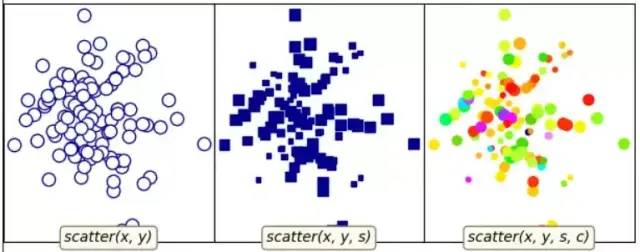
对应代码:
"""
散点图的基本用法
"""
import numpy as np
import matplotlib.pyplot as plt
import example_utils
# 随机生成数据
np.random.seed(1874)
x, y, z = np.random.normal(0, 1, (3, 100))
t = np.arctan2(y, x)
size = 50 * np.cos(2 * t)**2 + 10
fig, axes = example_utils.setup_axes()
# 子图1
axes[0].scatter(x, y, marker='o', color='darkblue', facecolor='white', s=80)
example_utils.label(axes[0], 'scatter(x, y)')
# 子图2
axes[1].scatter(x, y, marker='s', color='darkblue', s=size)
example_utils.label(axes[1], 'scatter(x, y, s)')
# 子图3
axes[2].scatter(x, y, s=size, c=z, cmap='gist_ncar')
example_utils.label(axes[2], 'scatter(x, y, s, c)')
# example_utils.title(fig, '"ax.scatter(...)": Colored/scaled markers',
# y=0.95)
fig.savefig('scatter_example.png', facecolor='none')
plt.show()复制
8 matplotlib柱状图
对应代码:
import numpy as np
import matplotlib.pyplot as plt
import example_utils
def main():
fig, axes = example_utils.setup_axes()
basic_bar(axes[0])
tornado(axes[1])
general(axes[2])
# example_utils.title(fig, '"ax.bar(...)": Plot rectangles')
fig.savefig('bar_example.png', facecolor='none')
plt.show()
# 子图1
def basic_bar(ax):
y = [1, 3, 4, 5.5, 3, 2]
err = [0.2, 1, 2.5, 1, 1, 0.5]
x = np.arange(len(y))
ax.bar(x, y, yerr=err, color='lightblue', ecolor='black')
ax.margins(0.05)
ax.set_ylim(bottom=0)
example_utils.label(ax, 'bar(x, y, yerr=e)')
# 子图2
def tornado(ax):
y = np.arange(8)
x1 = y + np.random.random(8) + 1
x2 = y + 3 * np.random.random(8) + 1
ax.barh(y, x1, color='lightblue')
ax.barh(y, -x2, color='salmon')
ax.margins(0.15)
example_utils.label(ax, 'barh(x, y)')
# 子图3
def general(ax):
num = 10
left = np.random.randint(0, 10, num)
bottom = np.random.randint(0, 10, num)
width = np.random.random(num) + 0.5
height = np.random.random(num) + 0.5
ax.bar(left, height, width, bottom, color='salmon')
ax.margins(0.15)
example_utils.label(ax, 'bar(l, h, w, b)')
main()复制
9 matplotlib等高线图

对应代码:
import matplotlib.pyplot as plt
import numpy as np
from matplotlib.cbook import get_sample_data
import example_utils
z = np.load(get_sample_data('bivariate_normal.npy'))
fig, axes = example_utils.setup_axes()
axes[0].contour(z, cmap='gist_earth')
example_utils.label(axes[0], 'contour')
axes[1].contourf(z, cmap='gist_earth')
example_utils.label(axes[1], 'contourf')
axes[2].contourf(z, cmap='gist_earth')
cont = axes[2].contour(z, colors='black')
axes[2].clabel(cont, fontsize=6)
example_utils.label(axes[2], 'contourf + contour\n + clabel')
# example_utils.title(fig, '"contour, contourf, clabel": Contour/label 2D data',
# y=0.96)
fig.savefig('contour_example.png', facecolor='none')
plt.show()复制
10 imshow图
对应代码:
import matplotlib.pyplot as plt
import numpy as np
from matplotlib.cbook import get_sample_data
from mpl_toolkits import axes_grid1
import example_utils
def main():
fig, axes = setup_axes()
plot(axes, *load_data())
# example_utils.title(fig, '"ax.imshow(data, ...)": Colormapped or RGB arrays')
fig.savefig('imshow_example.png', facecolor='none')
plt.show()
def plot(axes, img_data, scalar_data, ny):
# 默认线性插值
axes[0].imshow(scalar_data, cmap='gist_earth', extent=[0, ny, ny, 0])
# 最近邻插值
axes[1].imshow(scalar_data, cmap='gist_earth', interpolation='nearest',
extent=[0, ny, ny, 0])
# 展示RGB/RGBA数据
axes[2].imshow(img_data)
def load_data():
img_data = plt.imread(get_sample_data('5.png'))
ny, nx, nbands = img_data.shape
scalar_data = np.load(get_sample_data('bivariate_normal.npy'))
return img_data, scalar_data, ny
def setup_axes():
fig = plt.figure(figsize=(6, 3))
axes = axes_grid1.ImageGrid(fig, [0, 0, .93, 1], (1, 3), axes_pad=0)
for ax in axes:
ax.set(xticks=[], yticks=[])
return fig, axes
main()
复制代码复制
11 pyecharts绘制仪表盘
使用pip install pyecharts 安装,版本为 v1.6,pyecharts绘制仪表盘,只需要几行代码:
from pyecharts import charts
# 仪表盘
gauge = charts.Gauge()
gauge.add('Python小例子', [('Python机器学习', 30), ('Python基础', 70.),
('Python正则', 90)])
gauge.render(path="./data/仪表盘.html")
print('ok')复制
仪表盘中共展示三项,每项的比例为30%,70%,90%,如下图默认名称显示第一项:Python机器学习,完成比例为30%
12 pyecharts漏斗图
from pyecharts import options as opts
from pyecharts.charts import Funnel, Page
from random import randint
def funnel_base() -> Funnel:
c = (
Funnel()
.add("豪车", [list(z) for z in zip(['宝马', '法拉利', '奔驰', '奥迪', '大众', '丰田', '特斯拉'],
[randint(1, 20) for _ in range(7)])])
.set_global_opts(title_opts=opts.TitleOpts(title="豪车漏斗图"))
)
return c
funnel_base().render('./img/car_fnnel.html')
复制代码复制
以7种车型及某个属性值绘制的漏斗图,属性值大越靠近漏斗的大端。
13 pyecharts日历图
import datetime
import random
from pyecharts import options as opts
from pyecharts.charts import Calendar
def calendar_interval_1() -> Calendar:
begin = datetime.date(2019, 1, 1)
end = datetime.date(2019, 12, 27)
data = [
[str(begin + datetime.timedelta(days=i)), random.randint(1000, 25000)]
for i in range(0, (end - begin).days + 1, 2) # 隔天统计
]
calendar = (
Calendar(init_opts=opts.InitOpts(width="1200px")).add(
"", data, calendar_opts=opts.CalendarOpts(range_="2019"))
.set_global_opts(
title_opts=opts.TitleOpts(title="Calendar-2019年步数统计"),
visualmap_opts=opts.VisualMapOpts(
max_=25000,
min_=1000,
orient="horizontal",
is_piecewise=True,
pos_top="230px",
pos_left="100px",
),
)
)
return calendar
calendar_interval_1().render('./img/calendar.html')
复制代码复制
绘制2019年1月1日到12月27日的步行数,官方给出的图形宽度900px
不够,只能显示到9月份,本例使用opts.InitOpts(width="1200px")
做出微调,并且visualmap
显示所有步数,每隔一天显示一次:
14 pyecharts绘制graph图
import json
import os
from pyecharts import options as opts
from pyecharts.charts import Graph, Page
def graph_base() -> Graph:
nodes = [
{"name": "cus1", "symbolSize": 10},
{"name": "cus2", "symbolSize": 30},
{"name": "cus3", "symbolSize": 20}
]
links = []
for i in nodes:
if i.get('name') == 'cus1':
continue
for j in nodes:
if j.get('name') == 'cus1':
continue
links.append({"source": i.get("name"), "target": j.get("name")})
c = (
Graph()
.add("", nodes, links, repulsion=8000)
.set_global_opts(title_opts=opts.TitleOpts(title="customer-influence"))
)
return c复制
构建图,其中客户点1与其他两个客户都没有关系(link
),也就是不存在有效边:
15 pyecharts水球图
from pyecharts import options as opts
from pyecharts.charts import Liquid, Page
from pyecharts.globals import SymbolType
def liquid() -> Liquid:
c = (
Liquid()
.add("lq", [0.67, 0.30, 0.15])
.set_global_opts(title_opts=opts.TitleOpts(title="Liquid"))
)
return c
liquid().render('./img/liquid.html')复制
水球图的取值[0.67, 0.30, 0.15]
表示下图中的三个波浪线
,一般代表三个百分比:
16 pyecharts饼图
from pyecharts import options as opts
from pyecharts.charts import Pie
from random import randint
def pie_base() -> Pie:
c = (
Pie()
.add("", [list(z) for z in zip(['宝马', '法拉利', '奔驰', '奥迪', '大众', '丰田', '特斯拉'],
[randint(1, 20) for _ in range(7)])])
.set_global_opts(title_opts=opts.TitleOpts(title="Pie-基本示例"))
.set_series_opts(label_opts=opts.LabelOpts(formatter="{b}: {c}"))
)
return c
pie_base().render('./img/pie_pyecharts.html')复制
17 pyecharts极坐标图
import random
from pyecharts import options as opts
from pyecharts.charts import Page, Polar
def polar_scatter0() -> Polar:
data = [(alpha, random.randint(1, 100)) for alpha in range(101)] # r = random.randint(1, 100)
print(data)
c = (
Polar()
.add("", data, type_="bar", label_opts=opts.LabelOpts(is_show=False))
.set_global_opts(title_opts=opts.TitleOpts(title="Polar"))
)
return c
polar_scatter0().render('./img/polar.html')复制
极坐标表示为(夹角,半径)
,如(6,94)表示夹角为6,半径94的点:
18 pyecharts词云图
from pyecharts import options as opts
from pyecharts.charts import Page, WordCloud
from pyecharts.globals import SymbolType
words = [
("Python", 100),
("C++", 80),
("Java", 95),
("R", 50),
("JavaScript", 79),
("C", 65)
]
def wordcloud() -> WordCloud:
c = (
WordCloud()
# word_size_range: 单词字体大小范围
.add("", words, word_size_range=[20, 100], shape='cardioid')
.set_global_opts(title_opts=opts.TitleOpts(title="WordCloud"))
)
return c
wordcloud().render('./img/wordcloud.html')复制
("C",65)
表示在本次统计中C语言出现65次

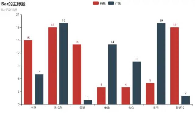
19 pyecharts系列柱状图
from pyecharts import options as opts
from pyecharts.charts import Bar
from random import randint
def bar_series() -> Bar:
c = (
Bar()
.add_xaxis(['宝马', '法拉利', '奔驰', '奥迪', '大众', '丰田', '特斯拉'])
.add_yaxis("销量", [randint(1, 20) for _ in range(7)])
.add_yaxis("产量", [randint(1, 20) for _ in range(7)])
.set_global_opts(title_opts=opts.TitleOpts(title="Bar的主标题", subtitle="Bar的副标题"))
)
return c
bar_series().render('./img/bar_series.html')
复制代码复制
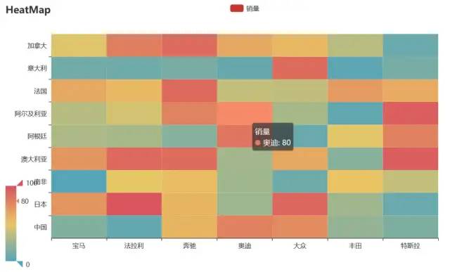
20 pyecharts热力图
import random
from pyecharts import options as opts
from pyecharts.charts import HeatMap
def heatmap_car() -> HeatMap:
x = ['宝马', '法拉利', '奔驰', '奥迪', '大众', '丰田', '特斯拉']
y = ['中国','日本','南非','澳大利亚','阿根廷','阿尔及利亚','法国','意大利','加拿大']
value = [[i, j, random.randint(0, 100)]
for i in range(len(x)) for j in range(len(y))]
c = (
HeatMap()
.add_xaxis(x)
.add_yaxis("销量", y, value)
.set_global_opts(
title_opts=opts.TitleOpts(title="HeatMap"),
visualmap_opts=opts.VisualMapOpts(),
)
)
return c
heatmap_car().render('./img/heatmap_pyecharts.html')复制
热力图描述的实际是三维关系,x轴表示车型,y轴表示国家,每个色块的颜色值代表销量,颜色刻度尺显示在左下角,颜色越红表示销量越大。