


温馨提示:本篇博客的详细代码已发布到 git : https://gitcode.com/nutpi/HarmonyosNext 可以下载运行哦!

HarmonyOS NEXT Layout 布局组件系统详解(八):自定义样式与类
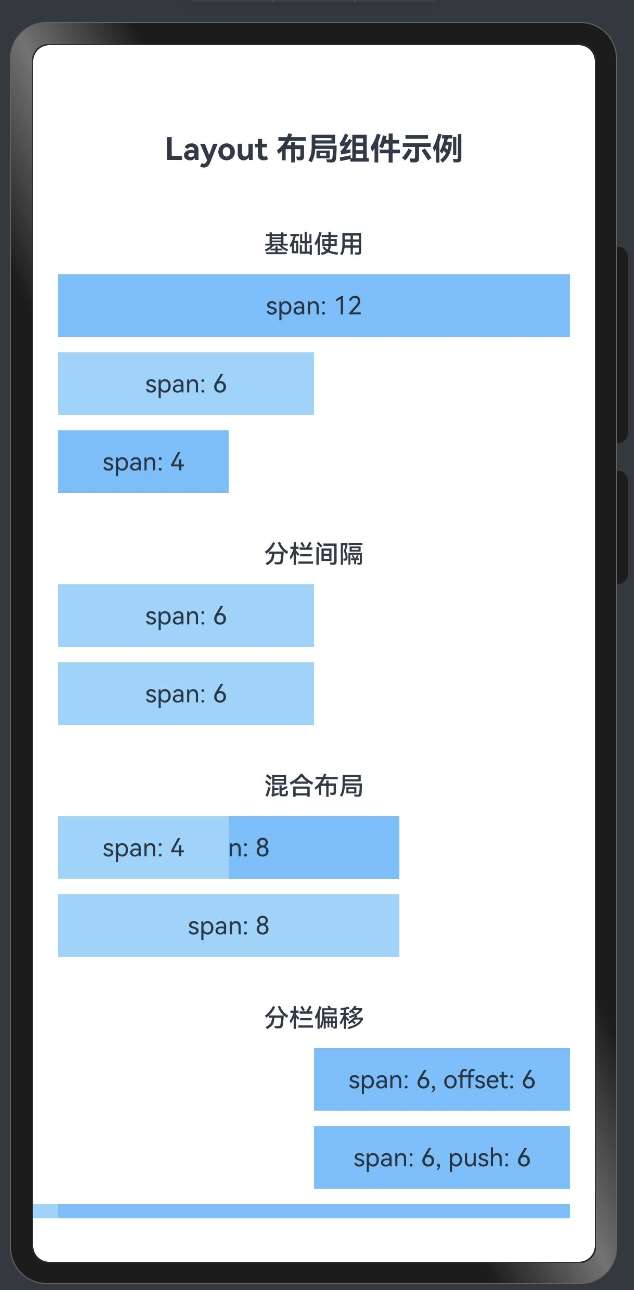
效果演示
1. 自定义样式概述
在 HarmonyOS 的 Layout 布局组件系统中,除了基本的布局功能外,还提供了丰富的自定义样式选项,使开发者能够根据需求灵活调整组件的外观。本文将详细介绍 Layout 布局组件系统中的自定义样式和类的使用方法。
2. 自定义样式属性定义
2.1 AutoRow 组件中的样式属性
export interface RowProps {
    // 自定义样式类
    customClass?: string;
    // 外边距
    autoMargin?: string | number | Margin;
    // 内边距
    autoPadding?: string | number | Padding;
    // 宽度
    autoWidth?: string | number;
    // 高度
    autoHeight?: string | number;
    // 其他属性...
}
复制
2.2 AutoCol 组件中的样式属性
export interface LayoutProps {
    // 自定义样式类
    customClass?: string;
    // 其他属性...
}
复制
3. 自定义样式的实现原理
3.1 直接样式属性
AutoRow 组件提供了多个直接样式属性,如 autoMargin、autoPadding、autoWidth 和 autoHeight,这些属性直接映射到组件的样式属性:
build() {
    Column() {
        Flex({ direction: FlexDirection.Row, justifyContent: this.justify, alignItems: this.ItemAligns, wrap: FlexWrap.Wrap }) {
            // 渲染内容构建函数
            this.content();
        }
        .width('100%')
        .height('100%')
        .padding(0)
        .margin(0)
    }
    .width(this.autoWidth)
    .height(this.autoHeight)
    .padding(this.autoPadding)
    .margin(this.autoMargin)
}
复制
3.2 customClass 属性
customClass 属性允许开发者为组件指定自定义的样式类,这些样式类可以在应用的样式文件中定义。虽然在当前的实现中,customClass 属性已经定义但尚未完全实现,但它为未来的扩展提供了基础。
4. 自定义样式的使用方法
4.1 设置外边距和内边距
// 设置外边距
AutoRow({ autoMargin: { bottom: 30 } }) {
    AutoCol({ span: 12 }) {
        Text('带底部外边距的行')
            .width('100%')
            .height(40)
            .textAlign(TextAlign.Center)
            .backgroundColor('#69c0ff')
    }
}

// 设置内边距
AutoRow({ autoPadding: { left: 20, right: 20 } }) {
    AutoCol({ span: 12 }) {
        Text('带左右内边距的行')
            .width('100%')
            .height(40)
            .textAlign(TextAlign.Center)
            .backgroundColor('#69c0ff')
    }
}
复制
4.2 设置宽度和高度
// 设置宽度和高度
AutoRow({ autoWidth: '90%', autoHeight: '60' }) {
    AutoCol({ span: 12 }) {
        Text('自定义宽度和高度的行')
            .width('100%')
            .height(40)
            .textAlign(TextAlign.Center)
            .backgroundColor('#69c0ff')
    }
}
复制
4.3 组合使用多种样式
// 组合使用多种样式
AutoRow({
    autoMargin: { top: 20, bottom: 20 },
    autoPadding: 16,
    autoWidth: '95%',
    autoHeight: 'auto'
}) {
    AutoCol({ span: 12 }) {
        Text('组合样式的行')
            .width('100%')
            .height(40)
            .textAlign(TextAlign.Center)
            .backgroundColor('#69c0ff')
    }
}
复制
5. 自定义样式的最佳实践
5.1 保持样式的一致性
在实际开发中,应保持样式的一致性,可以定义一组标准的样式值:
// 定义标准样式值
const STYLES = {
    margin: {
        small: 8,
        medium: 16,
        large: 24
    },
    padding: {
        small: 8,
        medium: 16,
        large: 24
    },
    width: {
        narrow: '90%',
        standard: '95%',
        full: '100%'
    }
};

// 使用标准样式值
AutoRow({
    autoMargin: { bottom: STYLES.margin.medium },
    autoPadding: STYLES.padding.small,
    autoWidth: STYLES.width.standard
}) {
    // 列内容...
}
复制
5.2 响应式样式
结合响应式设计,可以根据屏幕尺寸动态调整样式:
// 根据屏幕宽度设置不同的样式
let marginValue = 8;
let paddingValue = 8;
let widthValue = '100%';

if (screenWidth >= 768) {
    marginValue = 16;
    paddingValue = 16;
    widthValue = '95%';
}
if (screenWidth >= 1200) {
    marginValue = 24;
    paddingValue = 24;
    widthValue = '90%';
}

AutoRow({
    autoMargin: { bottom: marginValue },
    autoPadding: paddingValue,
    autoWidth: widthValue
}) {
    // 列内容...
}
复制
5.3 使用主题样式
为了支持主题切换,可以定义主题相关的样式:
// 定义主题样式
const THEME = {
    light: {
        background: '#ffffff',
        primary: '#1890ff',
        secondary: '#69c0ff',
        text: '#000000'
    },
    dark: {
        background: '#141414',
        primary: '#177ddc',
        secondary: '#40a9ff',
        text: '#ffffff'
    }
};

// 当前主题
const currentTheme = isDarkMode ? THEME.dark : THEME.light;

// 使用主题样式
AutoRow() {
    AutoCol({ span: 12 }) {
        Text('主题样式')
            .width('100%')
            .height(40)
            .textAlign(TextAlign.Center)
            .backgroundColor(currentTheme.secondary)
            .fontColor(currentTheme.text)
    }
}
复制
6. 自定义样式的扩展方向
6.1 样式类系统
未来可以实现一个完整的样式类系统,支持通过 customClass 属性应用预定义的样式:
// 定义样式类
@Styles function cardStyle() {
    .borderRadius(8)
    .backgroundColor('#f0f0f0')
    .shadow({
        radius: 4,
        color: 'rgba(0, 0, 0, 0.1)',
        offsetX: 0,
        offsetY: 2
    })
}

// 使用样式类
AutoRow({ customClass: 'card' }) {
    AutoCol({ span: 12 }) {
        Text('卡片样式')
            .width('100%')
            .height(40)
            .textAlign(TextAlign.Center)
    }
}
复制
6.2 样式主题化
支持通过主题系统自动应用样式:
// 主题化样式
AutoRow({ theme: 'primary' }) {
    AutoCol({ span: 12 }) {
        Text('主题样式')
            .width('100%')
            .height(40)
            .textAlign(TextAlign.Center)
    }
}
复制
7. 总结
HarmonyOS Layout 布局组件系统提供了丰富的自定义样式选项,包括外边距、内边距、宽度和高度等。通过这些选项,开发者可以灵活调整组件的外观,实现各种复杂的界面设计。
虽然当前的实现中 customClass 属性尚未完全发挥作用,但未来可以通过扩展样式类系统和主题化支持,进一步增强 Layout 布局组件系统的灵活性和可定制性。
在实际开发中,应保持样式的一致性,结合响应式设计动态调整样式,并考虑主题切换的支持,以创建出既美观又实用的用户界面。
「喜欢这篇文章,您的关注和赞赏是给作者最好的鼓励」
关注作者
【版权声明】本文为墨天轮用户原创内容,转载时必须标注文章的来源(墨天轮),文章链接,文章作者等基本信息,否则作者和墨天轮有权追究责任。如果您发现墨天轮中有涉嫌抄袭或者侵权的内容,欢迎发送邮件至:contact@modb.pro进行举报,并提供相关证据,一经查实,墨天轮将立刻删除相关内容。
文章被以下合辑收录
评论
相关阅读
190.HarmonyOS NEXT系列教程之图案锁振动反馈功能实现
若城
110次阅读
2025-03-22 21:19:01
196.HarmonyOS NEXT系列教程之图案锁状态管理详解
若城
108次阅读
2025-03-22 21:23:00
199.HarmonyOS NEXT系列教程之图案锁组件集成详解
若城
104次阅读
2025-03-22 21:24:46
195.HarmonyOS NEXT系列教程之图案锁主页面基础架构详解
若城
101次阅读
2025-03-22 21:22:24
202.HarmonyOS NEXT系列教程之图案锁错误处理机制详解
若城
100次阅读
2025-03-22 21:26:36
194.HarmonyOS NEXT系列教程之图案锁交互反馈系统详解
若城
100次阅读
2025-03-22 21:21:49
198.HarmonyOS NEXT系列教程之图案锁页面布局详解
若城
99次阅读
2025-03-22 21:24:11
189.HarmonyOS NEXT系列教程之图案锁组件基础架构详解
若城
99次阅读
2025-03-22 21:18:16
200.HarmonyOS NEXT系列教程之图案锁按钮交互详解
若城
98次阅读
2025-03-22 21:25:19
191.HarmonyOS NEXT系列教程之图案锁样式配置详解
若城
98次阅读
2025-03-22 21:19:41


TA的专栏
热门文章
03. 快速上手!HarmonyOS4.0 Text/Span组件详解
2024-03-18 1622浏览
14. 快速上手!HarmonyOS4.0 (TextPicker/文本滑动选择器弹窗/TextTimer)组件详解
2024-09-18 1358浏览
05. 快速上手!HarmonyOS4.0 Button/Blank 基础组件详解
2024-03-28 1273浏览
DeepSeek R1助力,腾讯AI代码助手解锁音乐创作新
2025-03-05 1212浏览
01. HarmonyOS Next应用开发实践与技术解析
2025-03-04 1207浏览
最新文章
217.HarmonyOS NEXT系列教程之 TabBar工具函数与Canvas绘制实现解析
2025-03-27 65浏览
216.HarmonyOS NEXT系列教程之 TabBar凸起效果与图片偏移实现解析
2025-03-27 66浏览
215.HarmonyOS NEXT系列教程之 CircleClass基础类与圆形效果实现原理解析
2025-03-27 69浏览
214.HarmonyOS NEXT系列教程之 自定义TabBar组件系列总结与最佳实践
2025-03-27 72浏览
213.HarmonyOS NEXT系列教程之 CustomDrawTabbarComponent组件功能解析
2025-03-27 68浏览
目录
