


温馨提示:本篇博客的详细代码已发布到 git : https://gitcode.com/nutpi/HarmonyosNext 可以下载运行哦!

HarmonyOS NEXT系列教程之 TabsRaisedCircleSelect组件实现解析
本文将详细解析TabsRaisedCircleSelect组件的实现,这是一个用于处理选中状态视觉效果的组件。
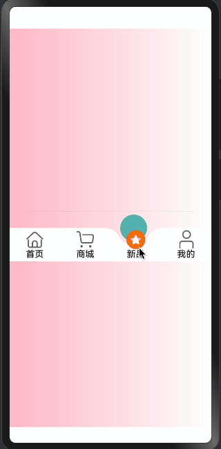
效果演示
1. 组件结构定义
@Builder
export function TabsRaisedCircleSelect(TabItemSelectOptions: TabItemSelectType) {
  RelativeContainer() {
    // 选中时凸起的圆
    Column()
      .aspectRatio(1)
      .height(TabItemSelectOptions.chamfer.circleDiameter)
      .borderRadius(TabItemSelectOptions.chamfer.circleRadius)
      .borderWidth(TabItemSelectOptions.chamfer.circleDiameter * 0.1)
      .borderColor(TabItemSelectOptions.tabsBgColor)
      .radialGradient({
        center: [TabItemSelectOptions.chamfer.circleRadius, TabItemSelectOptions.chamfer.circleRadius],
        radius: TabItemSelectOptions.chamfer.circleRadius,
        colors: [[TabItemSelectOptions.tabsSelectBgColor,
          (TabItemSelectOptions.chamfer.circleDiameter - SURPLUSRADIUS) / TabItemSelectOptions.chamfer.circleDiameter],
          [Color.Transparent,
            (TabItemSelectOptions.chamfer.circleDiameter - SURPLUSRADIUS) /
            TabItemSelectOptions.chamfer.circleDiameter]]
      })
      .id(TabItemSelectOptions.selectBodyId)

    // 其他过渡效果
  }
}
复制
组件结构说明:
-
组件类型:
- 使用
@Builder装饰器 - 接收配置参数
- 使用
-
布局容器:
- 使用
RelativeContainer - 支持相对定位
- 使用
-
样式设置:
- 保持宽高比1:1
- 设置圆形边框
- 应用渐变效果
2. 渐变效果实现
.radialGradient({
  center: [TabItemSelectOptions.chamfer.circleRadius, TabItemSelectOptions.chamfer.circleRadius],
  radius: TabItemSelectOptions.chamfer.circleRadius,
  colors: [[TabItemSelectOptions.tabsSelectBgColor,
    (TabItemSelectOptions.chamfer.circleDiameter - SURPLUSRADIUS) / TabItemSelectOptions.chamfer.circleDiameter],
    [Color.Transparent,
      (TabItemSelectOptions.chamfer.circleDiameter - SURPLUSRADIUS) /
      TabItemSelectOptions.chamfer.circleDiameter]]
})
复制
渐变效果说明:
-
渐变中心:
- 使用圆心坐标
- 基于圆半径计算
-
渐变范围:
- 使用圆半径作为范围
- 确保覆盖整个区域
-
颜色配置:
- 从选中颜色过渡到透明
- 计算过渡位置
3. 过渡效果实现
// 左边过渡
Column()
  .width(TabItemSelectOptions.chamfer.chamferXY[0])
  .height(TabItemSelectOptions.chamfer.chamferXY[1])
  .radialGradient({
    center: [0, 0],
    radius: TabItemSelectOptions.chamfer.chamferRadius,
    colors: [[Color.Transparent, 0.0], [Color.Transparent, 1], [TabItemSelectOptions.tabsBgColor, 1]]
  })
  .clipShape(new PathShape({
    commands: `M0 0 L0 ${vp2px(TabItemSelectOptions.chamfer.chamferXY[1])}
              L${vp2px(TabItemSelectOptions.chamfer.chamferXY[0])}
              ${vp2px(TabItemSelectOptions.chamfer.chamferXY[1])} Z`
  }))
复制
过渡效果说明:
-
尺寸设置:
- 根据凸起尺寸计算
- 保持比例一致
-
渐变配置:
- 从边缘向内渐变
- 使用三个颜色节点
-
裁切形状:
- 使用PathShape
- 创建三角形区域
4. 位置对齐
.alignRules({
  'right': { 'anchor': TabItemSelectOptions.selectBodyId, 'align': HorizontalAlign.Center },
  "bottom": { 'anchor': TabItemSelectOptions.selectBodyId, 'align': VerticalAlign.Center }
})
复制
对齐规则说明:
-
水平对齐:
- 相对选中项居中
- 使用right规则
-
垂直对齐:
- 相对底部对齐
- 使用bottom规则
-
锚点设置:
- 使用选中项ID
- 确保精确定位
5. 整体定位
.offset({
  x: -TabItemSelectOptions.chamfer.circleOffsetX,
  y: -TabItemSelectOptions.chamfer.circleOffsetY
})
.zIndex(-1)
.alignRules({
  'left': {
    'anchor': `${TabItemSelectOptions.tabItemId}${TabItemSelectOptions.selectIndex}`,
    'align': HorizontalAlign.Center
  }
})
复制
定位实现说明:
-
偏移设置:
- 计算X轴偏移
- 计算Y轴偏移
-
层级管理:
- 设置zIndex
- 确保正确的显示顺序
-
对齐规则:
- 相对选中项居中
- 使用left规则
总结
TabsRaisedCircleSelect组件通过:
- 精确的渐变效果
- 平滑的过渡处理
- 准确的位置计算
- 灵活的对齐规则
实现了一个:
- 视觉效果出色
- 过渡自然流畅
- 位置准确
- 易于集成
的选中状态处理组件。
「喜欢这篇文章,您的关注和赞赏是给作者最好的鼓励」
关注作者
【版权声明】本文为墨天轮用户原创内容,转载时必须标注文章的来源(墨天轮),文章链接,文章作者等基本信息,否则作者和墨天轮有权追究责任。如果您发现墨天轮中有涉嫌抄袭或者侵权的内容,欢迎发送邮件至:contact@modb.pro进行举报,并提供相关证据,一经查实,墨天轮将立刻删除相关内容。