


HarmonyOS ArkUI 3.0 正式到来,今天就给大家分享一下我的 HarmonyOS ArkUI 3.0 框架试玩初体验,以合成 1024 的开发实战,带大家感受一下 HarmonyOS ArkUI 3.0 的极简开发。

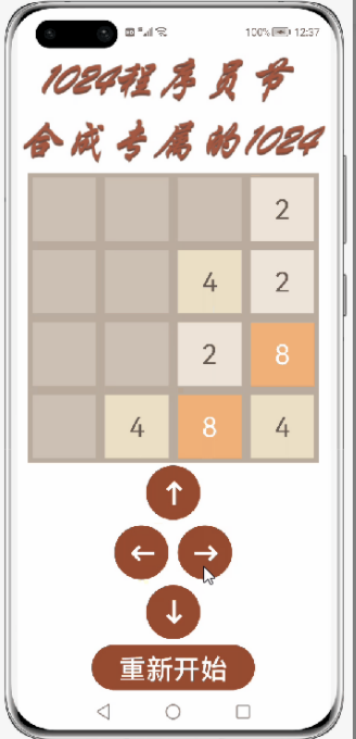
效果图如下:
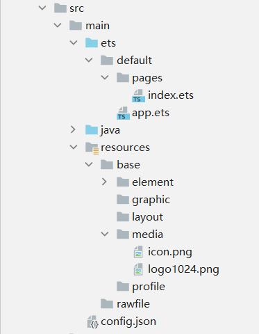
代码文件结构:
创建一个空白的工程
①安装和配置 DevEco Studio
https://developer.harmonyos.com/cn/develop/deveco-studio#download
DevEco Studio 安装:
https://developer.harmonyos.com/cn/docs/documentation/doc-guides/software_install-0000001053582415
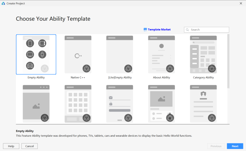
②创建一个 Empty Ability 应用
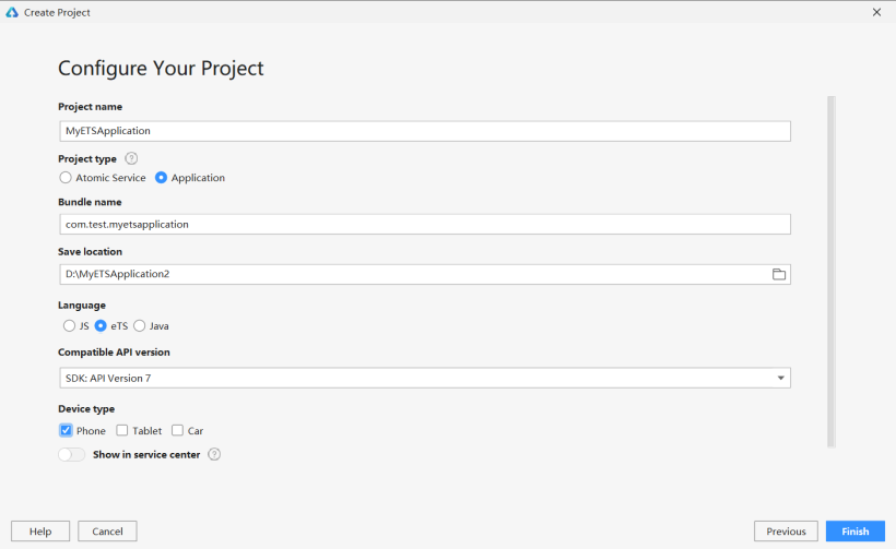
将文件命名为 MyETSApplication(文件名不能出现中文或者特殊字符,否则将无法成功创建项目文件),Project Type 勾选 Application,选择保存路径。
③准备工作
在 entry>src>main>config.json 文件中最下方"launchType": "standard"的后面添加以下代码,这样就可以实现去掉应用上方的标签栏了。
"metaData": {
      "customizeData": [
        {
          "name": "hwc-theme",
          "value": "androidhwext:style/Theme.Emui.Light.NoTitleBar",
          "extra": ""
        }
      ]
    }
实现界面布局
①保存图片
将 logo 图片保存到 entry>src>main>resources>base>media 文件中。

②新一代的声明式 UI 开发范式
③实现界面
aboutToAppear:函数在创建自定义组件的新实例后,在执行其build函数之前执行。允许在 aboutToAppear 函数中改变状态变量,这些更改将在后续执行build函数中生效。
aboutToDisappear:函数在自定义组件析构消耗之前执行。不允许在 aboutToDisappear 函数中改变状态变量,特别是 @Link 变量的修改可能会导致应用程序行为不稳定。
onPageShow:当此页面显示时触发一次。包括路由过程、应用进入前后台等场景,仅 @Entry 修饰的自定义组件生效。
onPageHide:当此页面消失时触发一次。包括路由过程、应用进入前后台等场景,仅 @Entry 修饰的自定义组件生效。
onBackPress:当用户点击返回按钮时触发,,仅 @Entry 修饰的自定义组件生效。
index.ets:先定义一个方格的背景颜色字典 colors,用以绘制不同数字的背景颜色,和一个全局变量 number,用以 ForEach 的键值生成。
var number = 1
const colors={
  "0": "#CDC1B4",
  "2": "#EEE4DA",
  "4": "#ECE0C6",
  "8": "#F2B179",
  "16": "#F59563",
  "32": "#F67C5F",
  "64": "#F65E3B",
  "128": "#EDCF72",
  "256": "#EDCC61",
  "512": "#99CC00",
  "1024": "#83AF9B",
  "2048": "#0099CC",
  "4096": "#0099CC",
  "8192": "#0099CC"
}
文本颜色判断其值是否为 2 或 4,如果为 2 或 4,则采用颜色 #645B52,否则采用背景颜色白色。
@Component
struct setText {
  @Link grids: number[]

  build() {
    Flex({ justifyContent: FlexAlign.Center, alignItems: ItemAlign.Center, direction: FlexDirection.Row }) {
      ForEach(this.grids,
        (item: number) => Text(item == 0 ? '' : item.toString())
          .width(70)
          .height(70)
          .textAlign(TextAlign.Center)
          .fontSize(30)
          .margin({ left: 5, top: 5, right: 5, bottom: 5 })
          .backgroundColor(colors[item.toString()])
          .fontColor((item == 2 || item == 4) ? '#645B52' : '#FFFFFF'),
        (item: number) => (number++) + item.toString())
    }
  }
}
同理,使用装饰器 @Component,自定义一个按钮 Button 组件,用以绘制上下左右四个按钮。
@Component
struct setButton {
  private dirtext: string
  private dir: string
  @Link Grids: number[][]
  @Link grid1: number[]
  @Link grid2: number[]
  @Link grid3: number[]
  @Link grid4: number[]

  build() {
    Button(this.dirtext)
      .width(60)
      .height(60)
      .fontSize(30)
      .fontWeight(FontWeight.Bold)
      .align(Alignment.Center)
      .backgroundColor('#974B31')
      .fontColor('#FFFFFF')
      .margin({ left: 5, top: 3, right: 5, bottom: 3 })
  }
}
@Entry
@Component
struct Index {
  @State grids: number[][] = [[0, 0, 0, 0],
                              [0, 2, 0, 0],
                              [0, 0, 2, 0],
                              [0, 0, 0, 0]]
  @State grid1: number[] = [this.grids[0][0], this.grids[0][1], this.grids[0][2], this.grids[0][3]]
  @State grid2: number[] = [this.grids[1][0], this.grids[1][1], this.grids[1][2], this.grids[1][3]]
  @State grid3: number[] = [this.grids[2][0], this.grids[2][1], this.grids[2][2], this.grids[2][3]]
  @State grid4: number[] = [this.grids[3][0], this.grids[3][1], this.grids[3][2], this.grids[3][3]]

  build() {
    Column() {
      Image($r('app.media.logo1024')).width('100%').height(140).align(Alignment.Center)
      Column() {
        setText({ grids: $grid1 })
        setText({ grids: $grid2 })
        setText({ grids: $grid3 })
        setText({ grids: $grid4 })
      }
      .width(320)
      .height(320)
      .backgroundColor("#BBADA0")
      setButton({dirtext: '↑', dir: 'up', Grids: $grids, grid1: $grid1, grid2: $grid2, grid3: $grid3, grid4: $grid4})
      Flex({ justifyContent: FlexAlign.Center, alignItems: ItemAlign.Center, direction: FlexDirection.Row }) {
        setButton({dirtext: '←', dir: 'left', Grids: $grids, grid1: $grid1, grid2: $grid2, grid3: $grid3, grid4: $grid4})
        setButton({dirtext: '→', dir: 'right', Grids: $grids, grid1: $grid1, grid2: $grid2, grid3: $grid3, grid4: $grid4})
      }
      setButton({dirtext: '↓', dir: 'down', Grids: $grids, grid1: $grid1, grid2: $grid2, grid3: $grid3, grid4: $grid4})
      Button('重新开始')
        .width(180)
        .height(50)
        .fontSize(30)
        .align(Alignment.Center)
        .backgroundColor('#974B31')
        .fontColor('#FFFFFF')
        .margin({ left: 5, top: 3, right: 5, bottom: 3 })
    }
    .width('100%')
    .height('100%')
    .backgroundColor("#FFFFFF")
    .alignItems(HorizontalAlign.Center)
  }
}
编写逻辑代码
addTwoOrFourToGrids():用以随机生成一个新的方格数字,数字为2或4。
swipeGrids(direction):用以实现方格的重新生成。
changeGrids(direction):用以实现方格的上下左右移动。
changeString():用以将二维数组分成四个一维数组。
最后在 Button 组件的属性里添加一个点击事件,依次调用函数 swipeGrids(direction)、addTwoOrFourToGrids() 和 changeString()。
@Component
struct setButton {
  private dirtext: string
  private dir: string
  @Link Grids: number[][]
  @Link grid1: number[]
  @Link grid2: number[]
  @Link grid3: number[]
  @Link grid4: number[]

  addTwoOrFourToGrids() {
    let array = [];
    for (let row = 0; row < 4; row++)
    for (let column = 0;column < 4; column++)
    if (this.Grids[row][column] == 0)
    array.push([row, column]);

    let randomIndes = Math.floor(Math.random() * array.length);
    let row = array[randomIndes][0];
    let column = array[randomIndes][1];
    if (Math.random() < 0.8) {
      this.Grids[row][column] = 2;
    } else {
      this.Grids[row][column] = 4;
    }
  }

  swipeGrids(direction) {
    let newGrids = this.changeGrids(direction);
    if (newGrids.toString() != this.Grids.toString()) {
      this.Grids = newGrids;
    }
  }

  changeGrids(direction) {
    let newGrids = [[0, 0, 0, 0],
    [0, 0, 0, 0],
    [0, 0, 0, 0],
    [0, 0, 0, 0]];

    if (direction == 'left' || direction == 'right') {
      let step = 1;
      if (direction == 'right') {
        step = -1;//step作为循环时数组下标改变的方向
      }
      for (let row = 0; row < 4; row++) {//每一层
        let array = [];

        let column = 0;//如果为left则从0开始right从3开始,
        if (direction == 'right') {
          column = 3;
        }
        for (let i = 0; i < 4; i++) {
          if (this.Grids[row][column] != 0) {//把所有非零元依次放入数组中
            array.push(this.Grids[row][column]);
          }
          column += step;//当direction为left时则从0向3递增,为right时则从3向0递减
        }
        for (let i = 0; i < array.length - 1; i++) {//访问当前元素及他的下一个元素,所有循环次数为length-1
          if (array[i] == array[i + 1]) {//判断是否可合并,
            array[i] += array[i + 1];//合并,
            array[i + 1] = 0;//合并后参与合并的第二个元素消失
            i++;
          }
        }

        column = 0;
        if (direction == 'right') {
          column = 3;
        }

        for (const elem of array) {
          if (elem != 0) {//跳过array里的空元素
            newGrids[row][column] = elem;//把合并后的状态赋给新数组grids,
            column += step;
          }
        }
      }
    } else if (direction == 'up' || direction == 'down') {//同理
      let step = 1;
      if (direction == 'down') {
        step = -1;
      }

      for (let column = 0; column < 4; column++) {
        let array = [];

        let row = 0;
        if (direction == 'down') {
          row = 3;
        }
        for (let i = 0; i < 4; i++) {
          if (this.Grids[row][column] != 0) {
            array.push(this.Grids[row][column]);
          }
          row += step;
        }
        for (let i = 0; i < array.length - 1; i++) {
          if (array[i] == array[i + 1]) {
            array[i] += array[i + 1];
            array[i + 1] = 0;
            i++;
          }
        }
        row = 0;
        if (direction == 'down') {
          row = 3;
        }
        for (const elem of array) {
          if (elem != 0) {
            newGrids[row][column] = elem;
            row += step;
          }
        }
      }
    }
    return newGrids;
  }

  changeString() {
    this.grid1 = [this.Grids[0][0], this.Grids[0][1], this.Grids[0][2], this.Grids[0][3]]
    this.grid2 = [this.Grids[1][0], this.Grids[1][1], this.Grids[1][2], this.Grids[1][3]]
    this.grid3 = [this.Grids[2][0], this.Grids[2][1], this.Grids[2][2], this.Grids[2][3]]
    this.grid4 = [this.Grids[3][0], this.Grids[3][1], this.Grids[3][2], this.Grids[3][3]]
  }

  build() {
    Button(this.dirtext)
      .width(60)
      .height(60)
      .fontSize(30)
      .fontWeight(FontWeight.Bold)
      .align(Alignment.Center)
      .backgroundColor('#974B31')
      .fontColor('#FFFFFF')
      .margin({ left: 5, top: 3, right: 5, bottom: 3 })
      .onClick((event: ClickEvent) => {
        this.swipeGrids(this.dir)
        this.addTwoOrFourToGrids()
        this.changeString()
      })
  }
}
在结构体 index 中文本内容为“重新开始”的按钮添加一个点击事件,用以重新初始化数据。
@Entry
@Component
struct Index {
  @State grids: number[][] = [[0, 0, 0, 0],
                              [0, 2, 0, 0],
                              [0, 0, 2, 0],
                              [0, 0, 0, 0]]
  @State grid1: number[] = [this.grids[0][0], this.grids[0][1], this.grids[0][2], this.grids[0][3]]
  @State grid2: number[] = [this.grids[1][0], this.grids[1][1], this.grids[1][2], this.grids[1][3]]
  @State grid3: number[] = [this.grids[2][0], this.grids[2][1], this.grids[2][2], this.grids[2][3]]
  @State grid4: number[] = [this.grids[3][0], this.grids[3][1], this.grids[3][2], this.grids[3][3]]

  build() {
    Column() {
      Image($r('app.media.logo1024')).width('100%').height(140).align(Alignment.Center)
      Column() {
        setText({ grids: $grid1 })
        setText({ grids: $grid2 })
        setText({ grids: $grid3 })
        setText({ grids: $grid4 })
      }
      .width(320)
      .height(320)
      .backgroundColor("#BBADA0")
      setButton({dirtext: '↑', dir: 'up', Grids: $grids, grid1: $grid1, grid2: $grid2, grid3: $grid3, grid4: $grid4})
      Flex({ justifyContent: FlexAlign.Center, alignItems: ItemAlign.Center, direction: FlexDirection.Row }) {
        setButton({dirtext: '←', dir: 'left', Grids: $grids, grid1: $grid1, grid2: $grid2, grid3: $grid3, grid4: $grid4})
        setButton({dirtext: '→', dir: 'right', Grids: $grids, grid1: $grid1, grid2: $grid2, grid3: $grid3, grid4: $grid4})
      }
      setButton({dirtext: '↓', dir: 'down', Grids: $grids, grid1: $grid1, grid2: $grid2, grid3: $grid3, grid4: $grid4})
      Button('重新开始')
        .width(180)
        .height(50)
        .fontSize(30)
        .align(Alignment.Center)
        .backgroundColor('#974B31')
        .fontColor('#FFFFFF')
        .margin({ left: 5, top: 3, right: 5, bottom: 3 })
        .onClick((event: ClickEvent)=>{
        this.grids = [[0, 0, 0, 0],
                      [0, 2, 0, 0],
                      [0, 0, 2, 0],
                      [0, 0, 0, 0]]

        this.grid1 = [this.grids[0][0], this.grids[0][1], this.grids[0][2], this.grids[0][3]]
        this.grid2 = [this.grids[1][0], this.grids[1][1], this.grids[1][2], this.grids[1][3]]
        this.grid3 = [this.grids[2][0], this.grids[2][1], this.grids[2][2], this.grids[2][3]]
        this.grid4 = [this.grids[3][0], this.grids[3][1], this.grids[3][2], this.grids[3][3]]
      })
    }
    .width('100%')
    .height('100%')
    .backgroundColor("#FFFFFF")
    .alignItems(HorizontalAlign.Center)
  }
}
写在最后
更多资料请关注我们的项目 Awesome-Harmony_木棉花:
https://gitee.com/hiharmonica/awesome-harmony-os-kapok

求分享
求点赞
求在看
