


本文主要展示如何利用ggplot2绘制二维数据的密度图(Density Plot of Two-Dimensional)。绘制效果如下: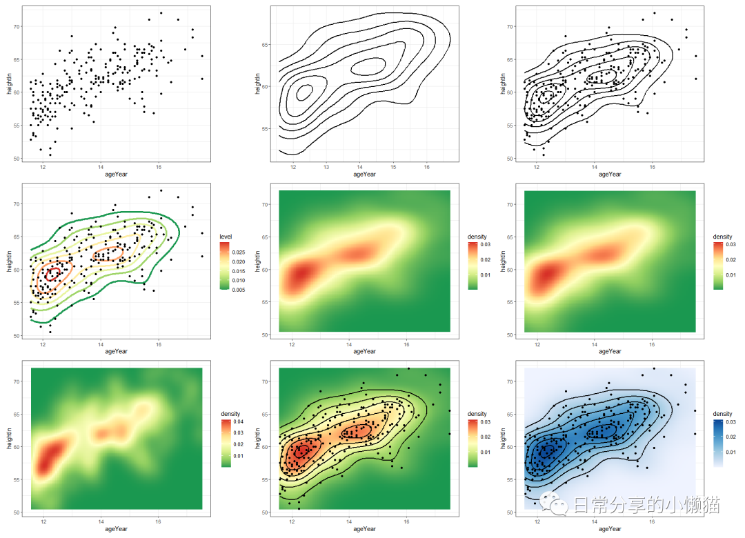
1、数据准备
使用gcookbook包中heightweight数据集,绘制变量ageYear与变量heightIn二者间的散点图,进行二维数据密度图刻画。
library(ggplot2)
library(gcookbook)
library(RColorBrewer)
head(heightweight)
#  sex ageYear ageMonth heightIn weightLb
#1   f   11.92      143     56.3     85.0
#2   f   12.92      155     62.3    105.0
#3   f   12.75      153     63.3    108.0
#4   f   13.42      161     59.0     92.0
#5   f   15.92      191     62.5    112.5
#6   f   14.25      171     62.5    112.0
str(heightweight)
#'data.frame': 236 obs. of  5 variables:
# $ sex     : Factor w/ 2 levels "f","m": 1 1 1 1 1 1 1 1 1 1 ...
# $ ageYear : num  11.9 12.9 12.8 13.4 15.9 ...
# $ ageMonth: int  143 155 153 161 191 171 185 142 160 140 ...
# $ heightIn: num  56.3 62.3 63.3 59 62.5 62.5 59 56.5 62 53.8 ...
# $ weightLb: num  85 105 108 92 112 ...
2、图形绘制
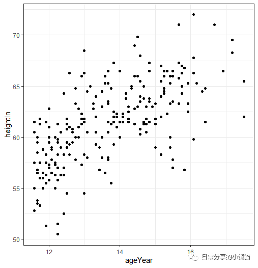
2.1 散点图
ggplot(data = heightweight, aes(ageYear, heightIn)) +
  geom_point(colour = "black") +
  theme_bw()
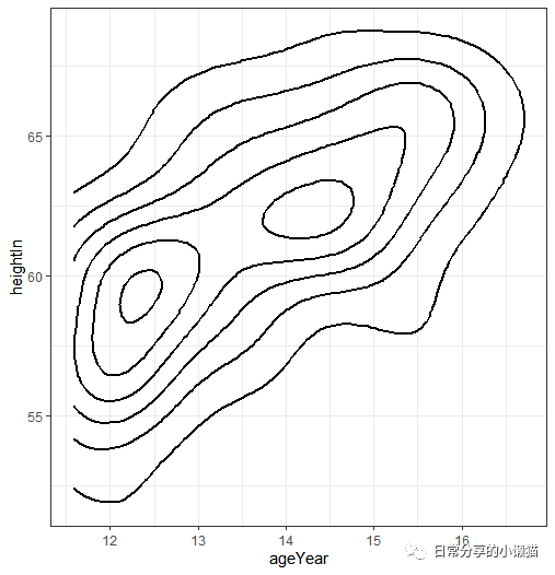
2.2 等高线图
ggplot(data = heightweight, aes(ageYear, heightIn)) +
  stat_density2d(color = "black", size = 1) +
  theme_bw()
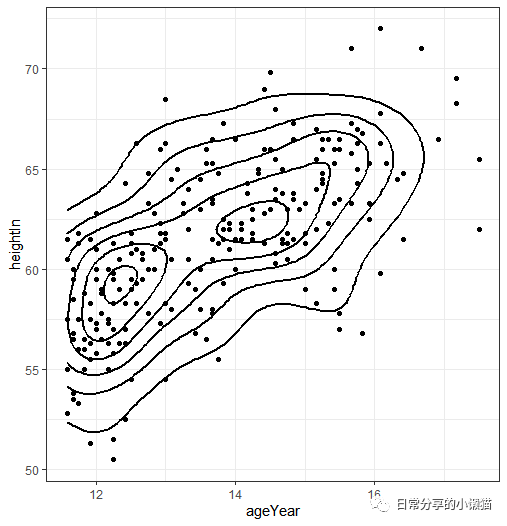
2.3 等高线图+散点图
ggplot(data = heightweight, aes(ageYear, heightIn)) +
  stat_density2d(color = "black", size = 1) +
  geom_point(colour = "black") +
  theme_bw()
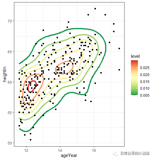
2.4 将密度映射到等高线
ggplot(data = heightweight, aes(ageYear, heightIn)) +
  stat_density2d(aes(color = ..level..), size = 1.5) +
  geom_point(colour = "black") +
  scale_color_distiller(palette = "RdYlGn") +
  theme_bw()
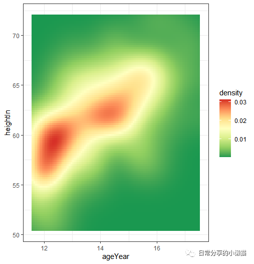
2.5 geom = "tile"
ggplot(data = heightweight, aes(ageYear, heightIn)) +
  stat_density2d(geom = "tile", aes(fill = ..density..), contour = FALSE) +
  scale_fill_distiller(palette = "RdYlGn") +
  theme_bw()
2.6 geom = "raster"
ggplot(data = heightweight, aes(ageYear, heightIn)) +
  stat_density2d(geom = "raster", aes(fill = ..density..), contour = FALSE) +
  scale_fill_distiller(palette = "RdYlGn")  +
  theme_bw()
2.7 对带宽进行调整
ggplot(data = heightweight, aes(ageYear, heightIn)) +
  stat_density2d(geom = "raster", aes(fill = ..density..), contour = FALSE, h = c(1, 5)) +  # 修改带宽
  scale_fill_distiller(palette = "RdYlGn")  +
  theme_bw()

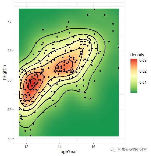
2.8 综合
ggplot(data = heightweight, aes(ageYear, heightIn)) +
  stat_density2d(geom = "raster", aes(fill = ..density..), contour = FALSE) +
  stat_density2d(color = "black", size = 1) +
  geom_point(colour = "black") +
  scale_fill_distiller(palette = "RdYlGn")  +
  theme_bw()
3、其他
关于二维密度图的更多内容可参考Winston Chang
的 R Graphics Cookbook[1]一书。关于散点图绘制可参考R语言绘图|散点图与回归拟合曲线。
如有帮助请多多点赞哦!
参考资料
Making a Density Plot of Two-Dimensional Data: https://r-graphics.org/recipe-distribution-density2d#RECIPE-DISTRIBUTION-DENSITY2D
文章转载自日常分享的小懒猫,如果涉嫌侵权,请发送邮件至:contact@modb.pro进行举报,并提供相关证据,一经查实,墨天轮将立刻删除相关内容。
