


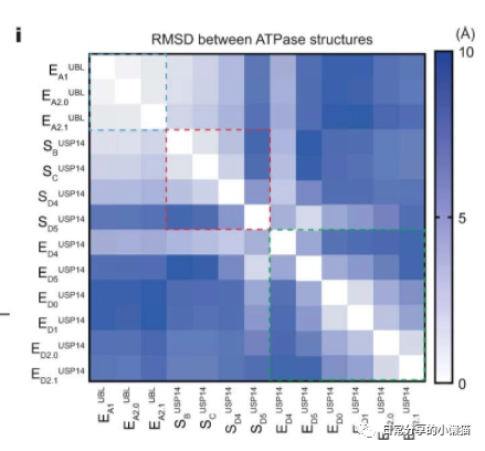
本文主要展示如何利用R语言绘制来自nature期刊USP14-regulated allostery of the human proteasome by time-resolved cryo-EM(Shuwen Zhang, et al,2022)[1]一文中的Extended Data Fig.7i。该图形式为热图。如下图所示:

1、图形绘制
setwd("C:\\Users\\Acer\\Desktop")
library(dplyr)
library(ggplot2)

zhang_ed.fig7.i <- readxl::read_xlsx("41586_2022_4671_MOESM7_ESM.xlsx", sheet = 2)
head(zhang_ed.fig7.i)
#  type     EA1UBL EA2.0UBL EA2.1UBL SBUSP14 SCUSP14 SD4USP14 SD5USP14 ED4USP14 ED5USP14 ED0USP14 ED1USP14 ED2.0USP14 ED2.1USP14
#  <chr>     <dbl>    <dbl>    <dbl>   <dbl>   <dbl>    <dbl>    <dbl>    <dbl>    <dbl>    <dbl>    <dbl>      <dbl>      <dbl>
#1 EA1UBL    0        0.388    0.75     1.29    2.06     3.33     6.78     3.96     7.16     8.04     8.02       6.99       6.76
#2 EA2.0UBL  0.388    0        0.708    1.34    2.08     3.34     6.86     3.91     7.25     8.00     7.92       7.07       6.70
#3 EA2.1UBL  0.75     0.708    0        1.95    2.62     3.72     6.98     4.04     7.27     8.28     8.32       7.63       7.29
#4 SBUSP14   1.29     1.34     1.95     0       1.14     2.95     7.72     3.54     8.39     7.40     7.24       6.58       6.49
#5 SCUSP14   2.06     2.08     2.62     1.14    0        2.20     7.38     3.10     8.15     7.26     7.12       6.56       6.41
#6 SD4USP14  3.33     3.34     3.72     2.95    2.20     0        5.12     2.56     5.8      7.19     7.20       6.78       6.87

fig7.i <- zhang_ed.fig7.i %>% reshape2::melt(id.vars = "type", variable.name = "class", value.name = "value")
fig7.i$type <- factor(fig7.i$type, levels = fig7.i$type %>% unique())
fig7.i$class <- factor(fig7.i$class, levels = fig7.i$class %>% unique() %>% rev() )

fig7.i <- fig7.i %>% mutate(integer.x = as.numeric(fig7.i$type)) #factor to numeric
fig7.i <- fig7.i %>% mutate(integer.y = as.numeric(fig7.i$class)) #factor to numeric

head(fig7.i)
#      type  class value integer.x integer.y
#1   EA1UBL EA1UBL 0.000         1        13
#2 EA2.0UBL EA1UBL 0.388         2        13
#3 EA2.1UBL EA1UBL 0.750         3        13
#4  SBUSP14 EA1UBL 1.288         4        13
#5  SCUSP14 EA1UBL 2.058         5        13
#6 SD4USP14 EA1UBL 3.331         6        13
str(fig7.i)
#'data.frame': 169 obs. of  5 variables:
# $ type     : Factor w/ 13 levels "EA1UBL","EA2.0UBL",..: 1 2 3 4 5 6 7 8 9 10 ...
# $ class    : Factor w/ 13 levels "ED2.1USP14","ED2.0USP14",..: 13 13 13 13 13 13 13 13 13 13 ...
# $ value    : num  0 0.388 0.75 1.288 2.058 ...
# $ integer.x: num  1 2 3 4 5 6 7 8 9 10 ...
# $ integer.y: num  13 13 13 13 13 13 13 13 13 13 ...

#绘图
ggplot(fig7.i, aes(x = type, y = class, fill = value)) +
  geom_tile() +
  scale_x_discrete(expand = c(0,0)) +
  scale_y_discrete(expand = c(0,0)) +
  geom_rect(aes(xmin=1 - 0.45, xmax = 3 + 0.45, ymin = 11 - 0.45, ymax = 13 + 0.45), color = "red", fill = NA, size = 1, linetype = 2) +
  geom_rect(aes(xmin=4 - 0.45, xmax = 7 + 0.45, ymin = 7 - 0.45, ymax = 10 + 0.45), color = "blue", fill = NA, size = 1, linetype = 2) +
  geom_rect(aes(xmin=8 - 0.45, xmax = 13 + 0.45, ymin = 1 - 0.45, ymax = 6 + 0.45), color = "green", fill = NA, size = 1, linetype = 2) +
  scale_fill_distiller(palette = "Purples", direction = 1, breaks = seq(0,10,5), limits = c(0,10)) +
  theme_bw() +
  theme(axis.text.x = element_text(angle = 90, hjust = 1),
        text = element_text(colour = "black"),
        plot.title = element_text(hjust = 0.5),
        axis.text = element_text(size = 10),
        axis.title = element_blank(),
        axis.ticks.length = unit(0, "cm")) +
  guides(fill = guide_colorbar(barheight = 22, frame.colour = "black", ticks.colour = "black")) +
  labs(fill = "     (A)", title = "RMSD between ATPase structures")
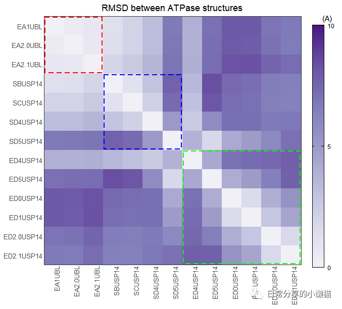
该图所使用的基本绘图函数为geom_tile() 函数与geom_rect() 函数。其中有2个需要注意的点:一是如何在热图中加入框线,为此首先需要将因子型变量转换为数值型变量,即用到as.numeric() 函数,其次根据因子的对应数值,填充到geom_rect() 函数中,来完成框线的绘制;二是因子的顺序,需要对其中一列因子顺序进行反转。
2、其他
其他绘图方法可进一步阅读公众号其他文章。
如有帮助请多多点赞哦!
参考资料
Zhang, S., Zou, S., Yin, D. et al. USP14-regulated allostery of the human proteasome by time-resolved cryo-EM. Nature 605, 567–574 (2022). : https://doi.org/10.1038/s41586-022-04671-8
文章转载自日常分享的小懒猫,如果涉嫌侵权,请发送邮件至:contact@modb.pro进行举报,并提供相关证据,一经查实,墨天轮将立刻删除相关内容。
