


本文主要介绍如何为散点图添加边际效果图。包括密度图、条形图、箱线图、小提琴图以及分组变量下的散点图添加边际效果图。绘图效果如下图所示: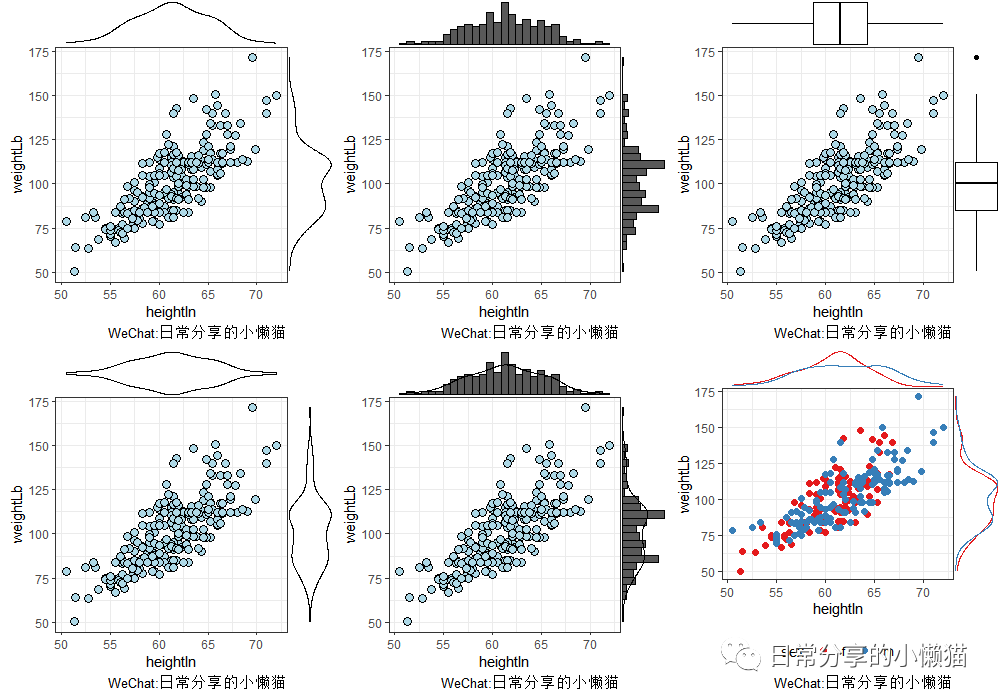
1、数据准备
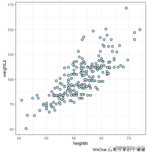
以gcookbook包中的heightweight数据集为例,绘制身高(heightIn
)与体重(weightLb
)的散点图。
#install.packages("gcookbook")
#install.packages("ggplot2")
#install.packages("ggExtra")
library(gcookbook)
library(ggplot2)
library(ggExtra)
head(heightweight)
#  sex ageYear ageMonth heightIn weightLb
#1   f   11.92      143     56.3     85.0
#2   f   12.92      155     62.3    105.0
#3   f   12.75      153     63.3    108.0
#4   f   13.42      161     59.0     92.0
#5   f   15.92      191     62.5    112.5
#6   f   14.25      171     62.5    112.0
plot.scatter <-
  ggplot(heightweight, aes(heightIn, weightLb)) +
  geom_point(fill = "lightblue",color = "black", shape = 21, size = 3) +
  theme_bw()
plot.scatter
2、添加边际效果图
主要包括6种形式边际效果图。密度图"density", 直方图"histogram", 箱线图"boxplot", 小提琴图"violin", 密度图+直方图"densigram"。
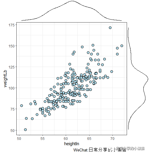
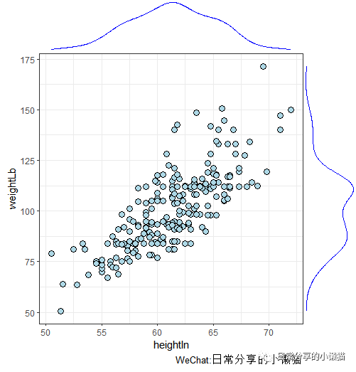
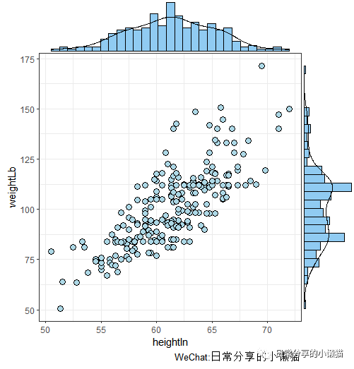
2.1 添加密度图
ggMarginal(plot.scatter, type = "density") #密度图
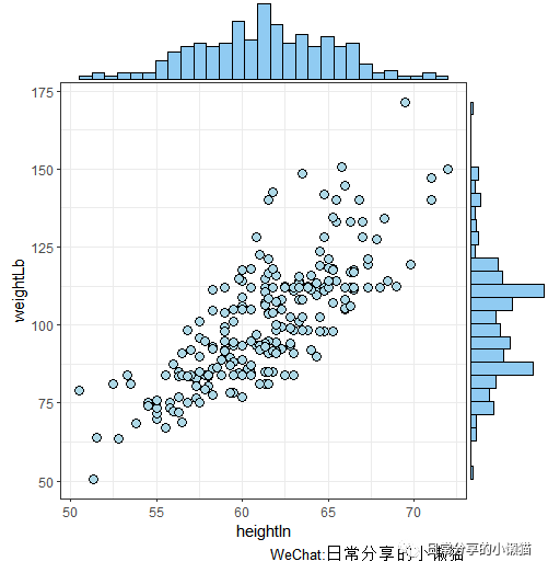
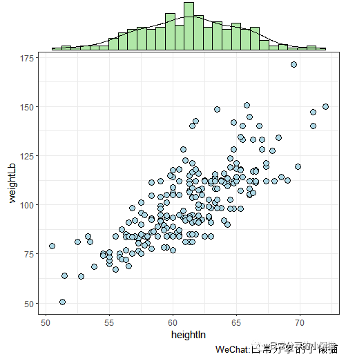
2.2 添加直方图
ggMarginal(plot.scatter, type = "histogram") #直方图

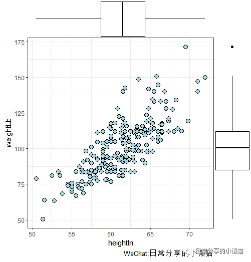
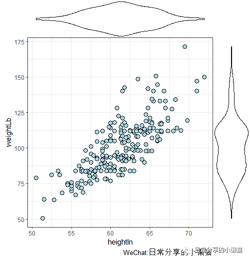
2.3 添加箱线图
ggMarginal(plot.scatter, type = "boxplot") #箱线图
2.4 添加小提琴图
ggMarginal(plot.scatter, type = "violin") #小提琴图
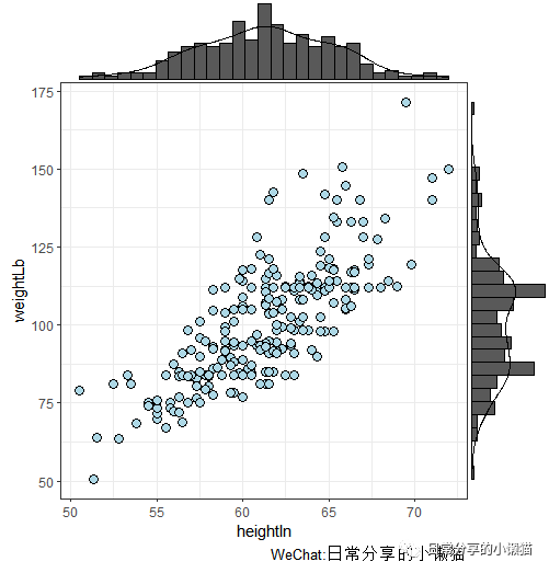
2.5 添加密度图与直方图
ggMarginal(plot.scatter, type = "densigram") #密度图+直方图
3、参数调整
3.1 调整密度图颜色
ggMarginal(plot.scatter,type = "density", color = "blue")
3.2 调整直方图颜色
ggMarginal(plot.scatter, type = "histogram", fill = 4, alpha = 0.5)
3.3 调整密度图+直方图颜色
ggMarginal(plot.scatter, type = "densigram", fill = 4, alpha = 0.5)
3.4 只添加x轴或y轴
margins = "x"
ggMarginal(plot.scatter, type = "densigram", margins = "x", fill = 3, alpha = 0.5) #只添加x轴
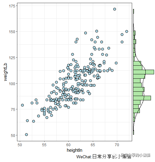
 margins = "y"
ggMarginal(plot.scatter, type = "densigram", margins = "y", fill = 3, alpha = 0.5) #只添加y轴
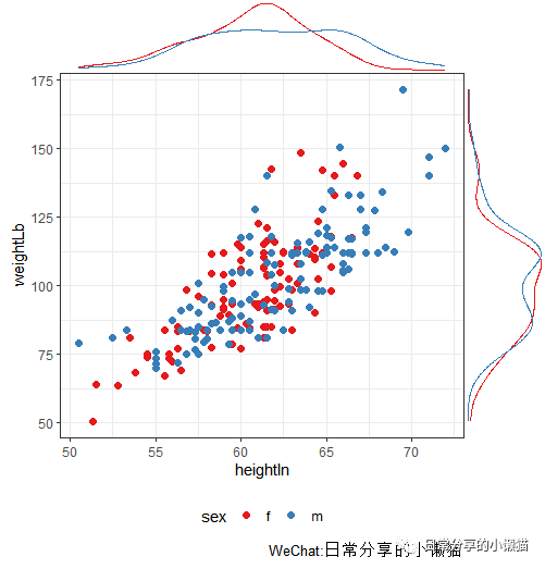
4、分组变量下的散点图
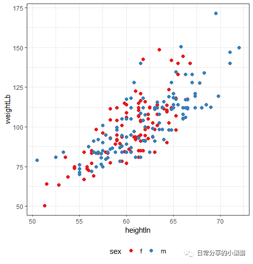
绘制sex
分组变量下的散点图
plot.scatter2 <-
  ggplot(heightweight, aes(heightIn, weightLb, color = sex)) +
  geom_point() +
  theme_bw() +
  scale_color_brewer(palette = "Set1") +
  theme(legend.position = "bottom")
plot.scatter2
 为分组变量散点图添加密度图
ggMarginal(plot.scatter2, type = "density", groupColour = TRUE)
5、其他
关于散点图相关内容可进一步阅读R语言绘图|散点图与回归拟合曲线。其他绘图方法可进一步阅读公众号其他文章。
如有帮助请多多点赞哦!
文章转载自日常分享的小懒猫,如果涉嫌侵权,请发送邮件至:contact@modb.pro进行举报,并提供相关证据,一经查实,墨天轮将立刻删除相关内容。
