


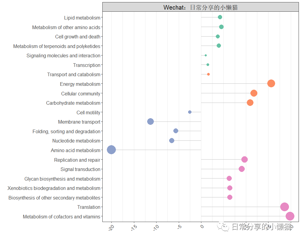
本文接上期内容R语言每日一图|棒棒糖图,继续介绍如何利用R语言绘制分类棒棒糖图,图形来自chiplot[1]网站,如下图所示。分类棒棒糖图主要用于展示离散变量在不同类别下的分布特征。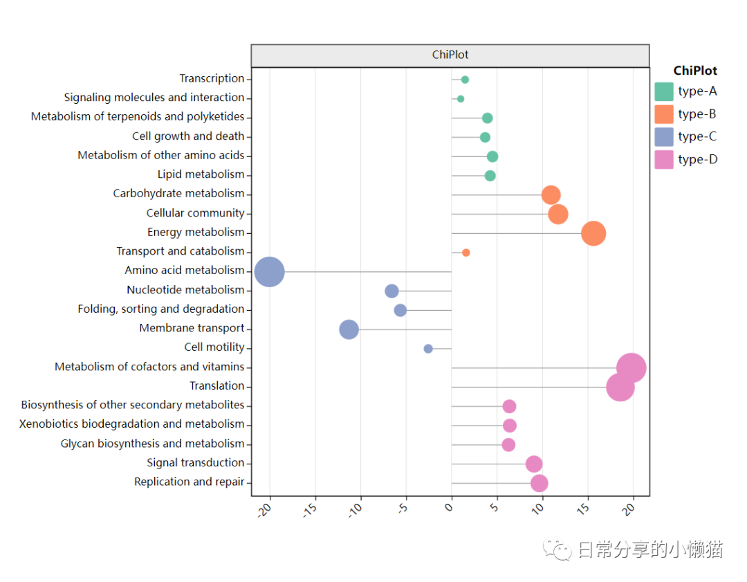
1、数据准备
数据可在chiplot网站自主下载,或后台回复【20221008】进行下载。
setwd("C:\\Users\\Acer\\Desktop\\chiplot")
# https://www.chiplot.online/
library(RColorBrewer)
library(ggplot2)
library(dplyr)

#分类棒棒糖图
df <- read.table("分类棒棒糖图.tsv", sep = "\t", header = TRUE)
head(df)
df$overall = "Wechat:日常分享的小懒猫"
df <- df %>% arrange(type)
df$level2_pathway_name <- factor(df$level2_pathway_name, levels = df$level2_pathway_name %>% rev())
head(df)
#                       level2_pathway_name gene_abundance   type                  overall
#1                         Lipid metabolism       4.246739 type-A Wechat:日常分享的小懒猫
#2          Metabolism of other amino acids       4.505277 type-A Wechat:日常分享的小懒猫
#3                    Cell growth and death       3.693669 type-A Wechat:日常分享的小懒猫
#4 Metabolism of terpenoids and polyketides       3.942598 type-A Wechat:日常分享的小懒猫
#5      Signaling molecules and interaction       1.000000 type-A Wechat:日常分享的小懒猫
#6                            Transcription       1.481749 type-A Wechat:日常分享的小懒猫
2、图形绘制
#plot
ggplot(df, aes(gene_abundance, level2_pathway_name, color = type)) +
  geom_segment(aes(yend = level2_pathway_name), color = "grey", xend = 0) +
  geom_point(aes(size = gene_abundance), show.legend = FALSE) +
  scale_color_brewer(palette = "Set2") +
  guides(colour = guide_legend(override.aes = list(shape = 15, size = 6))) +
  scale_size_area(max_size = 10) +
  scale_x_continuous(breaks = seq(-20, 20, 5)) +
  #scale_y_discrete(limits = rev) +
  facet_wrap(~overall) + #add title
  labs(x = "", y = "") +
  theme_bw() +
  theme(
    panel.grid.major.y = element_blank(),
    axis.text.x = element_text(angle = 45, size = 12, hjust = 1),
    axis.text.y = element_text(size = 12),
    legend.title = element_text(size = 15),
    legend.key.height = unit(0.8, "cm"),
    legend.text = element_text(size = 12),
    strip.text = element_text(size = 15),
    legend.justification = "top")
可通过叠加geom_text() 图层函数,进行数据标签的添加。
geom_text(aes(label = gene_abundance %>% round(2)),color = "black", size = 4, show.legend = FALSE)

3、绘图解读
在数据处理过程中,需先对类别进行排序,进而固定因子。绘图过程中主要使用到geom_segment() 及 geom_point() 图层函数,分别创建线段图层与点图层,进行叠加。
4、其他
关于该图形的交互式绘图可以进一步在chiplot网站上点击尝试。更多绘图方法可进一步阅读本公众号其他推文。
如有帮助请多多点赞哦!
参考资料
chiplot: https://www.chiplot.online/
文章转载自日常分享的小懒猫,如果涉嫌侵权,请发送邮件至:contact@modb.pro进行举报,并提供相关证据,一经查实,墨天轮将立刻删除相关内容。
