


#install.packages(plotrix)
library(plotrix) #画图椭圆

#颜色范围
ellipse_col <- c('#6181BD4E','#F348004E','#64A10E4E','#9300264E','#464E044E','#049a0b4E','#4E0C664E','#D000004E','#FF6C004E','#FF00FF4E','#c7475b4E','#00F5FF4E','#BDA5004E','#A5CFED4E','#f0301c4E','#2B8BC34E','#FDA1004E','#54adf54E','#CDD7E24E','#9295C14E')

#定义画flower_plot的函数:引用自:https://www.maimengkong.com/kyjc/585.html
flower_plot <- function(sample, otu_num, core_otu, start, a, b, r, ellipse_col, circle_col) {
    par( bty = 'n', ann = F, xaxt = 'n', yaxt = 'n', mar = c(1,1,1,1))
    plot(c(0,10),c(0,10),type='n')
    n   <- length(sample)
    deg <- 360 / n
    res <- lapply(1:n, function(t){
        draw.ellipse(x = 5 + cos((start + deg * (t - 1)) * pi / 180),
            y = 5 + sin((start + deg * (t - 1)) * pi / 180),
            col = ellipse_col[t],
            border = ellipse_col[t],
            a = a, b = b, angle = deg * (t - 1))
        text(x = 5 + 2.5 * cos((start + deg * (t - 1)) * pi / 180),
            y = 5 + 2.5 * sin((start + deg * (t - 1)) * pi / 180),
            otu_num[t])
        if (deg * (t - 1) < 180 && deg * (t - 1) > 0 ) {
            text(x = 5 + 3.3 * cos((start + deg * (t - 1)) * pi / 180),
                y = 5 + 3.3 * sin((start + deg * (t - 1)) * pi / 180),
                sample[t],
                srt = deg * (t - 1) - start,
                adj = 1,
                cex = 1
                )
        } else {
            text(x = 5 + 3.3 * cos((start + deg * (t - 1)) * pi / 180),
                y = 5 + 3.3 * sin((start + deg * (t - 1)) * pi / 180),
                sample[t],
                srt = deg * (t - 1) + start,
                adj = 0,
                cex = 1
                )
        }
    })
    draw.circle(x = 5, y = 5, r = r, col = circle_col, border = NA)
    text(x = 5, y = 5, paste('Core:', core_otu))
}
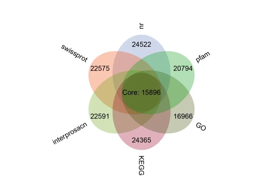
anno = read.csv('function_annotion/anno.xls',sep='\t',header = T)

#提取各个数据库注释到的基因集
Nr = as.vector(na.omit(anno[,c('gene_id','nr')])[,c('gene_id')])
SwissProt = as.vector(na.omit(anno[,c('gene_id','swissprot')])[,c('gene_id')])
interPro = as.vector(na.omit(anno[,c('gene_id','interprosacn')])[,c('gene_id')])
KEGG = as.vector(na.omit(anno[,c('gene_id','KEGG')])[,c('gene_id')])
GO = as.vector(na.omit(anno[,c('gene_id','GO')])[,c('gene_id')])
Pfam = as.vector(na.omit(anno[,c('gene_id','pfam')])[,c('gene_id')])

#计算各个数据库基因集的交集元素的个数
core = length(Reduce(intersect,list(Nr,SwissProt,KEGG,GO,interPro,Pfam)))

#计算各个数据库基因集的元素个数
Nr=length(Nr)
SwissProt=length(SwissProt)
interPro=length(interPro)
KEGG=length(KEGG)
GO=length(GO)
Pfam=length(Pfam)
data = t(data.frame(Nr,SwissProt,interPro,KEGG,GO,Pfam)) #整合到数据框

#画花瓣图
flower_plot(sample =row.names(data), otu_num = data[,1], core_otu = core, start = 90, a = 1.5, b = 2, r = 0, ellipse_col = ellipse_col, circle_col = 'white')
#core_otu 交集元素个数
#a和b椭圆的半径
#r中心圆的半径
#circle_col中心圆的元素
#ellipse_col花瓣的颜色
文章转载自陈桂森,如果涉嫌侵权,请发送邮件至:contact@modb.pro进行举报,并提供相关证据,一经查实,墨天轮将立刻删除相关内容。
