


Tutorialspoint Highcharts 教程
作者:W3School
Highcharts 简介

Highcharts 是一个用纯JavaScript编写的一个图表库。
Highcharts 能够很简单便捷的在web网站或是web应用程序添加有交互性的图表
Highcharts 免费提供给个人学习、个人网站和非商业用途使用。
HighCharts 特性
- 兼容性 - 支持所有主流浏览器和移动平台(android、iOS等)。
- 多设备 - 支持多种设备,如手持设备 iPhone/iPad、平板等。
- 免费使用 - 开源免费。
- 轻量 - highcharts.js 内核库大小只有 35KB 左右。
- 配置简单 - 使用 json 格式配置
- 动态 - 可以在图表生成后修改。
- 多维 - 支持多维图表
- 配置提示工具 - 鼠标移动到图表的某一点上有提示信息。
- 时间轴 - 可以精确到毫秒。
- 导出 - 表格可导出为 PDF/ PNG/ JPG / SVG 格式
- 输出 - 网页输出图表。
- 可变焦 - 选中图表部分放大,近距离观察图表;
- 外部数据 - 从服务器载入动态数据。
- 文字旋转 - 支持在任意方向的标签旋转。
支持的图表类型
HighCharts支持的图表类型:
序号 | 图表类型 |
1 | 曲线图 |
2 | 区域图 |
3 | 饼图 |
4 | 散点图 |
5 | 气泡图 |
6 | 动态图表 |
7 | 组合图表 |
8 | 3D 图 |
9 | 测量图 |
10 | 热点图 |
11 | 树状图(Treemap) |
接下来几个章节我们讲为大家具体介绍 Highcharts 的使用。
Highcharts 环境配置
本章节我们将为大家介绍如何在网页中使用 Highcharts。
Highcharts 依赖于 jQuery,所以在加载 Highcharts 前必须先加载 jQuery 库。
如果你对 jQuery 不熟悉,可以参阅本站的jQuery 教程。
安装 jQuery
jQuery 安装可以使用以下两种方式:
- 1、访问 jquery.com 下载jQuery包。
- 2、使用百度静态资源库(http://cdn.code.baidu.com/)的jQuery资源:**http://apps.bdimg.com/libs/jquery/2.1.4/jquery.min.js**
使用下载的方式
使用下载的方式,在 HTML 页面引入 jQuery 代码:
<head> <script src="/jquery/jquery.min.js"></script> </head>
使用 CDN(推荐)
使用百度静态资源库来加载jQuery库:
<head> <script src="http://apps.bdimg.com/libs/jquery/2.1.4/jquery.min.js"></script> </head>
安装 Highcharts
Highcharts 安装可以使用以下两种方式:
- 1、访问 highcharts.com 下载 Highcharts 包。
- 2、使用官方提供的 CDN 地址:http://code.highcharts.com/highcharts.js
使用下载的方式(推荐)
使用下载的方式,在 HTML 页面引入 Highcharts 代码:
<head> <script src="/highcharts/highcharts.js"></script> </head>
使用 CDN
使用官方提供的 CDN 地址:
<head> <script src="http://code.highcharts.com/highcharts.js"></script> </head>
Highcharts 配置语法
本章节我们将为大家介绍使用 Highcharts 生成图表的一些配置。
第一步:创建 HTML 页面
创建一个 HTML 页面,引入 jQuery 和 Highcharts 库:
文件名:HighchartsTest.htm
<html>
<head>
<title>Highcharts 教程 | 菜鸟教程</title>
<script src="http://apps.bdimg.com/libs/jquery/2.1.4/jquery.min.js"></script>
<script src="/try/demo_source/highcharts.js"></script>
</head>
<body>
<div id="container" style="width: 550px; height: 400px; margin: 0 auto"></div>
<script language="JavaScript">
$(document).ready(function() {
});
</script>
</body>
</html>
实例中 id 为 container 的 div 用于包含 Highcharts 绘制的图表。
第二步: 创建配置文件
Highcharts 库使用 json 格式来配置。
$('#container').highcharts(json);
这里 json 表示使用 json 数据格式和 json 格式的配置来绘制图表。步骤如下:
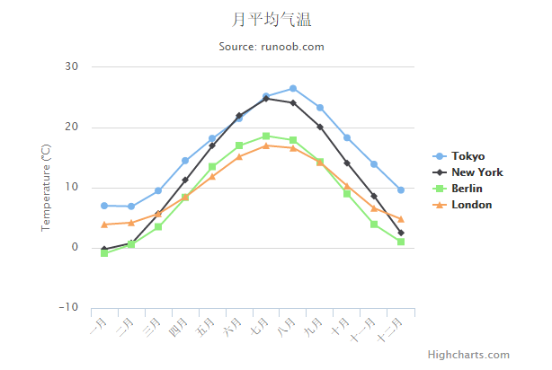
标题
为图表配置标题:
var title = {
text: '月平均气温'
};
副标题
为图表配置副标题:
var subtitle = {
text: 'Source: runoob.com'
};
X 轴
配置要在 X 轴显示的项。
var xAxis = {
categories: ['一月', '二月', '三月', '四月', '五月', '六月'
,'七月', '八月', '九月', '十月', '十一月', '十二月']
};
X 轴
配置要在 Y 轴显示的项。
var yAxis = {
title: {
text: 'Temperature (\xB0C)'
},
plotLines: [{
value: 0,
width: 1,
color: '#808080'
}]
};
提示信息
配置提示信息:
var tooltip = {
valueSuffix: '\xB0C'
}
展示方式
配置图表向右对齐:
var legend = {
layout: 'vertical',
align: 'right',
verticalAlign: 'middle',
borderWidth: 0
};
数据
配置图表要展示的数据。每个系列是个数组,每一项在图片中都会生成一条曲线。
var series = [
{
name: 'Tokyo',
data: [7.0, 6.9, 9.5, 14.5, 18.2, 21.5, 25.2,
26.5, 23.3, 18.3, 13.9, 9.6]
},
{
name: 'New York',
data: [-0.2, 0.8, 5.7, 11.3, 17.0, 22.0, 24.8,
24.1, 20.1, 14.1, 8.6, 2.5]
},
{
name: 'Berlin',
data: [-0.9, 0.6, 3.5, 8.4, 13.5, 17.0, 18.6,
17.9, 14.3, 9.0, 3.9, 1.0]
},
{
name: 'London',
data: [3.9, 4.2, 5.7, 8.5, 11.9, 15.2, 17.0,
16.6, 14.2, 10.3, 6.6, 4.8]
}
];
第三步: 创建 json 数据
组合是由配置信息:
var json = {};
json.title = title;
json.subtitle = subtitle;
json.xAxis = xAxis;
json.yAxis = yAxis;
json.tooltip = tooltip;
json.legend = legend;
json.series = series;
Step 4: Draw the chart
$('#container').highcharts(json);
实例
以下为完整的实例(HighchartsTest.htm):
<html>
<head>
<title>Highcharts Tutorial</title>
<script src="http://apps.bdimg.com/libs/jquery/2.1.4/jquery.min.js"></script>
<script src="/try/demo_source/highcharts.js"></script>
</head>
<body>
<div id="container" style="width: 550px; height: 400px; margin: 0 auto"></div>
<script language="JavaScript">
$(document).ready(function() {
var title = {
text: '月平均气温'
};
var subtitle = {
text: 'Source: runoob.com'
};
var xAxis = {
categories: ['一月', '二月', '三月', '四月', '五月', '六月'
,'七月', '八月', '九月', '十月', '十一月', '十二月']
};
var yAxis = {
title: {
text: 'Temperature (\xB0C)'
},
plotLines: [{
value: 0,
width: 1,
color: '#808080'
}]
};
var tooltip = {
valueSuffix: '\xB0C'
}
var legend = {
layout: 'vertical',
align: 'right',
verticalAlign: 'middle',
borderWidth: 0
};
var series = [
{
name: 'Tokyo',
data: [7.0, 6.9, 9.5, 14.5, 18.2, 21.5, 25.2,
26.5, 23.3, 18.3, 13.9, 9.6]
},
{
name: 'New York',
data: [-0.2, 0.8, 5.7, 11.3, 17.0, 22.0, 24.8,
24.1, 20.1, 14.1, 8.6, 2.5]
},
{
name: 'Berlin',
data: [-0.9, 0.6, 3.5, 8.4, 13.5, 17.0, 18.6,
17.9, 14.3, 9.0, 3.9, 1.0]
},
{
name: 'London',
data: [3.9, 4.2, 5.7, 8.5, 11.9, 15.2, 17.0,
16.6, 14.2, 10.3, 6.6, 4.8]
}
];
var json = {};
json.title = title;
json.subtitle = subtitle;
json.xAxis = xAxis;
json.yAxis = yAxis;
json.tooltip = tooltip;
json.legend = legend;
json.series = series;
$('#container').highcharts(json);
});
</script>
</body>
</html>
以上实例输出结果为:
Highcharts 配置选项详细说明
Highcharts 提供大量的配置选项参数,您可以轻松定制符合用户要求的图表,本章节为大家详细介绍Highcharts 配置选项使用说明:
参数配置(属性+事件)
- chart.events.addSeries:添加数列到图表中。
- chart.events.click:整个图表的绘图区上所发生的点击事件。
- chart.events.load:图表加载事件。
- chart.events.redraw:图表重画事件,当点击图注显示和隐藏绘图时可以触发。
- chart.events.selection:当图表曲线可选择放大时,当选择图表操作时,可以触发该事件。
- chart.height:所绘制图表的高度值。
- chart.inverted:图表中的x,y轴对换。
- chart.polar:是否为极性图表。
- chart.reflow:当窗口大小改变时,图表宽度自适应窗口大小改变。
- chart.renderTo:图表加载的位置,是页面上的一个DOM对象。
- chart.showAxes:在空白图表中,是否显示坐标轴。
- chart.type:图表的类型,默认为line,还有bar/column/pie……
- chart.width:图表绘图区的宽度,默认为自适应。
- chart.zoomType:图表中数据报表的放大类型,可以以X轴放大,或是以Y轴放大,还可以以XY轴同时放大。
- colors:图表中多数列时,各数列之间的颜色。是一个数组,一般不动。
- credits.enabled:是否允许显示版权信息。
- credits.href:版权所有的链接。
- credits.text:版权信息显示文字。
- exporting.buttons.exportButton.enabled:是否允许显示导出按钮。
- exporting.buttons.exportButton.menuItems:导出按钮的菜单选项。
- exporting.buttons.exportButton.onclick:导出按钮被点击的事件,不是内部的菜单。
- exporting.buttons.printButton.enabled:是否允许打印按钮。
- exporting.buttons.printButton.onclick:打印按钮的点击事件。
- exporting.enabled:打印和导出按钮是否被允许。
- exporting.filename:被导出文件的文件名。
- exporting.type:默认导出图片的文件格式。
- exporting.url:SVG图表转换并导出的接口处理地址。
- exporing.width:默认导出图片的宽度。
- labels:标签,可以加载到图表的任何位置,里面有items,style。
- lang:语言参数配置,与导出按钮菜单有关的配置,时间名称的配置等。
- legend.enabled:是否允许图注。
- navigation.buttonOptions.enabled:图表中所有导航中的按钮是否可被点击。
- plotOptions.area.allowPointSelect:是否允许数据点的点击。
- plotOptions.area.color:绘图的颜色。
- plotOptions.area.dataLabels.enabled:是否允许数据标签。
- plotOptions.area.enableMouseTracking:是否允许数据图表中,数据点的鼠标跟踪气泡显示。
- plotOptions.area.events.checkboxClick:数据图表中图注中复选框的点击事件。
- plotOptions.area.events.click:数据图表中,数据点的点击事件。
- plotOptions.area.events.hide:数据图表中,某一数据序列隐藏时的事件。
- plotOptions.area.events.show:数据图表中,某一数据序列显示时的事件。
- plotOptions.area.events.legendItemClick:数据图表中,图注中的项目被点击时的事件,直接赋值false,则不可点击。
- plotOptions.area.events.mouseOut:数据点的鼠标移出事件。
- plotOptions.area.events.mouseOver:数据点的鼠标经过事件。
- plotOptions.area.marker.enabled:图表中绘图中是否显示点的标记符。
- plotOptions.area.marker.states.hover.enabled:是否允许标记符的鼠标经过状态。
- plotOptions.area.marker.states.select.enabled:是否允许标记符的选择状态。
- plotOptions.area.point.events.click:图表中每一个单独的点点击事件。
- plotOptions.area.point.events.mouseOut
- plotOptions.area.point.events..mouseOver
- plotOptions.area.point.events.remove:删除图表中的点时的事件。
- plotOptions.area.point.events.select:图表中点选择事件。
- plotOptions.area.point.events.unselect:图表中点取消选择时的事件。
- plotOptions.area.point.events.update:图表中数据发生更新时的事件。
- plotOptions.area.visible:加载时,数据序列默认是显示还是隐藏。
- plotOptions.area.zIndex:在多序列的情况下,调整每一个序列的层叠顺序。
- 以上的point.events同样还适用于其他面积类图表(arearange、areaspline、areasplinerange),其他的柱状图(bar、column)及所有图表。
- plotOptions.area.showInLegend:是否在图注中显示。
- plotOptions.area.stacking:是以值堆叠,还是以百分比堆叠。
- plotOptions.area.states.hover.enabled:鼠标放上的状态是否允许。
- plotOptions.area.stickyTracking:鼠标粘性跟踪数据点。
- plotOptions.arearange,plotOptions.areaspline,plotOptions.areasplinerange类同于plotOptions.area
- plotOptions.bar.groupPadding:对于柱状图分组,每个分组之间的间隔。
- plotOptions.bar.grouping:是否对数据进行分组。
- plotOptions.bar.minPointLength::定义当point值为零时,点的最小长度为多少
- plotOptions.bar.showInLegend:是否在图注中显示。
- plotOptions.bar.stacking:是以值堆叠,还是以百分比堆叠(normal/percent)。
- plotOptions.column,plotOptions.columnrange类同于plotOptions.bar
- plotOptions.line的相关配置类似于plotOptions.area配置。
- plotOptions.pie.ignoreHiddenPoint:在饼状图中,某一个序列经图注点击隐藏后,整个饼状图是重新以100%分配,还是只在原图基础上隐藏,呈现一个缺口。
- plotOptions.pie.innerSize:绘制饼状图时,饼状图的圆心预留多大的空白。
- plotOptions.pie.slicedOffset:与allowPointSelect结合使用,当点被点击时,对应的扇区剥离,这个参数即配置离开的距离。
- plotOptions.pie的其他常用配置参数类同于plotOptions.area,plotOptions.scatter,plotOptions.series,plotOptions.spline的相关配置类似于plotOptions.area配置。
- series:是一个数组。
- series.data.color:某一个数据的颜色。
- series.data.dataLabels:序列中某一个数据的数据标签。
- series.data.events类同于plotOptions.area.point.events的相关配置。
- series.data.marker类同于plotOptions.area.marker的相关配置。
- series.data.name:配置数据点的名称。
- series.data.sliced:配置在饼图中,扇区的分离距离大小。
- series.data.x:点的x值。
- series.data.y:点的y值。
- series.name:数据序列的名称。
- series.stack:堆叠的分组索引。
- series.type:数据序列的展示类型。
- series.xAxis,series.yAxis:当使用多坐标轴时,指定某个数列对应哪个坐标轴。
- subtitle:配置图表的子标题。
- title:配置图表的标题。
- tooltip:配置图表中数据的气泡提示。
- tooltip.valueDecimals:允许的小数点位数。
- tooltip.percentageDecimals:允许百分比的小数点后位数。
- xAxis,yAxis配置设置坐标轴
- allowDecimals:坐标轴上是否允许小数。
- categories:是一个数组,坐标轴的分类。
- plotLines:绘制主线。
- tickColor:刻度颜色。
- tickInterval:刻度的步进值。
- labels.rotation:刻度标签旋转度数
Chart:图表区选项
Chart图表区选项用于设置图表区相关属性。
参数 | 描述 | 默认值 |
backgroundColor | 设置图表区背景色 | #FFFFFF |
borderWidth | 设置图表边框宽度 | 0 |
borderRadius | 设置图表边框圆角角度 | 5 |
renderTo | 图表放置的容器,一般在html中放置一个DIV,获取DIV的id属性值 | null |
defaultSeriesType | 默认图表类型line, spline, area, areaspline, column, bar, pie , scatter | 0 |
width | 图表宽度,默认根据图表容器自适应宽度 | null |
height | 图表高度,默认根据图表容器自适应高度 | null |
margin | 设置图表与其他元素之间的间距,数组,如[0,0,0,0] | [null] |
plotBackgroundColor | 主图表区背景色,即X轴与Y轴围成的区域的背景色 | null |
plotBorderColor | 主图表区边框的颜色,即X轴与Y轴围成的区域的边框颜色 | null |
plotBorderWidth | 主图表区边框的宽度 | 0 |
shadow | 是否设置阴影,需要设置背景色backgroundColor。 | false |
reflow | 是否自使用图表区域高度和宽度,如果没有设置width和height时,会自适应大小。 | true |
zoomType | 拖动鼠标进行缩放,沿x轴或y轴进行缩放,可以设置为:'x','y','xy' | '' |
events | 事件回调,支持addSeries方法,click方法,load方法,selection方法等的回调函数。 |
Color:颜色选项
Color颜色选项用于设置图表的颜色方案。
参数 | 描述 | 默认值 |
color | 用于展示图表,折线/柱状/饼状等图的颜色,数组形式。 | array |
Highcharts已经默认提供了多种颜色方案,当要显示的图形多于颜色种类时,多出的图形会自动从第一种颜色方案开始选取。自定义颜色方案的方法:
Highcharts.setOptions({
colors: ['#058DC7', '#50B432', '#ED561B', '#DDDF00', '#24CBE5', '#64E572', '#FF9655',
'#FFF263', '#6AF9C4']
});
Title:标题选项
Title标题选项用于设置图表的标题相关属性。
参数 | 描述 | 默认值 |
text | 标题文本内容。 | Chart title |
align | 水平对齐方式。 | center |
verticalAlign | 垂直对齐方式。 | top |
margin | 标题与副标题之间或者主图表区间的间距。 | 15 |
floating | 是否浮动,如果为true,则标题可以偏离主图表区,可配合x,y属性使用。 | false |
style | 设置CSS样式。 | {color: '#3E576F', |
fontSize: '16px'} |
Subtitle:副标题选项
副标题提供的属性选项与标题title大致相同,可参照上述标题选项,值得一提的是副标题的text选项默认为'',即空的,所以默认情况下副标题不显示。
xAxis:X轴选项
X轴选项用于设置图表X轴相关属性。
参数 | 描述 | 默认值 |
categories | 设置X轴分类名称,数组,例如:categories: ['Apples', 'Bananas', 'Oranges'] | [] |
title | X轴名称,支持text、enabled、align、rotation、style等属性 | |
labels | 设置X轴各分类名称的样式style,格式formatter,角度rotation等。 | array |
max | X轴最大值(categories为空时),如果为null,则最大值会根据X轴数据自动匹配一个最大值。 | null |
min | X轴最小值(categories为空时),如果为null,则最小值会根据X轴数据自动匹配一个最小值。 | array |
gridLineColor | 网格(竖线)颜色 | #C0C0C0 |
gridLineWidth | 网格(竖线)宽度 | 1 |
lineColor | 基线颜色 | #C0D0E0 |
lineWidth | 基线宽度 | 0 |
yAxis:Y轴选项
Y轴选项与上述xAxis选项基本一致,请参照上表中的参数设置,不再单独列出。
Series:数据列选项
数据列选项用于设置图表中要展示的数据相关的属性。
参数 | 描述 | 默认值 |
data | 显示在图表中的数据列,可以为数组或者JSON格式的数据。如:data:[0, 5, 3, 5],或data: [{name: 'Point 1',y: 0}, {name: 'Point 2',y: 5}] | '' |
name | 显示数据列的名称。 | '' |
type | 数据列类型,支持 area, areaspline, bar, column, line, pie, scatter or spline | line |
plotOptions:数据点选项
plotOptions用于设置图表中的数据点相关属性。plotOptions根据各种图表类型,其属性设置略微有些差异,现将常用选项列出来。
参数 | 描述 | 默认值 |
enabled | 是否在数据点上直接显示数据 | false |
allowPointSelect | 是否允许使用鼠标选中数据点 | false |
formatter | 回调函数,格式化数据显示内容 | formatter: function() {return this.y;} |
Tooltip:数据点提示框
Tooltip用于设置当鼠标滑向数据点时显示的提示框信息。
参数 | 描述 | 默认值 |
enabled | 是否显示提示框 | true |
backgroundColor | 设置提示框的背景色 | rgba(255, 255, 255, .85) |
borderColor | 提示框边框颜色,默认自动匹配数据列的颜色 | auto |
borderRadius | 提示框圆角度 | 5 |
shadow | 是否显示提示框阴影 | true |
style | 设置提示框内容样式,如字体颜色等 | color:'#333' |
formatter | 回调函数,用于格式化输出提示框的显示内容。返回的内容支持html标签如:<b>, <strong>, <i>, <em>, <br/>, <span> | 2 |
Legend:图例选项
legend用于设置图例相关属性。
参数 | 描述 | 默认值 |
layout | 显示形式,支持水平horizontal和垂直vertical | horizontal |
align | 对齐方式。 | center |
backgroundColor | 图例背景色。 | null |
borderColor | 图例边框颜色。 | #909090 |
borderRadius | 图例边框角度 | 5 |
enabled | 是否显示图例 | true |
floating | 是否可以浮动,配合x,y属性。 | false |
shadow | 是否显示阴影 | false |
style | 设置图例内容样式 | '' |
更多详细信息请参照highcharts官网英文文档:http://api.highcharts.com/highcharts
Highcharts 曲线图
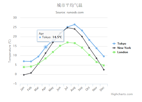
Highcharts 基本曲线图
以下实例是基础曲线图。我们在前面的章节已经了解了 Highcharts 配置语法。接下来让我们来看个完整实例:
实例
文件名:highcharts_line_basic.htm
<html> <head> <title>Highcharts 教程 | 菜鸟教程(runoob.com)</title> <script src="http://apps.bdimg.com/libs/jquery/2.1.4/jquery.min.js"></script> <script src="/try/demo_source/highcharts.js"></script> </head> <body> <div id="container" style="width: 550px; height: 400px; margin: 0 auto"></div> <script language="JavaScript"> $(document).ready(function() { var title = { text: '城市平均气温' }; var subtitle = { text: 'Source: runoob.com' }; var xAxis = { categories: ['Jan', 'Feb', 'Mar', 'Apr', 'May', 'Jun', 'Jul', 'Aug', 'Sep', 'Oct', 'Nov', 'Dec'] }; var yAxis = { title: { text: 'Temperature (\xB0C)' }, plotLines: [{ value: 0, width: 1, color: '#808080' }] }; var tooltip = { valueSuffix: '\xB0C' } var legend = { layout: 'vertical', align: 'right', verticalAlign: 'middle', borderWidth: 0 }; var series = [ { name: 'Tokyo', data: [7.0, 6.9, 9.5, 14.5, 18.2, 21.5, 25.2, 26.5, 23.3, 18.3, 13.9, 9.6] }, { name: 'New York', data: [-0.2, 0.8, 5.7, 11.3, 17.0, 22.0, 24.8, 24.1, 20.1, 14.1, 8.6, 2.5] }, { name: 'London', data: [3.9, 4.2, 5.7, 8.5, 11.9, 15.2, 17.0, 16.6, 14.2, 10.3, 6.6, 4.8] } ]; var json = {}; json.title = title; json.subtitle = subtitle; json.xAxis = xAxis; json.yAxis = yAxis; json.tooltip = tooltip; json.legend = legend; json.series = series; $('#container').highcharts(json); }); </script> </body> </html>
以上实例输出结果为:
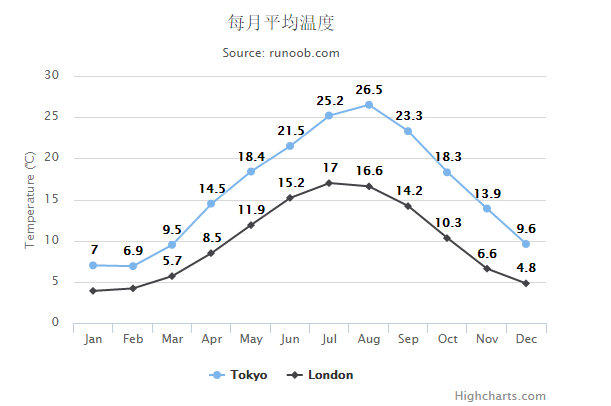
Highcharts 带有数据标签曲线图表
以下实例是带有数据标签曲线图表。我们在前面的章节已经了解了 Highcharts 配置语法。接下来让我们来看个完整实例:
实例
文件名:highcharts_line_labels.htm
<html> <head> <title>Highcharts 教程 | 菜鸟教程(runoob.com)</title> <script src="http://apps.bdimg.com/libs/jquery/2.1.4/jquery.min.js"></script> <script src="/try/demo_source/highcharts.js"></script> </head> <body> <div id="container" style="width: 550px; height: 400px; margin: 0 auto"></div> <script language="JavaScript"> $(document).ready(function() { var title = { text: '每月平均温度' }; var subtitle = { text: 'Source: runoob.com' }; var xAxis = { categories: ['Jan', 'Feb', 'Mar', 'Apr', 'May', 'Jun', 'Jul', 'Aug', 'Sep', 'Oct', 'Nov', 'Dec'] }; var yAxis = { title: { text: 'Temperature (\xB0C)' } }; var plotOptions = { line: { dataLabels: { enabled: true }, enableMouseTracking: false } }; var series= [{ name: 'Tokyo', data: [7.0, 6.9, 9.5, 14.5, 18.4, 21.5, 25.2, 26.5, 23.3, 18.3, 13.9, 9.6] }, { name: 'London', data: [3.9, 4.2, 5.7, 8.5, 11.9, 15.2, 17.0, 16.6, 14.2, 10.3, 6.6, 4.8] } ]; var json = {}; json.title = title; json.subtitle = subtitle; json.xAxis = xAxis; json.yAxis = yAxis; json.series = series; json.plotOptions = plotOptions; $('#container').highcharts(json); }); </script> </body> </html>
以上实例输出结果为:
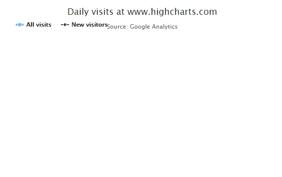
Highcharts 异步加载数据曲线图表
以下实例演示了异步加载数据曲线图表。这边我们通过 jQuery.getJSON() 方法从异步加载 csv 文件:
我们在前面的章节已经了解了 Highcharts 配置语法。接下来让我们来看个完整实例:
导入 data.js 文件
异步加载数据需要引入以下js 文件:
<script src="http://code.highcharts.com/modules/data.js"></script>
配置
X 轴
以每周为间隔设置 X 轴:
var xAxis = { tickInterval: 7 * 24 * 3600 * 1000, // 一周 tickWidth: 0, gridLineWidth: 1, labels: { align: 'left', x: 3, y: -3 } };
Y 轴
以每周为间隔设置 Y 轴:
配置两个 Y 轴:
var yAxis = [{ // 左边 Y 轴 title: { text: null }, labels: { align: 'left', x: 3, y: 16, format: '{value:.,0f}' }, showFirstLabel: false },{ // 右边 Y 轴 linkedTo: 0, gridLineWidth: 0, opposite: true, title: { text: null }, labels: { align: 'right', x: -3, y: 16, format: '{value:.,0f}' }, showFirstLabel: false } ];
plotOptions
plotOptions用于设置图表中的数据点相关属性。
var plotOptions = { series: { cursor: 'pointer', point: { events: { click: function (e) { hs.htmlExpand(null, { pageOrigin: { x: e.pageX || e.clientX, y: e.pageY || e.clientY }, headingText: this.series.name, maincontentText: Highcharts.dateFormat('%A, %b %e, %Y', this.x) + ':<br/> ' + this.y + ' visits', width: 200 }); } } }, marker: { lineWidth: 1 } } }
实例
文件名:highcharts_line_ajax.html
<html> <head> <title>Highcharts Tutorial</title> <title>Highcharts 教程 | 菜鸟教程(runoob.com)</title> <script src="http://apps.bdimg.com/libs/jquery/2.1.4/jquery.min.js"></script> <script src="/try/demo_source/highcharts.js"></script> <script src="http://code.highcharts.com/highcharts-more.js"></script> <script src="http://code.highcharts.com/modules/data.js"></script> </head> <body> <div id="container" style="width: 550px; height: 400px; margin: 0 auto"></div> <script language="JavaScript"> $(document).ready(function() { var title = { text: 'Daily visits at www.highcharts.com' }; var subtitle = { text: 'Source: Google Analytics' }; var xAxis = { tickInterval: 7 * 24 * 3600 * 1000, // 一周 tickWidth: 0, gridLineWidth: 1, labels: { align: 'left', x: 3, y: -3 } }; var yAxis = [{ // 左边 y 轴 title: { text: null }, labels: { align: 'left', x: 3, y: 16, format: '{value:.,0f}' }, showFirstLabel: false },{ // 右边 y 轴 linkedTo: 0, gridLineWidth: 0, opposite: true, title: { text: null }, labels: { align: 'right', x: -3, y: 16, format: '{value:.,0f}' }, showFirstLabel: false } ]; var tooltip = { shared: true, crosshairs: true } var legend = { align: 'left', verticalAlign: 'top', y: 20, floating: true, borderWidth: 0 }; var plotOptions = { series: { cursor: 'pointer', point: { events: { click: function (e) { hs.htmlExpand(null, { pageOrigin: { x: e.pageX || e.clientX, y: e.pageY || e.clientY }, headingText: this.series.name, maincontentText: Highcharts.dateFormat('%A, %b %e, %Y', this.x) + ':<br/> ' + this.y + ' visits', width: 200 }); } } }, marker: { lineWidth: 1 } } } var series = [{ name: 'All visits', lineWidth: 4, marker: { radius: 4 } }, { name: 'New visitors' }] var json = {}; json.title = title; json.subtitle = subtitle; json.xAxis = xAxis; json.yAxis = yAxis; json.tooltip = tooltip; json.legend = legend; json.series = series; json.plotOptions = plotOptions; $.getJSON('http://www.highcharts.com/samples/data/jsonp.php?filename=analytics.csv&callback=?', function (csv) { var data = { csv: csv }; json.data = data; $('#container').highcharts(json); }); }); </script> </body> </html>
以上实例输出结果为:
Highcharts 时间序列,可缩放的图表
以下实例演示了基于时间的曲线图表。
我们在前面的章节已经了解了 Highcharts 配置语法。接下来让我们来看个完整实例:
配置
图表
配置可缩放图表。 chart.zoomType 指定了用户可以拖放的尺寸,用户可以通过拖动鼠标来放大,可能值是x,y或xy:
var chart = { zoomType: 'x' };
plotOptions
使用 plotOptions 配置图表区域:
配置两个 Y 轴:
var plotOptions = { area: { fillColor: { linearGradient: { x1: 0, y1: 0, x2: 0, y2: 1}, stops: [ [0, Highcharts.getOptions().colors[0]], [1, Highcharts.Color(Highcharts.getOptions().colors[0]).setOpacity(0).get('rgba')] ] }, marker: { radius: 2 }, lineWidth: 1, states: { hover: { lineWidth: 1 } }, threshold: null } };
plotOptions
plotOptions用于设置图表中的数据点相关属性。
var plotOptions = { series: { cursor: 'pointer', point: { events: { click: function (e) { hs.htmlExpand(null, { pageOrigin: { x: e.pageX || e.clientX, y: e.pageY || e.clientY }, headingText: this.series.name, maincontentText: Highcharts.dateFormat('%A, %b %e, %Y', this.x) + ':<br/> ' + this.y + ' visits', width: 200 }); } } }, marker: { lineWidth: 1 } } }
实例
文件名:highcharts_line_time.htm
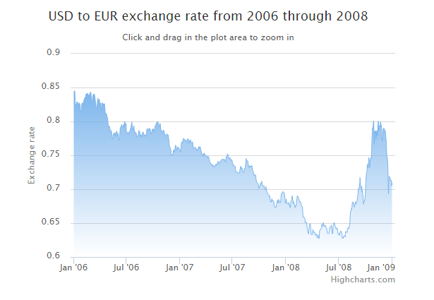
<html> <head> <title>Highcharts 教程 | 菜鸟教程(runoob.com)</title> <script src="http://apps.bdimg.com/libs/jquery/2.1.4/jquery.min.js"></script> <script src="/try/demo_source/highcharts.js"></script> </head> <body> <div id="container" style="width: 550px; height: 400px; margin: 0 auto"></div> <script language="JavaScript"> $(document).ready(function() { var chart = { zoomType: 'x' }; var title = { text: 'USD to EUR exchange rate from 2006 through 2008' }; var subtitle = { text: document.ontouchstart === undefined ? 'Click and drag in the plot area to zoom in' : 'Pinch the chart to zoom in' }; var xAxis = { type: 'datetime', minRange: 14 * 24 * 3600000 // 14 天 }; var yAxis = { title: { text: 'Exchange rate' } }; var legend = { enabled: false }; var plotOptions = { area: { fillColor: { linearGradient: { x1: 0, y1: 0, x2: 0, y2: 1}, stops: [ [0, Highcharts.getOptions().colors[0]], [1, Highcharts.Color(Highcharts.getOptions().colors[0]).setOpacity(0).get('rgba')] ] }, marker: { radius: 2 }, lineWidth: 1, states: { hover: { lineWidth: 1 } }, threshold: null } }; var series= [{ type: 'area', name: 'USD to EUR', pointInterval: 24 * 3600 * 1000, pointStart: Date.UTC(2006, 0, 1), data: [ 0.8446, 0.8445, 0.8444, 0.8451, 0.8418, 0.8264, 0.8258, 0.8232, 0.8233, 0.8258, 0.8283, 0.8278, 0.8256, 0.8292, 0.8239, 0.8239, 0.8245, 0.8265, 0.8261, 0.8269, 0.8273, 0.8244, 0.8244, 0.8172, 0.8139, 0.8146, 0.8164, 0.82, 0.8269, 0.8269, 0.8269, 0.8258, 0.8247, 0.8286, 0.8289, 0.8316, 0.832, 0.8333, 0.8352, 0.8357, 0.8355, 0.8354, 0.8403, 0.8403, 0.8406, 0.8403, 0.8396, 0.8418, 0.8409, 0.8384, 0.8386, 0.8372, 0.839, 0.84, 0.8389, 0.84, 0.8423, 0.8423, 0.8435, 0.8422, 0.838, 0.8373, 0.8316, 0.8303, 0.8303, 0.8302, 0.8369, 0.84, 0.8385, 0.84, 0.8401, 0.8402, 0.8381, 0.8351, 0.8314, 0.8273, 0.8213, 0.8207, 0.8207, 0.8215, 0.8242, 0.8273, 0.8301, 0.8346, 0.8312, 0.8312, 0.8312, 0.8306, 0.8327, 0.8282, 0.824, 0.8255, 0.8256, 0.8273, 0.8209, 0.8151, 0.8149, 0.8213, 0.8273, 0.8273, 0.8261, 0.8252, 0.824, 0.8262, 0.8258, 0.8261, 0.826, 0.8199, 0.8153, 0.8097, 0.8101, 0.8119, 0.8107, 0.8105, 0.8084, 0.8069, 0.8047, 0.8023, 0.7965, 0.7919, 0.7921, 0.7922, 0.7934, 0.7918, 0.7915, 0.787, 0.7861, 0.7861, 0.7853, 0.7867, 0.7827, 0.7834, 0.7766, 0.7751, 0.7739, 0.7767, 0.7802, 0.7788, 0.7828, 0.7816, 0.7829, 0.783, 0.7829, 0.7781, 0.7811, 0.7831, 0.7826, 0.7855, 0.7855, 0.7845, 0.7798, 0.7777, 0.7822, 0.7785, 0.7744, 0.7743, 0.7726, 0.7766, 0.7806, 0.785, 0.7907, 0.7912, 0.7913, 0.7931, 0.7952, 0.7951, 0.7928, 0.791, 0.7913, 0.7912, 0.7941, 0.7953, 0.7921, 0.7919, 0.7968, 0.7999, 0.7999, 0.7974, 0.7942, 0.796, 0.7969, 0.7862, 0.7821, 0.7821, 0.7821, 0.7811, 0.7833, 0.7849, 0.7819, 0.7809, 0.7809, 0.7827, 0.7848, 0.785, 0.7873, 0.7894, 0.7907, 0.7909, 0.7947, 0.7987, 0.799, 0.7927, 0.79, 0.7878, 0.7878, 0.7907, 0.7922, 0.7937, 0.786, 0.787, 0.7838, 0.7838, 0.7837, 0.7836, 0.7806, 0.7825, 0.7798, 0.777, 0.777, 0.7772, 0.7793, 0.7788, 0.7785, 0.7832, 0.7865, 0.7865, 0.7853, 0.7847, 0.7809, 0.778, 0.7799, 0.78, 0.7801, 0.7765, 0.7785, 0.7811, 0.782, 0.7835, 0.7845, 0.7844, 0.782, 0.7811, 0.7795, 0.7794, 0.7806, 0.7794, 0.7794, 0.7778, 0.7793, 0.7808, 0.7824, 0.787, 0.7894, 0.7893, 0.7882, 0.7871, 0.7882, 0.7871, 0.7878, 0.79, 0.7901, 0.7898, 0.7879, 0.7886, 0.7858, 0.7814, 0.7825, 0.7826, 0.7826, 0.786, 0.7878, 0.7868, 0.7883, 0.7893, 0.7892, 0.7876, 0.785, 0.787, 0.7873, 0.7901, 0.7936, 0.7939, 0.7938, 0.7956, 0.7975, 0.7978, 0.7972, 0.7995, 0.7995, 0.7994, 0.7976, 0.7977, 0.796, 0.7922, 0.7928, 0.7929, 0.7948, 0.797, 0.7953, 0.7907, 0.7872, 0.7852, 0.7852, 0.786, 0.7862, 0.7836, 0.7837, 0.784, 0.7867, 0.7867, 0.7869, 0.7837, 0.7827, 0.7825, 0.7779, 0.7791, 0.779, 0.7787, 0.78, 0.7807, 0.7803, 0.7817, 0.7799, 0.7799, 0.7795, 0.7801, 0.7765, 0.7725, 0.7683, 0.7641, 0.7639, 0.7616, 0.7608, 0.759, 0.7582, 0.7539, 0.75, 0.75, 0.7507, 0.7505, 0.7516, 0.7522, 0.7531, 0.7577, 0.7577, 0.7582, 0.755, 0.7542, 0.7576, 0.7616, 0.7648, 0.7648, 0.7641, 0.7614, 0.757, 0.7587, 0.7588, 0.762, 0.762, 0.7617, 0.7618, 0.7615, 0.7612, 0.7596, 0.758, 0.758, 0.758, 0.7547, 0.7549, 0.7613, 0.7655, 0.7693, 0.7694, 0.7688, 0.7678, 0.7708, 0.7727, 0.7749, 0.7741, 0.7741, 0.7732, 0.7727, 0.7737, 0.7724, 0.7712, 0.772, 0.7721, 0.7717, 0.7704, 0.769, 0.7711, 0.774, 0.7745, 0.7745, 0.774, 0.7716, 0.7713, 0.7678, 0.7688, 0.7718, 0.7718, 0.7728, 0.7729, 0.7698, 0.7685, 0.7681, 0.769, 0.769, 0.7698, 0.7699, 0.7651, 0.7613, 0.7616, 0.7614, 0.7614, 0.7607, 0.7602, 0.7611, 0.7622, 0.7615, 0.7598, 0.7598, 0.7592, 0.7573, 0.7566, 0.7567, 0.7591, 0.7582, 0.7585, 0.7613, 0.7631, 0.7615, 0.76, 0.7613, 0.7627, 0.7627, 0.7608, 0.7583, 0.7575, 0.7562, 0.752, 0.7512, 0.7512, 0.7517, 0.752, 0.7511, 0.748, 0.7509, 0.7531, 0.7531, 0.7527, 0.7498, 0.7493, 0.7504, 0.75, 0.7491, 0.7491, 0.7485, 0.7484, 0.7492, 0.7471, 0.7459, 0.7477, 0.7477, 0.7483, 0.7458, 0.7448, 0.743, 0.7399, 0.7395, 0.7395, 0.7378, 0.7382, 0.7362, 0.7355, 0.7348, 0.7361, 0.7361, 0.7365, 0.7362, 0.7331, 0.7339, 0.7344, 0.7327, 0.7327, 0.7336, 0.7333, 0.7359, 0.7359, 0.7372, 0.736, 0.736, 0.735, 0.7365, 0.7384, 0.7395, 0.7413, 0.7397, 0.7396, 0.7385, 0.7378, 0.7366, 0.74, 0.7411, 0.7406, 0.7405, 0.7414, 0.7431, 0.7431, 0.7438, 0.7443, 0.7443, 0.7443, 0.7434, 0.7429, 0.7442, 0.744, 0.7439, 0.7437, 0.7437, 0.7429, 0.7403, 0.7399, 0.7418, 0.7468, 0.748, 0.748, 0.749, 0.7494, 0.7522, 0.7515, 0.7502, 0.7472, 0.7472, 0.7462, 0.7455, 0.7449, 0.7467, 0.7458, 0.7427, 0.7427, 0.743, 0.7429, 0.744, 0.743, 0.7422, 0.7388, 0.7388, 0.7369, 0.7345, 0.7345, 0.7345, 0.7352, 0.7341, 0.7341, 0.734, 0.7324, 0.7272, 0.7264, 0.7255, 0.7258, 0.7258, 0.7256, 0.7257, 0.7247, 0.7243, 0.7244, 0.7235, 0.7235, 0.7235, 0.7235, 0.7262, 0.7288, 0.7301, 0.7337, 0.7337, 0.7324, 0.7297, 0.7317, 0.7315, 0.7288, 0.7263, 0.7263, 0.7242, 0.7253, 0.7264, 0.727, 0.7312, 0.7305, 0.7305, 0.7318, 0.7358, 0.7409, 0.7454, 0.7437, 0.7424, 0.7424, 0.7415, 0.7419, 0.7414, 0.7377, 0.7355, 0.7315, 0.7315, 0.732, 0.7332, 0.7346, 0.7328, 0.7323, 0.734, 0.734, 0.7336, 0.7351, 0.7346, 0.7321, 0.7294, 0.7266, 0.7266, 0.7254, 0.7242, 0.7213, 0.7197, 0.7209, 0.721, 0.721, 0.721, 0.7209, 0.7159, 0.7133, 0.7105, 0.7099, 0.7099, 0.7093, 0.7093, 0.7076, 0.707, 0.7049, 0.7012, 0.7011, 0.7019, 0.7046, 0.7063, 0.7089, 0.7077, 0.7077, 0.7077, 0.7091, 0.7118, 0.7079, 0.7053, 0.705, 0.7055, 0.7055, 0.7045, 0.7051, 0.7051, 0.7017, 0.7, 0.6995, 0.6994, 0.7014, 0.7036, 0.7021, 0.7002, 0.6967, 0.695, 0.695, 0.6939, 0.694, 0.6922, 0.6919, 0.6914, 0.6894, 0.6891, 0.6904, 0.689, 0.6834, 0.6823, 0.6807, 0.6815, 0.6815, 0.6847, 0.6859, 0.6822, 0.6827, 0.6837, 0.6823, 0.6822, 0.6822, 0.6792, 0.6746, 0.6735, 0.6731, 0.6742, 0.6744, 0.6739, 0.6731, 0.6761, 0.6761, 0.6785, 0.6818, 0.6836, 0.6823, 0.6805, 0.6793, 0.6849, 0.6833, 0.6825, 0.6825, 0.6816, 0.6799, 0.6813, 0.6809, 0.6868, 0.6933, 0.6933, 0.6945, 0.6944, 0.6946, 0.6964, 0.6965, 0.6956, 0.6956, 0.695, 0.6948, 0.6928, 0.6887, 0.6824, 0.6794, 0.6794, 0.6803, 0.6855, 0.6824, 0.6791, 0.6783, 0.6785, 0.6785, 0.6797, 0.68, 0.6803, 0.6805, 0.676, 0.677, 0.677, 0.6736, 0.6726, 0.6764, 0.6821, 0.6831, 0.6842, 0.6842, 0.6887, 0.6903, 0.6848, 0.6824, 0.6788, 0.6814, 0.6814, 0.6797, 0.6769, 0.6765, 0.6733, 0.6729, 0.6758, 0.6758, 0.675, 0.678, 0.6833, 0.6856, 0.6903, 0.6896, 0.6896, 0.6882, 0.6879, 0.6862, 0.6852, 0.6823, 0.6813, 0.6813, 0.6822, 0.6802, 0.6802, 0.6784, 0.6748, 0.6747, 0.6747, 0.6748, 0.6733, 0.665, 0.6611, 0.6583, 0.659, 0.659, 0.6581, 0.6578, 0.6574, 0.6532, 0.6502, 0.6514, 0.6514, 0.6507, 0.651, 0.6489, 0.6424, 0.6406, 0.6382, 0.6382, 0.6341, 0.6344, 0.6378, 0.6439, 0.6478, 0.6481, 0.6481, 0.6494, 0.6438, 0.6377, 0.6329, 0.6336, 0.6333, 0.6333, 0.633, 0.6371, 0.6403, 0.6396, 0.6364, 0.6356, 0.6356, 0.6368, 0.6357, 0.6354, 0.632, 0.6332, 0.6328, 0.6331, 0.6342, 0.6321, 0.6302, 0.6278, 0.6308, 0.6324, 0.6324, 0.6307, 0.6277, 0.6269, 0.6335, 0.6392, 0.64, 0.6401, 0.6396, 0.6407, 0.6423, 0.6429, 0.6472, 0.6485, 0.6486, 0.6467, 0.6444, 0.6467, 0.6509, 0.6478, 0.6461, 0.6461, 0.6468, 0.6449, 0.647, 0.6461, 0.6452, 0.6422, 0.6422, 0.6425, 0.6414, 0.6366, 0.6346, 0.635, 0.6346, 0.6346, 0.6343, 0.6346, 0.6379, 0.6416, 0.6442, 0.6431, 0.6431, 0.6435, 0.644, 0.6473, 0.6469, 0.6386, 0.6356, 0.634, 0.6346, 0.643, 0.6452, 0.6467, 0.6506, 0.6504, 0.6503, 0.6481, 0.6451, 0.645, 0.6441, 0.6414, 0.6409, 0.6409, 0.6428, 0.6431, 0.6418, 0.6371, 0.6349, 0.6333, 0.6334, 0.6338, 0.6342, 0.632, 0.6318, 0.637, 0.6368, 0.6368, 0.6383, 0.6371, 0.6371, 0.6355, 0.632, 0.6277, 0.6276, 0.6291, 0.6274, 0.6293, 0.6311, 0.631, 0.6312, 0.6312, 0.6304, 0.6294, 0.6348, 0.6378, 0.6368, 0.6368, 0.6368, 0.636, 0.637, 0.6418, 0.6411, 0.6435, 0.6427, 0.6427, 0.6419, 0.6446, 0.6468, 0.6487, 0.6594, 0.6666, 0.6666, 0.6678, 0.6712, 0.6705, 0.6718, 0.6784, 0.6811, 0.6811, 0.6794, 0.6804, 0.6781, 0.6756, 0.6735, 0.6763, 0.6762, 0.6777, 0.6815, 0.6802, 0.678, 0.6796, 0.6817, 0.6817, 0.6832, 0.6877, 0.6912, 0.6914, 0.7009, 0.7012, 0.701, 0.7005, 0.7076, 0.7087, 0.717, 0.7105, 0.7031, 0.7029, 0.7006, 0.7035, 0.7045, 0.6956, 0.6988, 0.6915, 0.6914, 0.6859, 0.6778, 0.6815, 0.6815, 0.6843, 0.6846, 0.6846, 0.6923, 0.6997, 0.7098, 0.7188, 0.7232, 0.7262, 0.7266, 0.7359, 0.7368, 0.7337, 0.7317, 0.7387, 0.7467, 0.7461, 0.7366, 0.7319, 0.7361, 0.7437, 0.7432, 0.7461, 0.7461, 0.7454, 0.7549, 0.7742, 0.7801, 0.7903, 0.7876, 0.7928, 0.7991, 0.8007, 0.7823, 0.7661, 0.785, 0.7863, 0.7862, 0.7821, 0.7858, 0.7731, 0.7779, 0.7844, 0.7866, 0.7864, 0.7788, 0.7875, 0.7971, 0.8004, 0.7857, 0.7932, 0.7938, 0.7927, 0.7918, 0.7919, 0.7989, 0.7988, 0.7949, 0.7948, 0.7882, 0.7745, 0.771, 0.775, 0.7791, 0.7882, 0.7882, 0.7899, 0.7905, 0.7889, 0.7879, 0.7855, 0.7866, 0.7865, 0.7795, 0.7758, 0.7717, 0.761, 0.7497, 0.7471, 0.7473, 0.7407, 0.7288, 0.7074, 0.6927, 0.7083, 0.7191, 0.719, 0.7153, 0.7156, 0.7158, 0.714, 0.7119, 0.7129, 0.7129, 0.7049, 0.7095 ] } ]; var json = {}; json.chart = chart; json.title = title; json.subtitle = subtitle; json.legend = legend; json.xAxis = xAxis; json.yAxis = yAxis; json.series = series; json.plotOptions = plotOptions; $('#container').highcharts(json); }); </script> </body> </html>
以上实例输出结果为:
Highcharts X 轴翻转曲线图
以下实例演示了 X 轴翻转曲线图。
我们在前面的章节已经了解了 Highcharts 配置语法。接下来让我们来看个完整实例:
配置
配置图表类型 type 为 spline。chart.type 默认为 "line"。
配置 X 轴翻转。inverted 设置为 true 即 X 轴翻转,默认为 false。
chart var chart = { type: 'spline', inverted: true };
实例
文件名:highcharts_spline_inverted.htm
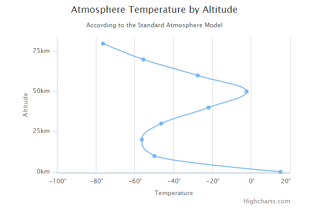
<html> <head> <title>Highcharts 教程 | 菜鸟教程(runoob.com)</title> <script src="http://apps.bdimg.com/libs/jquery/2.1.4/jquery.min.js"></script> <script src="/try/demo_source/highcharts.js"></script> </head> <body> <div id="container" style="width: 550px; height: 400px; margin: 0 auto"></div> <script language="JavaScript"> $(document).ready(function() { var chart = { type: 'spline', inverted: true }; var title = { text: 'Atmosphere Temperature by Altitude' }; var subtitle = { text: 'According to the Standard Atmosphere Model' }; var xAxis = { reversed: false, title: { enabled: true, text: 'Altitude' }, labels: { formatter: function () { return this.value + 'km'; } }, maxPadding: 0.05, showLastLabel: true }; var yAxis = { title: { text: 'Temperature' }, labels: { formatter: function () { return this.value + '\xB0'; } }, lineWidth: 2 }; var legend = { enabled: false }; var tooltip = { headerFormat: '<b>{series.name}</b><br/>', pointFormat: '{point.x} km: {point.y}\xB0C' }; var plotOptions = { spline: { marker: { enable: false } } }; var series= [{ name: 'Temperature', data: [[0, 15], [10, -50], [20, -56.5], [30, -46.5], [40, -22.1], [50, -2.5], [60, -27.7], [70, -55.7], [80, -76.5]] }]; var json = {}; json.chart = chart; json.title = title; json.subtitle = subtitle; json.legend = legend; json.tooltip = tooltip; json.xAxis = xAxis; json.yAxis = yAxis; json.series = series; json.plotOptions = plotOptions; $('#container').highcharts(json); }); </script> </body> </html>
以上实例输出结果为:
Highcharts 带标记曲线图
以下实例演示了 带标记曲线图。
我们在前面的章节已经了解了 Highcharts 配置语法。接下来让我们来看下如何配置。
配置
我们使用 marker.symbol 属性来配置标记。标记可以是 'square', 'diamond' 或 图片 url。标记可以添加在任何的数据点上:
var series= [{ name: 'Tokyo', marker: { symbol: 'square' }, data: [7.0, 6.9, 9.5, 14.5, 18.2, 21.5, 25.2, { y: 26.5, marker: { symbol: 'url(http://www.highcharts.com/demo/gfx/sun.png)' } }, 23.3, 18.3, 13.9, 9.6] }, { name: 'London', marker: { symbol: 'diamond' }, data: [{ y: 3.9, marker: { symbol: 'url(http://www.highcharts.com/demo/gfx/snow.png)' } }, 4.2, 5.7, 8.5, 11.9, 15.2, 17.0, 16.6, 14.2, 10.3, 6.6, 4.8] } ];
实例
文件名:highcharts_spline_symbols.htm
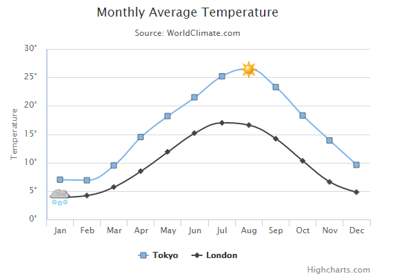
<html> <head> <title>Highcharts 教程 | 菜鸟教程(runoob.com)</title> <script src="http://apps.bdimg.com/libs/jquery/2.1.4/jquery.min.js"></script> <script src="/try/demo_source/highcharts.js"></script> </head> <body> <div id="container" style="width: 550px; height: 400px; margin: 0 auto"></div> <script language="JavaScript"> $(document).ready(function() { var chart = { type: 'spline' }; var title = { text: 'Monthly Average Temperature' }; var subtitle = { text: 'Source: WorldClimate.com' }; var xAxis = { categories: ['Jan', 'Feb', 'Mar', 'Apr', 'May', 'Jun', 'Jul', 'Aug', 'Sep', 'Oct', 'Nov', 'Dec'] }; var yAxis = { title: { text: 'Temperature' }, labels: { formatter: function () { return this.value + '\xB0'; } }, lineWidth: 2 }; var tooltip = { crosshairs: true, shared: true }; var plotOptions = { spline: { marker: { radius: 4, lineColor: '#666666', lineWidth: 1 } } }; var series= [{ name: 'Tokyo', marker: { symbol: 'square' }, data: [7.0, 6.9, 9.5, 14.5, 18.2, 21.5, 25.2, { y: 26.5, marker: { symbol: 'url(http://www.highcharts.com/demo/gfx/sun.png)' } }, 23.3, 18.3, 13.9, 9.6] }, { name: 'London', marker: { symbol: 'diamond' }, data: [{ y: 3.9, marker: { symbol: 'url(http://www.highcharts.com/demo/gfx/snow.png)' } }, 4.2, 5.7, 8.5, 11.9, 15.2, 17.0, 16.6, 14.2, 10.3, 6.6, 4.8] } ]; var json = {}; json.chart = chart; json.title = title; json.subtitle = subtitle; json.tooltip = tooltip; json.xAxis = xAxis; json.yAxis = yAxis; json.series = series; json.plotOptions = plotOptions; $('#container').highcharts(json); }); </script> </body> </html>
以上实例输出结果为:
Highcharts 标示区曲线图
以下实例演示了标示区曲线图。
我们在前面的章节已经了解了 Highcharts 配置语法。接下来让我们来看下如何配置。
配置
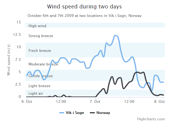
使用 yAxis.plotBands 属性来配置标示区。区间范围使用 'from' 和 'to' 属性。颜色设置使用 'color' 属性。标签样式使用 'label' 属性。
配置信息:
var yAxis = { title: { text: 'Wind speed (m/s)' }, min: 0, minorGridLineWidth: 0, gridLineWidth: 0, alternateGridColor: null, plotBands: [{ // Light air from: 0.3, to: 1.5, color: 'rgba(68, 170, 213, 0.1)', label: { text: 'Light air', style: { color: '#606060' } } }, { // Light breeze from: 1.5, to: 3.3, color: 'rgba(0, 0, 0, 0)', label: { text: 'Light breeze', style: { color: '#606060' } } }, { // Gentle breeze from: 3.3, to: 5.5, color: 'rgba(68, 170, 213, 0.1)', label: { text: 'Gentle breeze', style: { color: '#606060' } } }, { // Moderate breeze from: 5.5, to: 8, color: 'rgba(0, 0, 0, 0)', label: { text: 'Moderate breeze', style: { color: '#606060' } } }, { // Fresh breeze from: 8, to: 11, color: 'rgba(68, 170, 213, 0.1)', label: { text: 'Fresh breeze', style: { color: '#606060' } } }, { // Strong breeze from: 11, to: 14, color: 'rgba(0, 0, 0, 0)', label: { text: 'Strong breeze', style: { color: '#606060' } } }, { // High wind from: 14, to: 15, color: 'rgba(68, 170, 213, 0.1)', label: { text: 'High wind', style: { color: '#606060' } } }] };
实例
文件名:highcharts_spline_bands.htm
<html> <head> <title>Highcharts 教程 | 菜鸟教程(runoob.com)</title> <script src="http://apps.bdimg.com/libs/jquery/2.1.4/jquery.min.js"></script> <script src="/try/demo_source/highcharts.js"></script> </head> <body> <div id="container" style="width: 550px; height: 400px; margin: 0 auto"></div> <script language="JavaScript"> $(document).ready(function() { var chart = { type: 'spline' }; var title = { text: 'Wind speed during two days' }; var subtitle = { text: 'October 6th and 7th 2009 at two locations in Vik i Sogn, Norway' }; var xAxis = { type: 'datetime', labels: { overflow: 'justify' } }; var yAxis = { title: { text: 'Wind speed (m/s)' }, min: 0, minorGridLineWidth: 0, gridLineWidth: 0, alternateGridColor: null, plotBands: [{ // Light air from: 0.3, to: 1.5, color: 'rgba(68, 170, 213, 0.1)', label: { text: 'Light air', style: { color: '#606060' } } }, { // Light breeze from: 1.5, to: 3.3, color: 'rgba(0, 0, 0, 0)', label: { text: 'Light breeze', style: { color: '#606060' } } }, { // Gentle breeze from: 3.3, to: 5.5, color: 'rgba(68, 170, 213, 0.1)', label: { text: 'Gentle breeze', style: { color: '#606060' } } }, { // Moderate breeze from: 5.5, to: 8, color: 'rgba(0, 0, 0, 0)', label: { text: 'Moderate breeze', style: { color: '#606060' } } }, { // Fresh breeze from: 8, to: 11, color: 'rgba(68, 170, 213, 0.1)', label: { text: 'Fresh breeze', style: { color: '#606060' } } }, { // Strong breeze from: 11, to: 14, color: 'rgba(0, 0, 0, 0)', label: { text: 'Strong breeze', style: { color: '#606060' } } }, { // High wind from: 14, to: 15, color: 'rgba(68, 170, 213, 0.1)', label: { text: 'High wind', style: { color: '#606060' } } }] }; var tooltip = { valueSuffix: ' m/s' }; var plotOptions = { spline: { lineWidth: 4, states: { hover: { lineWidth: 5 } }, marker: { enabled: false }, pointInterval: 3600000, // one hour pointStart: Date.UTC(2009, 9, 6, 0, 0, 0) } }; var series= [{ name: 'Vik i Sogn', data: [4.3, 5.1, 4.3, 5.2, 5.4, 4.7, 3.5, 4.1, 5.6, 7.4, 6.9, 7.1, 7.9, 7.9, 7.5, 6.7, 7.7, 7.7, 7.4, 7.0, 7.1, 5.8, 5.9, 7.4, 8.2, 8.5, 9.4, 8.1, 10.9, 10.4, 10.9, 12.4, 12.1, 9.5, 7.5, 7.1, 7.5, 8.1, 6.8, 3.4, 2.1, 1.9, 2.8, 2.9, 1.3, 4.4, 4.2, 3.0, 3.0] }, { name: 'Norway', data: [0.0, 0.0, 0.0, 0.0, 0.0, 0.0, 0.0, 0.0, 0.1, 0.0, 0.3, 0.0, 0.0, 0.4, 0.0, 0.1, 0.0, 0.0, 0.0, 0.0, 0.0, 0.0, 0.0, 0.0, 0.0, 0.6, 1.2, 1.7, 0.7, 2.9, 4.1, 2.6, 3.7, 3.9, 1.7, 2.3, 3.0, 3.3, 4.8, 5.0, 4.8, 5.0, 3.2, 2.0, 0.9, 0.4, 0.3, 0.5, 0.4] }]; var navigation = { menuItemStyle: { fontSize: '10px' } } var json = {}; json.chart = chart; json.title = title; json.subtitle = subtitle; json.tooltip = tooltip; json.xAxis = xAxis; json.yAxis = yAxis; json.series = series; json.plotOptions = plotOptions; json.navigation = navigation; $('#container').highcharts(json); }); </script> </body> </html>
以上实例输出结果为:
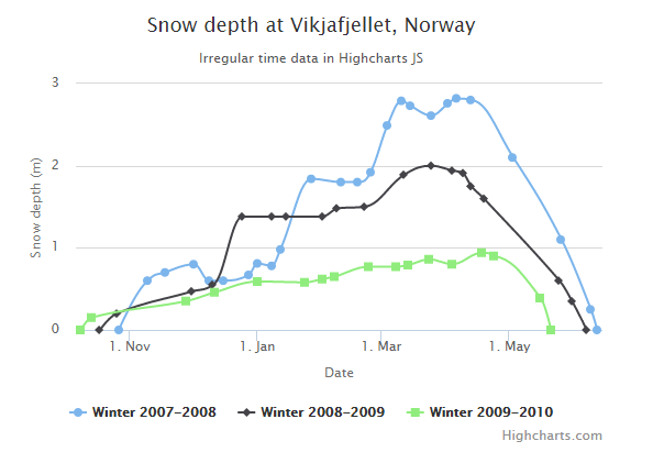
Highcharts 时间间隔图表
以下实例演示了时间间隔图表。
我们在前面的章节已经了解了 Highcharts 配置语法。接下来让我们来看下如何配置。
实例
文件名:highcharts_spline_time.htm
<html> <head> <title>Highcharts 教程 | 菜鸟教程(runoob.com)</title> <script src="http://apps.bdimg.com/libs/jquery/2.1.4/jquery.min.js"></script> <script src="/try/demo_source/highcharts.js"></script> </head> <body> <div id="container" style="width: 550px; height: 400px; margin: 0 auto"></div> <script language="JavaScript"> $(document).ready(function() { var chart = { type: 'spline' }; var title = { text: 'Snow depth at Vikjafjellet, Norway' }; var subtitle = { text: 'Irregular time data in Highcharts JS' }; var xAxis = { type: 'datetime', dateTimeLabelFormats: { // don't display the dummy year month: '%e. %b', year: '%b' }, title: { text: 'Date' } }; var yAxis = { title: { text: 'Snow depth (m)' }, min: 0 }; var tooltip = { headerFormat: '<b>{series.name}</b><br>', pointFormat: '{point.x:%e. %b}: {point.y:.2f} m' }; var plotOptions = { spline: { marker: { enabled: true } } }; var series= [{ name: 'Winter 2007-2008', // Define the data points. All series have a dummy year // of 1970/71 in order to be compared on the same x axis. Note // that in JavaScript, months start at 0 for January, 1 for February etc. data: [ [Date.UTC(1970, 9, 27), 0 ], [Date.UTC(1970, 10, 10), 0.6 ], [Date.UTC(1970, 10, 18), 0.7 ], [Date.UTC(1970, 11, 2), 0.8 ], [Date.UTC(1970, 11, 9), 0.6 ], [Date.UTC(1970, 11, 16), 0.6 ], [Date.UTC(1970, 11, 28), 0.67], [Date.UTC(1971, 0, 1), 0.81], [Date.UTC(1971, 0, 8), 0.78], [Date.UTC(1971, 0, 12), 0.98], [Date.UTC(1971, 0, 27), 1.84], [Date.UTC(1971, 1, 10), 1.80], [Date.UTC(1971, 1, 18), 1.80], [Date.UTC(1971, 1, 24), 1.92], [Date.UTC(1971, 2, 4), 2.49], [Date.UTC(1971, 2, 11), 2.79], [Date.UTC(1971, 2, 15), 2.73], [Date.UTC(1971, 2, 25), 2.61], [Date.UTC(1971, 3, 2), 2.76], [Date.UTC(1971, 3, 6), 2.82], [Date.UTC(1971, 3, 13), 2.8 ], [Date.UTC(1971, 4, 3), 2.1 ], [Date.UTC(1971, 4, 26), 1.1 ], [Date.UTC(1971, 5, 9), 0.25], [Date.UTC(1971, 5, 12), 0 ] ] }, { name: 'Winter 2008-2009', data: [ [Date.UTC(1970, 9, 18), 0 ], [Date.UTC(1970, 9, 26), 0.2 ], [Date.UTC(1970, 11, 1), 0.47], [Date.UTC(1970, 11, 11), 0.55], [Date.UTC(1970, 11, 25), 1.38], [Date.UTC(1971, 0, 8), 1.38], [Date.UTC(1971, 0, 15), 1.38], [Date.UTC(1971, 1, 1), 1.38], [Date.UTC(1971, 1, 8), 1.48], [Date.UTC(1971, 1, 21), 1.5 ], [Date.UTC(1971, 2, 12), 1.89], [Date.UTC(1971, 2, 25), 2.0 ], [Date.UTC(1971, 3, 4), 1.94], [Date.UTC(1971, 3, 9), 1.91], [Date.UTC(1971, 3, 13), 1.75], [Date.UTC(1971, 3, 19), 1.6 ], [Date.UTC(1971, 4, 25), 0.6 ], [Date.UTC(1971, 4, 31), 0.35], [Date.UTC(1971, 5, 7), 0 ] ] }, { name: 'Winter 2009-2010', data: [ [Date.UTC(1970, 9, 9), 0 ], [Date.UTC(1970, 9, 14), 0.15], [Date.UTC(1970, 10, 28), 0.35], [Date.UTC(1970, 11, 12), 0.46], [Date.UTC(1971, 0, 1), 0.59], [Date.UTC(1971, 0, 24), 0.58], [Date.UTC(1971, 1, 1), 0.62], [Date.UTC(1971, 1, 7), 0.65], [Date.UTC(1971, 1, 23), 0.77], [Date.UTC(1971, 2, 8), 0.77], [Date.UTC(1971, 2, 14), 0.79], [Date.UTC(1971, 2, 24), 0.86], [Date.UTC(1971, 3, 4), 0.8 ], [Date.UTC(1971, 3, 18), 0.94], [Date.UTC(1971, 3, 24), 0.9 ], [Date.UTC(1971, 4, 16), 0.39], [Date.UTC(1971, 4, 21), 0 ] ] } ]; var json = {}; json.chart = chart; json.title = title; json.subtitle = subtitle; json.tooltip = tooltip; json.xAxis = xAxis; json.yAxis = yAxis; json.series = series; json.plotOptions = plotOptions; $('#container').highcharts(json); }); </script> </body> </html>
以上实例输出结果为:
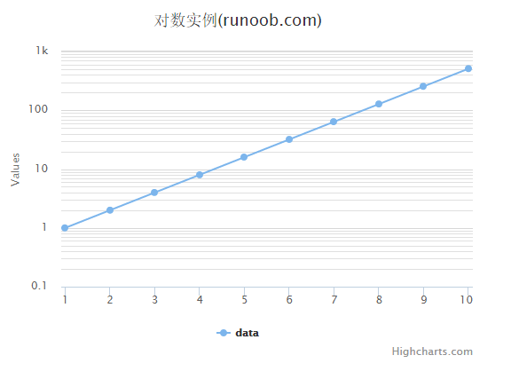
Highcharts 对数图表
以下实例演示了对数图表。
我们在前面的章节已经了解了 Highcharts 配置语法。接下来让我们来看下如何配置。
配置
配置 yAxis.type 为 'logarithmic'。它定义了 x 轴类型。可选值有 "linear", "logarithmic", "datetime" 或 "category"。默认值为linear。
yAxis var yAxis = { type: 'logarithmic', minorTickInterval: 0.1 };
实例
文件名:highcharts_line_logarithmic.htm
<html> <head> <title>Highcharts 教程 | 菜鸟教程(runoob.com)</title> <script src="http://apps.bdimg.com/libs/jquery/2.1.4/jquery.min.js"></script> <script src="/try/demo_source/highcharts.js"></script> </head> <body> <div id="container" style="width: 550px; height: 400px; margin: 0 auto"></div> <script language="JavaScript"> $(document).ready(function() { var title = { text: '对数实例(runoob.com)' }; var xAxis = { tickInterval: 1 }; var yAxis = { type: 'logarithmic', minorTickInterval: 0.1 }; var tooltip = { headerFormat: '<b>{series.name}</b><br>', pointFormat: 'x = {point.x}, y = {point.y}' }; var plotOptions = { spline: { marker: { enabled: true } } }; var series= [{ name: 'data', data: [1, 2, 4, 8, 16, 32, 64, 128, 256, 512], pointStart: 1 } ]; var json = {}; json.title = title; json.tooltip = tooltip; json.xAxis = xAxis; json.yAxis = yAxis; json.series = series; json.plotOptions = plotOptions; $('#container').highcharts(json); }); </script> </body> </html>
以上实例输出结果为:
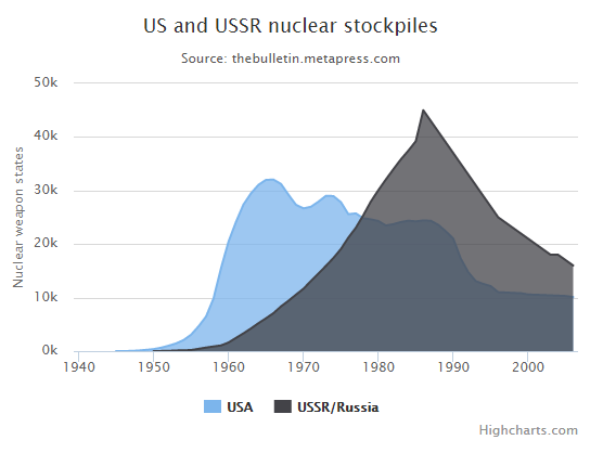
Highcharts 区域图
Highcharts 基本区域图
以下实例演示了基础区域图。
我们在前面的章节已经了解了 Highcharts 基本配置语法。接下来让我们来看下其他的配置:
配置
chart
chart.type 配置项用于设定图表类型,默认为 "line",本章节我们使用 'area'。
var chart = { type: 'area' };
实例
文件名:highcharts_area_basic.htm
<html> <head> <title>Highcharts 教程 | 菜鸟教程(runoob.com)</title> <script src="http://apps.bdimg.com/libs/jquery/2.1.4/jquery.min.js"></script> <script src="/try/demo_source/highcharts.js"></script> </head> <body> <div id="container" style="width: 550px; height: 400px; margin: 0 auto"></div> <script language="JavaScript"> $(document).ready(function() { var chart = { type: 'area' }; var title = { text: 'US and USSR nuclear stockpiles' }; var subtitle = { text: 'Source: <a href="http://thebulletin.metapress.com/content/c4120650912x74k7/fulltext.pdf">' + 'thebulletin.metapress.com</a>' }; var xAxis = { allowDecimals: false, labels: { formatter: function () { return this.value; // clean, unformatted number for year } } }; var yAxis = { title: { text: 'Nuclear weapon states' }, labels: { formatter: function () { return this.value / 1000 + 'k'; } } }; var tooltip = { pointFormat: '{series.name} produced <b>{point.y:,.0f}</b><br/>warheads in {point.x}' }; var plotOptions = { area: { pointStart: 1940, marker: { enabled: false, symbol: 'circle', radius: 2, states: { hover: { enabled: true } } } } }; var series= [{ name: 'USA', data: [null, null, null, null, null, 6, 11, 32, 110, 235, 369, 640, 1005, 1436, 2063, 3057, 4618, 6444, 9822, 15468, 20434, 24126, 27387, 29459, 31056, 31982, 32040, 31233, 29224, 27342, 26662, 26956, 27912, 28999, 28965, 27826, 25579, 25722, 24826, 24605, 24304, 23464, 23708, 24099, 24357, 24237, 24401, 24344, 23586, 22380, 21004, 17287, 14747, 13076, 12555, 12144, 11009, 10950, 10871, 10824, 10577, 10527, 10475, 10421, 10358, 10295, 10104] }, { name: 'USSR/Russia', data: [null, null, null, null, null, null, null, null, null, null, 5, 25, 50, 120, 150, 200, 426, 660, 869, 1060, 1605, 2471, 3322, 4238, 5221, 6129, 7089, 8339, 9399, 10538, 11643, 13092, 14478, 15915, 17385, 19055, 21205, 23044, 25393, 27935, 30062, 32049, 33952, 35804, 37431, 39197, 45000, 43000, 41000, 39000, 37000, 35000, 33000, 31000, 29000, 27000, 25000, 24000, 23000, 22000, 21000, 20000, 19000, 18000, 18000, 17000, 16000] } ]; var json = {}; json.chart = chart; json.title = title; json.subtitle = subtitle; json.tooltip = tooltip; json.xAxis = xAxis; json.yAxis = yAxis; json.series = series; json.plotOptions = plotOptions; $('#container').highcharts(json); }); </script> </body> </html>
以上实例输出结果为:
Highcharts 使用负数区域图
以下实例演示了使用负数区域图。
我们在前面的章节已经了解了 Highcharts 基本配置语法。接下来让我们来看下其他的实例:
实例
文件名:highcharts_area_negative.htm
<html> <head> <title>Highcharts 教程 | 菜鸟教程(runoob.com)</title> <script src="http://apps.bdimg.com/libs/jquery/2.1.4/jquery.min.js"></script> <script src="/try/demo_source/highcharts.js"></script> </head> <body> <div id="container" style="width: 550px; height: 400px; margin: 0 auto"></div> <script language="JavaScript"> $(document).ready(function() { var chart = { type: 'area' }; var title = { text: 'Area chart with negative values' }; var xAxis = { categories: ['Apples', 'Oranges', 'Pears', 'Grapes', 'Bananas'] }; var credits = { enabled: false }; var series= [{ name: 'John', data: [5, 3, 4, 7, 2] }, { name: 'Jane', data: [2, -2, -3, 2, 1] }, { name: 'Joe', data: [3, 4, 4, -2, 5] } ]; var json = {}; json.chart = chart; json.title = title; json.xAxis = xAxis; json.credits = credits; json.series = series; $('#container').highcharts(json); }); </script> </body> </html>
以上实例输出结果为:

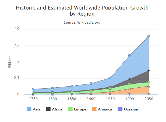
Highcharts 堆叠区域图
以下实例演示了堆叠区域图。
我们在前面的章节已经了解了 Highcharts 基本配置语法。接下来让我们来看下其他的配置。在 plotOptions 中添加 stacking 属性:
配置
plotOptions:数据点选项
plotOptions用于设置图表中的数据点相关属性。plotOptions根据各种图表类型,其属性设置略微有些差异。
配置图表堆叠设置 plotOptions.area.stacking 为 "normal"。如果禁用堆叠使用 null。 如果值为 "percent" 堆叠则按百分比。
var plotOptions = { area: { stacking: 'normal', lineColor: '#666666', lineWidth: 1, marker: { lineWidth: 1, lineColor: '#666666' } } };
实例
文件名:highcharts_area_stacked.htm
<html> <head> <title>Highcharts 教程 | 菜鸟教程(runoob.com)</title> <script src="http://apps.bdimg.com/libs/jquery/2.1.4/jquery.min.js"></script> <script src="/try/demo_source/highcharts.js"></script> </head> <body> <div id="container" style="width: 550px; height: 400px; margin: 0 auto"></div> <script language="JavaScript"> $(document).ready(function() { var chart = { type: 'area' }; var title = { text: 'Historic and Estimated Worldwide Population Growth by Region' }; var subtitle = { text: 'Source: Wikipedia.org' }; var xAxis = { categories: ['1750', '1800', '1850', '1900', '1950', '1999', '2050'], tickmarkPlacement: 'on', title: { enabled: false } }; var yAxis = { title: { text: 'Billions' }, labels: { formatter: function () { return this.value / 1000; } } }; var tooltip = { shared: true, valueSuffix: ' millions' }; var plotOptions = { area: { stacking: 'normal', lineColor: '#666666', lineWidth: 1, marker: { lineWidth: 1, lineColor: '#666666' } } }; var credits = { enabled: false }; var series= [{ name: 'Asia', data: [502, 635, 809, 947, 1402, 3634, 5268] }, { name: 'Africa', data: [106, 107, 111, 133, 221, 767, 1766] }, { name: 'Europe', data: [163, 203, 276, 408, 547, 729, 628] }, { name: 'America', data: [18, 31, 54, 156, 339, 818, 1201] }, { name: 'Oceania', data: [2, 2, 2, 6, 13, 30, 46] } ]; var json = {}; json.chart = chart; json.title = title; json.subtitle = subtitle; json.xAxis = xAxis; json.yAxis = yAxis; json.tooltip = tooltip; json.plotOptions = plotOptions; json.credits = credits; json.series = series; $('#container').highcharts(json); }); </script> </body> </html>
以上实例输出结果为:
Highcharts 百分比堆叠区域图
以下实例演示了百分比堆叠区域图。
我们在前面的章节已经了解了 Highcharts 基本配置语法。接下来让我们来看下其他的配置。在 plotOptions 中添加 stacking 属性:
配置
plotOptions:数据点选项
plotOptions用于设置图表中的数据点相关属性。plotOptions根据各种图表类型,其属性设置略微有些差异。
配置图表堆叠设置 plotOptions.area.stacking 为 "percent"。如果禁用堆叠使用 null。
var plotOptions = { area: { stacking: 'percent', lineColor: '#666666', lineWidth: 1, marker: { lineWidth: 1, lineColor: '#666666' } } };
实例
文件名:highcharts_area_percentage.htm
<html> <head> <title>Highcharts 教程 | 菜鸟教程(runoob.com)</title> <script src="http://apps.bdimg.com/libs/jquery/2.1.4/jquery.min.js"></script> <script src="/try/demo_source/highcharts.js"></script> </head> <body> <div id="container" style="width: 550px; height: 400px; margin: 0 auto"></div> <script language="JavaScript"> $(document).ready(function() { var chart = { type: 'area' }; var title = { text: 'Historic and Estimated Worldwide Population Growth by Region' }; var subtitle = { text: 'Source: Wikipedia.org' }; var xAxis = { categories: ['1750', '1800', '1850', '1900', '1950', '1999', '2050'], tickmarkPlacement: 'on', title: { enabled: false } }; var yAxis = { title: { text: 'Billions' }, labels: { formatter: function () { return this.value / 1000; } } }; var tooltip = { shared: true, valueSuffix: ' millions' }; var plotOptions = { area: { stacking: 'percent', lineColor: '#666666', lineWidth: 1, marker: { lineWidth: 1, lineColor: '#666666' } } }; var credits = { enabled: false }; var series= [{ name: 'Asia', data: [502, 635, 809, 947, 1402, 3634, 5268] }, { name: 'Africa', data: [106, 107, 111, 133, 221, 767, 1766] }, { name: 'Europe', data: [163, 203, 276, 408, 547, 729, 628] }, { name: 'America', data: [18, 31, 54, 156, 339, 818, 1201] }, { name: 'Oceania', data: [2, 2, 2, 6, 13, 30, 46] } ]; var json = {}; json.chart = chart; json.title = title; json.subtitle = subtitle; json.xAxis = xAxis; json.yAxis = yAxis; json.tooltip = tooltip; json.plotOptions = plotOptions; json.credits = credits; json.series = series; $('#container').highcharts(json); }); </script> </body> </html>
以上实例输出结果为:

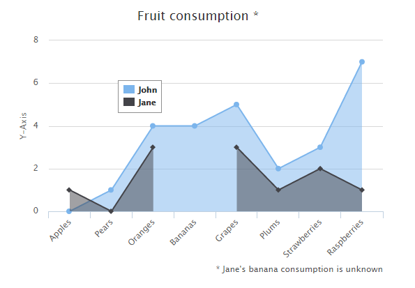
Highcharts 丢失值区域图
以下实例演示了丢失值区域图。
我们在前面的章节已经了解了 Highcharts 基本配置语法。接下来让我们来看下其他的配置。在 chart 中添加 spacingBottom 属性。
chart 配置
将 chart 的 spacingBottom 属性设置为 30。表示图表间的间隔区间。
var chart = { type: 'area', spacingBottom: 30 };
实例
文件名:highcharts_area_missing.htm
<html> <head> <title>Highcharts 教程 | 菜鸟教程(runoob.com)</title> <script src="http://apps.bdimg.com/libs/jquery/2.1.4/jquery.min.js"></script> <script src="/try/demo_source/highcharts.js"></script> </head> <body> <div id="container" style="width: 550px; height: 400px; margin: 0 auto"></div> <script language="JavaScript"> $(document).ready(function() { var chart = { type: 'area', spacingBottom: 30 }; var title = { text: 'Fruit consumption *' }; var subtitle = { text: '* Jane\'s banana consumption is unknown', floating: true, align: 'right', verticalAlign: 'bottom', y: 15 }; var legend = { layout: 'vertical', align: 'left', verticalAlign: 'top', x: 150, y: 100, floating: true, borderWidth: 1, backgroundColor: (Highcharts.theme && Highcharts.theme.legendBackgroundColor) || '#FFFFFF' }; var xAxis = { categories: ['Apples', 'Pears', 'Oranges', 'Bananas', 'Grapes', 'Plums', 'Strawberries', 'Raspberries'] }; var yAxis = { title: { text: 'Y-Axis' }, labels: { formatter: function () { return this.value; } } }; var tooltip = { formatter: function () { return '<b>' + this.series.name + '</b><br/>' + this.x + ': ' + this.y; } }; var plotOptions = { area: { fillOpacity: 0.5 } }; var credits = { enabled: false }; var series= [{ name: 'John', data: [0, 1, 4, 4, 5, 2, 3, 7] }, { name: 'Jane', data: [1, 0, 3, null, 3, 1, 2, 1] } ]; var json = {}; json.chart = chart; json.title = title; json.subtitle = subtitle; json.xAxis = xAxis; json.yAxis = yAxis; json.legend = legend; json.tooltip = tooltip; json.plotOptions = plotOptions; json.credits = credits; json.series = series; $('#container').highcharts(json); }); </script> </body> </html>
以上实例输出结果为:
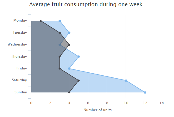
Highcharts 反转x轴与y轴
以下实例演示了反转x轴与y轴区域图。
我们在前面的章节已经了解了 Highcharts 基本配置语法。接下来让我们来看下其他的配置。在 chart 中添加 inverted 属性。
chart 配置
将 chart 的 inverted 属性设置为 true,X轴为垂直,Y轴为水平的。
var chart = { type: 'area', inverted: true };
实例
文件名:highcharts_area_inverted.htm
<html> <head> <title>Highcharts 教程 | 菜鸟教程(runoob.com)</title> <script src="http://apps.bdimg.com/libs/jquery/2.1.4/jquery.min.js"></script> <script src="/try/demo_source/highcharts.js"></script> </head> <body> <div id="container" style="width: 550px; height: 400px; margin: 0 auto"></div> <script language="JavaScript"> $(document).ready(function() { var chart = { type: 'area', inverted: true }; var title = { text: 'Average fruit consumption during one week' }; var subtitle = { style: { position: 'absolute', right: '0px', bottom: '10px' } }; var legend = { layout: 'vertical', align: 'left', verticalAlign: 'top', x: -150, y: 100, floating: true, borderWidth: 1, backgroundColor: (Highcharts.theme && Highcharts.theme.legendBackgroundColor) || '#FFFFFF' }; var xAxis = { categories: ['Monday','Tuesday','Wednesday','Thursday','Friday','Saturday','Sunday'] }; var yAxis = { title: { text: 'Number of units' }, labels: { formatter: function () { return this.value; } }, min: 0 }; var plotOptions = { area: { fillOpacity: 0.5 } }; var credits = { enabled: false }; var series= [{ name: 'John', data: [3, 4, 3, 5, 4, 10, 12] }, { name: 'Jane', data: [1, 3, 4, 3, 3, 5, 4] } ]; var json = {}; json.chart = chart; json.title = title; json.subtitle = subtitle; json.xAxis = xAxis; json.yAxis = yAxis; json.legend = legend; json.plotOptions = plotOptions; json.credits = credits; json.series = series; $('#container').highcharts(json); }); </script> </body> </html>
以上实例输出结果为:
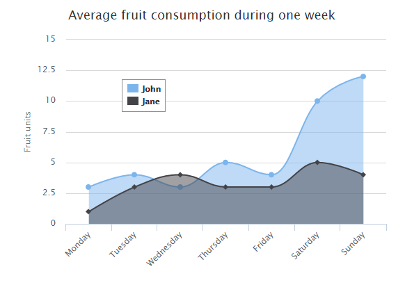
Highcharts 曲线区域图
以下实例演示了曲线区域图。
我们在前面的章节已经了解了 Highcharts 基本配置语法。接下来让我们来看下其他的配置。在 chart 中修改 type 属性。
chart 配置
将 chart 的 type 属性设置为 areaspline,chart.type 描述了图表类型。默认值为 "line"。
var chart = { type: 'areaspline' };
实例
文件名:highcharts_area_spline.htm
<html> <head> <title>Highcharts 教程 | 菜鸟教程(runoob.com)</title> <script src="http://apps.bdimg.com/libs/jquery/2.1.4/jquery.min.js"></script> <script src="/try/demo_source/highcharts.js"></script> </head> <body> <div id="container" style="width: 550px; height: 400px; margin: 0 auto"></div> <script language="JavaScript"> $(document).ready(function() { var chart = { type: 'areaspline' }; var title = { text: 'Average fruit consumption during one week' }; var subtitle = { style: { position: 'absolute', right: '0px', bottom: '10px' } }; var legend = { layout: 'vertical', align: 'left', verticalAlign: 'top', x: 150, y: 100, floating: true, borderWidth: 1, backgroundColor: (Highcharts.theme && Highcharts.theme.legendBackgroundColor) || '#FFFFFF' }; var xAxis = { categories: ['Monday','Tuesday','Wednesday','Thursday','Friday','Saturday','Sunday'] }; var yAxis = { title: { text: 'Fruit units' } }; var tooltip = { shared: true, valueSuffix: ' units' }; var credits = { enabled: false } var plotOptions = { areaspline: { fillOpacity: 0.5 } }; var series= [{ name: 'John', data: [3, 4, 3, 5, 4, 10, 12] }, { name: 'Jane', data: [1, 3, 4, 3, 3, 5, 4] } ]; var json = {}; json.chart = chart; json.title = title; json.subtitle = subtitle; json.xAxis = xAxis; json.yAxis = yAxis; json.legend = legend; json.plotOptions = plotOptions; json.credits = credits; json.series = series; $('#container').highcharts(json); }); </script> </body> </html>
以上实例输出结果为:
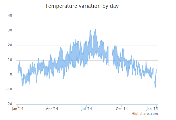
Highcharts 区间区域图
以下实例演示了区间区域图。
我们在前面的章节已经了解了 Highcharts 基本配置语法。接下来让我们来看下其他的配置。在 chart 中修改 type 属性。
chart 配置
将 chart 的 type 属性设置为 arearange,chart.type 描述了图表类型。默认值为 "line"。
var chart = { type: 'arearange' };
实例
文件名:highcharts_area_range.htm
<html> <head> <title>Highcharts 教程 | 菜鸟教程(runoob.com)</title> <script src="http://apps.bdimg.com/libs/jquery/2.1.4/jquery.min.js"></script> <script src="http://code.highcharts.com/highcharts.js"></script> <script src="http://code.highcharts.com/highcharts-more.js"></script> <script src="http://code.highcharts.com/modules/data.js"></script> </head> <body> <div id="container" style="width: 550px; height: 400px; margin: 0 auto"></div> <script language="JavaScript"> $(document).ready(function() { var chart = { type: 'arearange', zoomType: 'x' }; var title = { text: 'Temperature variation by day' }; var xAxis = { type: 'datetime' }; var yAxis = { title: { text: null } }; var tooltip = { shared: true, crosshairs: true, valueSuffix: '\xB0C' }; var legend = { enabled: false } var json = {}; json.chart = chart; json.title = title; json.xAxis = xAxis; json.yAxis = yAxis; json.legend = legend; $.getJSON('http://www.highcharts.com/samples/data/jsonp.php?filename=range.json&callback=?', function (data) { var series= [{ name: 'Temperatures', data: data } ]; json.series = series; $('#container').highcharts(json); }); }); </script> </body> </html>
以上实例输出结果为:
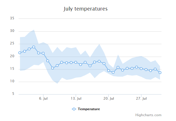
Highcharts 使用区间和线的区域图
以下实例演示了使用区间和线的区域图。
我们在前面的章节已经了解了 Highcharts 基本配置语法。接下来让我们来看下其他的配置。在 chart 中修改 type 属性。
chart 配置
将 chart 的 type 属性设置为 arearange,chart.type 描述了图表类型。默认值为 "line"。
var chart = { type: 'arearange' };
实例
文件名:highcharts_area_rangeline.htm
<html> <head> <title>Highcharts 教程 | 菜鸟教程(runoob.com)</title> <script src="http://apps.bdimg.com/libs/jquery/2.1.4/jquery.min.js"></script> <script src="http://code.highcharts.com/highcharts.js"></script> <script src="http://code.highcharts.com/highcharts-more.js"></script> </head> <body> <div id="container" style="width: 550px; height: 400px; margin: 0 auto"></div> <script language="JavaScript"> $(document).ready(function() { var ranges = [ [1246406400000, 14.3, 27.7], [1246492800000, 14.5, 27.8], [1246579200000, 15.5, 29.6], [1246665600000, 16.7, 30.7], [1246752000000, 16.5, 25.0], [1246838400000, 17.8, 25.7], [1246924800000, 13.5, 24.8], [1247011200000, 10.5, 21.4], [1247097600000, 9.2, 23.8], [1247184000000, 11.6, 21.8], [1247270400000, 10.7, 23.7], [1247356800000, 11.0, 23.3], [1247443200000, 11.6, 23.7], [1247529600000, 11.8, 20.7], [1247616000000, 12.6, 22.4], [1247702400000, 13.6, 19.6], [1247788800000, 11.4, 22.6], [1247875200000, 13.2, 25.0], [1247961600000, 14.2, 21.6], [1248048000000, 13.1, 17.1], [1248134400000, 12.2, 15.5], [1248220800000, 12.0, 20.8], [1248307200000, 12.0, 17.1], [1248393600000, 12.7, 18.3], [1248480000000, 12.4, 19.4], [1248566400000, 12.6, 19.9], [1248652800000, 11.9, 20.2], [1248739200000, 11.0, 19.3], [1248825600000, 10.8, 17.8], [1248912000000, 11.8, 18.5], [1248998400000, 10.8, 16.1] ]; var averages = [ [1246406400000, 21.5], [1246492800000, 22.1], [1246579200000, 23], [1246665600000, 23.8], [1246752000000, 21.4], [1246838400000, 21.3], [1246924800000, 18.3], [1247011200000, 15.4], [1247097600000, 16.4], [1247184000000, 17.7], [1247270400000, 17.5], [1247356800000, 17.6], [1247443200000, 17.7], [1247529600000, 16.8], [1247616000000, 17.7], [1247702400000, 16.3], [1247788800000, 17.8], [1247875200000, 18.1], [1247961600000, 17.2], [1248048000000, 14.4], [1248134400000, 13.7], [1248220800000, 15.7], [1248307200000, 14.6], [1248393600000, 15.3], [1248480000000, 15.3], [1248566400000, 15.8], [1248652800000, 15.2], [1248739200000, 14.8], [1248825600000, 14.4], [1248912000000, 15], [1248998400000, 13.6] ]; var title = { text: 'July temperatures' }; var xAxis = { type: 'datetime' }; var yAxis = { title: { text: null } }; var tooltip = { shared: true, crosshairs: true, valueSuffix: '\xB0C' }; var legend = { } var series= [{ name: 'Temperature', data: averages, zIndex: 1, marker: { fillColor: 'white', lineWidth: 2, lineColor: Highcharts.getOptions().colors[0] } }, { name: 'Range', data: ranges, type: 'arearange', lineWidth: 0, linkedTo: ':previous', color: Highcharts.getOptions().colors[0], fillOpacity: 0.3, zIndex: 0 } ]; var json = {}; json.title = title; json.xAxis = xAxis; json.yAxis = yAxis; json.tooltip = tooltip; json.legend = legend; json.series = series; $('#container').highcharts(json); }); </script> </body> </html>
以上实例输出结果为:
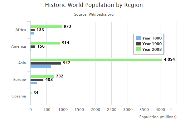
Highcharts 条形图
Highcharts 基本条形图
以下实例演示了基本条形图。
我们在前面的章节已经了解了 Highcharts 基本配置语法。接下来让我们来看下其他的配置。
配置
chart 配置
设置 chart 的 type 属性 为 bar ,chart.type 描述了图表类型。默认值为 "line"。
var chart = { type: 'bar' };
实例
文件名:highcharts_bar_basic.htm
<html> <head> <title>Highcharts 教程 | 菜鸟教程(runoob.com)</title> <script src="http://apps.bdimg.com/libs/jquery/2.1.4/jquery.min.js"></script> <script src="/try/demo_source/highcharts.js"></script> </head> <body> <div id="container" style="width: 550px; height: 400px; margin: 0 auto"></div> <script language="JavaScript"> $(document).ready(function() { var chart = { type: 'bar' }; var title = { text: 'Historic World Population by Region' }; var subtitle = { text: 'Source: Wikipedia.org' }; var xAxis = { categories: ['Africa', 'America', 'Asia', 'Europe', 'Oceania'], title: { text: null } }; var yAxis = { min: 0, title: { text: 'Population (millions)', align: 'high' }, labels: { overflow: 'justify' } }; var tooltip = { valueSuffix: ' millions' }; var plotOptions = { bar: { dataLabels: { enabled: true } } }; var legend = { layout: 'vertical', align: 'right', verticalAlign: 'top', x: -40, y: 100, floating: true, borderWidth: 1, backgroundColor: ((Highcharts.theme && Highcharts.theme.legendBackgroundColor) || '#FFFFFF'), shadow: true }; var credits = { enabled: false }; var series= [{ name: 'Year 1800', data: [107, 31, 635, 203, 2] }, { name: 'Year 1900', data: [133, 156, 947, 408, 6] }, { name: 'Year 2008', data: [973, 914, 4054, 732, 34] } ]; var json = {}; json.chart = chart; json.title = title; json.subtitle = subtitle; json.tooltip = tooltip; json.xAxis = xAxis; json.yAxis = yAxis; json.series = series; json.plotOptions = plotOptions; json.legend = legend; json.credits = credits; $('#container').highcharts(json); }); </script> </body> </html>
以上实例输出结果为:
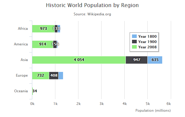
Highcharts 堆叠条形图
以下实例演示了堆叠条形图。
我们在前面的章节已经了解了 Highcharts 基本配置语法。接下来让我们来看下其他的配置。
配置
plotOptions
配置图表堆叠使用 plotOptions.series.stacking,并设置为 "normal"。如果禁用堆叠可设置为 null , "normal" 通过值设置堆叠, "percent" 堆叠则按百分比。
var plotOptions = { series: { stacking: 'normal' } };
实例
文件名:highcharts_bar_stacked.htm
<html> <head> <title>Highcharts 教程 | 菜鸟教程(runoob.com)</title> <script src="http://apps.bdimg.com/libs/jquery/2.1.4/jquery.min.js"></script> <script src="/try/demo_source/highcharts.js"></script> </head> <body> <div id="container" style="width: 550px; height: 400px; margin: 0 auto"></div> <script language="JavaScript"> $(document).ready(function() { var chart = { type: 'bar' }; var title = { text: 'Historic World Population by Region' }; var subtitle = { text: 'Source: Wikipedia.org' }; var xAxis = { categories: ['Africa', 'America', 'Asia', 'Europe', 'Oceania'], title: { text: null } }; var yAxis = { min: 0, title: { text: 'Population (millions)', align: 'high' }, labels: { overflow: 'justify' } }; var tooltip = { valueSuffix: ' millions' }; var plotOptions = { bar: { dataLabels: { enabled: true } }, series: { stacking: 'normal' } }; var legend = { layout: 'vertical', align: 'right', verticalAlign: 'top', x: -40, y: 100, floating: true, borderWidth: 1, backgroundColor: ((Highcharts.theme && Highcharts.theme.legendBackgroundColor) || '#FFFFFF'), shadow: true }; var credits = { enabled: false }; var series= [{ name: 'Year 1800', data: [107, 31, 635, 203, 2] }, { name: 'Year 1900', data: [133, 156, 947, 408, 6] }, { name: 'Year 2008', data: [973, 914, 4054, 732, 34] } ]; var json = {}; json.chart = chart; json.title = title; json.subtitle = subtitle; json.tooltip = tooltip; json.xAxis = xAxis; json.yAxis = yAxis; json.series = series; json.plotOptions = plotOptions; json.legend = legend; json.credits = credits; $('#container').highcharts(json); }); </script> </body> </html>
以上实例输出结果为:
Highcharts 反向条形图
以下实例演示了使用负值的,反向条形图。
实例
文件名:highcharts_bar_negative.htm
<html> <head> <title>Highcharts 教程 | 菜鸟教程(runoob.com)</title> <script src="http://apps.bdimg.com/libs/jquery/2.1.4/jquery.min.js"></script> <script src="/try/demo_source/highcharts.js"></script> </head> <body> <div id="container" style="width: 550px; height: 400px; margin: 0 auto"></div> <script language="JavaScript"> $(document).ready(function() { var chart = { type: 'bar' }; var title = { text: 'Bar chart with negative values' }; var xAxis = { categories: ['Apples', 'Oranges', 'Pears', 'Grapes', 'Bananas'] }; var credits = { enabled: false }; var series= [{ name: 'John', data: [5, 3, 4, 7, 2] }, { name: 'Jane', data: [2, -2, -3, 2, 1] }, { name: 'Joe', data: [3, 4, 4, -2, 5] } ]; var json = {}; json.chart = chart; json.title = title; json.xAxis = xAxis; json.credits = credits; json.series = series; $('#container').highcharts(json); }); </script> </body> </html>
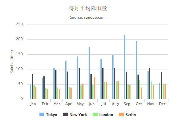
Highcharts 柱形图
Highcharts 基本柱形图
以下实例演示了基本柱形图。
我们在前面的章节已经了解了 Highcharts 基本配置语法。接下来让我们来看下其他的配置。
配置
chart 配置
设置 chart 的 type 属性 为 column ,chart.type 描述了图表类型。默认值为 "line"。
var chart = { type: 'column' };
实例
文件名:highcharts_column_basic.htm
<html> <head> <title>Highcharts 教程 | 菜鸟教程(runoob.com)</title> <script src="http://apps.bdimg.com/libs/jquery/2.1.4/jquery.min.js"></script> <script src="/try/demo_source/highcharts.js"></script> </head> <body> <div id="container" style="width: 550px; height: 400px; margin: 0 auto"></div> <script language="JavaScript"> $(document).ready(function() { var chart = { type: 'column' }; var title = { text: '每月平均降雨量' }; var subtitle = { text: 'Source: runoob.com' }; var xAxis = { categories: ['Jan','Feb','Mar','Apr','May','Jun','Jul','Aug','Sep','Oct','Nov','Dec'], crosshair: true }; var yAxis = { min: 0, title: { text: '降雨量 (mm)' } }; var tooltip = { headerFormat: '<span style="font-size:10px">{point.key}</span><table>', pointFormat: '<tr><td style="color:{series.color};padding:0">{series.name}: </td>' + '<td style="padding:0"><b>{point.y:.1f} mm</b></td></tr>', footerFormat: '</table>', shared: true, useHTML: true }; var plotOptions = { column: { pointPadding: 0.2, borderWidth: 0 } }; var credits = { enabled: false }; var series= [{ name: 'Tokyo', data: [49.9, 71.5, 106.4, 129.2, 144.0, 176.0, 135.6, 148.5, 216.4, 194.1, 95.6, 54.4] }, { name: 'New York', data: [83.6, 78.8, 98.5, 93.4, 106.0, 84.5, 105.0, 104.3, 91.2, 83.5, 106.6, 92.3] }, { name: 'London', data: [48.9, 38.8, 39.3, 41.4, 47.0, 48.3, 59.0, 59.6, 52.4, 65.2, 59.3, 51.2] }, { name: 'Berlin', data: [42.4, 33.2, 34.5, 39.7, 52.6, 75.5, 57.4, 60.4, 47.6, 39.1, 46.8, 51.1] }]; var json = {}; json.chart = chart; json.title = title; json.subtitle = subtitle; json.tooltip = tooltip; json.xAxis = xAxis; json.yAxis = yAxis; json.series = series; json.plotOptions = plotOptions; json.credits = credits; $('#container').highcharts(json); }); </script> </body> </html>
以上实例输出结果为:
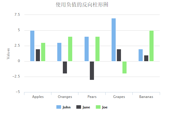
Highcharts 使用负值的反向柱形图
以下实例演示了使用负值的反向柱形图。
我们在前面的章节已经了解了 Highcharts 基本配置语法。接下来让我们来看下其他的配置。
配置
chart 配置
设置 chart 的 type 属性 为 column ,chart.type 描述了图表类型。默认值为 "line"。
var chart = { type: 'column' };
实例
文件名:highcharts_column_negative.htm
<html> <head> <title>Highcharts 教程 | 菜鸟教程(runoob.com)</title> <script src="http://apps.bdimg.com/libs/jquery/2.1.4/jquery.min.js"></script> <script src="/try/demo_source/highcharts.js"></script> </head> <body> <div id="container" style="width: 550px; height: 400px; margin: 0 auto"></div> <script language="JavaScript"> $(document).ready(function() { var chart = { type: 'column' }; var title = { text: '使用负值的反向柱形图' }; var xAxis = { categories: ['Apples', 'Oranges', 'Pears', 'Grapes', 'Bananas'] }; var credits = { enabled: false }; var series= [{ name: 'John', data: [5, 3, 4, 7, 2] }, { name: 'Jane', data: [2, -2, -3, 2, 1] }, { name: 'Joe', data: [3, 4, 4, -2, 5] } ]; var json = {}; json.chart = chart; json.title = title; json.xAxis = xAxis; json.credits = credits; json.series = series; $('#container').highcharts(json); }); </script> </body> </html>
以上实例输出结果为:
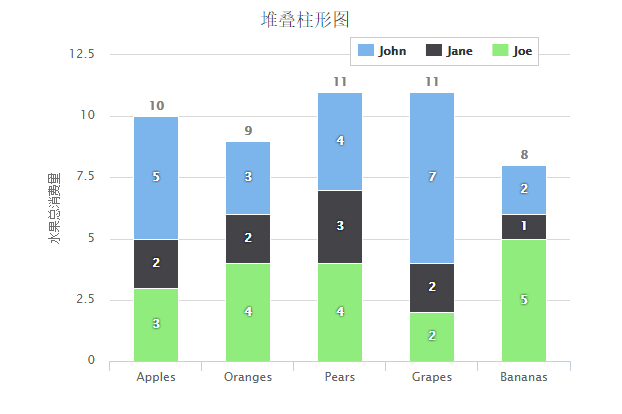
Highcharts 堆叠柱形图
以下实例演示了堆叠柱形图。
我们在前面的章节已经了解了 Highcharts 基本配置语法。接下来让我们来看下其他的配置。在 plotOptions 中添加 stacking 属性:
配置
plotOptions:数据点选项
plotOptions用于设置图表中的数据点相关属性。plotOptions根据各种图表类型,其属性设置略微有些差异。
配置图表堆叠设置 plotOptions.area.stacking 为 "percent"。如果禁用堆叠使用 null。
var plotOptions = { column: { stacking: 'normal', dataLabels: { enabled: true, color: (Highcharts.theme && Highcharts.theme.dataLabelsColor) || 'white', style: { textShadow: '0 0 3px black' } } } };
实例
文件名:highcharts_column_stacked.htm
<html> <head> <title>Highcharts 教程 | 菜鸟教程(runoob.com)</title> <script src="http://apps.bdimg.com/libs/jquery/2.1.4/jquery.min.js"></script> <script src="/try/demo_source/highcharts.js"></script> </head> <body> <div id="container" style="width: 550px; height: 400px; margin: 0 auto"></div> <script language="JavaScript"> $(document).ready(function() { var chart = { type: 'column' }; var title = { text: '堆叠柱形图' }; var xAxis = { categories: ['Apples', 'Oranges', 'Pears', 'Grapes', 'Bananas'] }; var yAxis ={ min: 0, title: { text: '水果总消费量' }, stackLabels: { enabled: true, style: { fontWeight: 'bold', color: (Highcharts.theme && Highcharts.theme.textColor) || 'gray' } } }; var legend = { align: 'right', x: -30, verticalAlign: 'top', y: 25, floating: true, backgroundColor: (Highcharts.theme && Highcharts.theme.background2) || 'white', borderColor: '#CCC', borderWidth: 1, shadow: false }; var tooltip = { formatter: function () { return '<b>' + this.x + '</b><br/>' + this.series.name + ': ' + this.y + '<br/>' + 'Total: ' + this.point.stackTotal; } }; var plotOptions = { column: { stacking: 'normal', dataLabels: { enabled: true, color: (Highcharts.theme && Highcharts.theme.dataLabelsColor) || 'white', style: { textShadow: '0 0 3px black' } } } }; var credits = { enabled: false }; var series= [{ name: 'John', data: [5, 3, 4, 7, 2] }, { name: 'Jane', data: [2, 2, 3, 2, 1] }, { name: 'Joe', data: [3, 4, 4, 2, 5] }]; var json = {}; json.chart = chart; json.title = title; json.xAxis = xAxis; json.yAxis = yAxis; json.legend = legend; json.tooltip = tooltip; json.plotOptions = plotOptions; json.credits = credits; json.series = series; $('#container').highcharts(json); }); </script> </body> </html>
以上实例输出结果为:
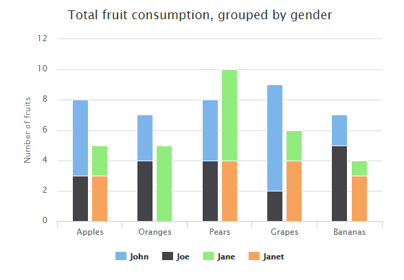
Highcharts 堆叠组柱形图
以下实例演示了堆叠组柱形图。
我们在前面的章节已经了解了 Highcharts 基本配置语法。接下来让我们来看下其他的配置。在 plotOptions 中添加 stacking 属性:
配置
plotOptions:数据点选项
plotOptions用于设置图表中的数据点相关属性。plotOptions根据各种图表类型,其属性设置略微有些差异。
配置图表堆叠设置 plotOptions.area.stacking 为 "percent"。如果禁用堆叠使用 null。
var plotOptions = { column: { stacking: 'normal', dataLabels: { enabled: true, color: (Highcharts.theme && Highcharts.theme.dataLabelsColor) || 'white', style: { textShadow: '0 0 3px black' } } } };
series 数据列项配置
配置堆叠组中每个对应的数据列项。
series: [{ name: 'John', data: [5, 3, 4, 7, 2], stack: 'male' }]
实例
文件名:highcharts_column_rotated.htm
<html> <head> <title>Highcharts 教程 | 菜鸟教程(runoob.com)</title> <script src="http://apps.bdimg.com/libs/jquery/2.1.4/jquery.min.js"></script> <script src="/try/demo_source/highcharts.js"></script> </head> <body> <div id="container" style="width: 550px; height: 400px; margin: 0 auto"></div> <script language="JavaScript"> $(document).ready(function() { var chart = { type: 'column' }; var title = { text: 'Total fruit consumption, grouped by gender' }; var xAxis = { categories: ['Apples', 'Oranges', 'Pears', 'Grapes', 'Bananas'] }; var yAxis ={ allowDecimals: false, min: 0, title: { text: 'Number of fruits' } }; var plotOptions = { column: { stacking: 'normal' } }; var credits = { enabled: false }; var series= [{ name: 'John', data: [5, 3, 4, 7, 2], stack: 'male' }, { name: 'Joe', data: [3, 4, 4, 2, 5], stack: 'male' }, { name: 'Jane', data: [2, 5, 6, 2, 1], stack: 'female' }, { name: 'Janet', data: [3, 0, 4, 4, 3], stack: 'female' }]; var json = {}; json.chart = chart; json.title = title; json.xAxis = xAxis; json.yAxis = yAxis; json.plotOptions = plotOptions; json.credits = credits; json.series = series; $('#container').highcharts(json); }); </script> </body> </html>
以上实例输出结果为:
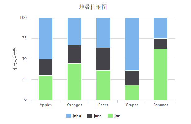
Highcharts 使用百分比的堆叠柱形图
以下实例演示了使用百分比的堆叠柱形图。
我们在前面的章节已经了解了 Highcharts 基本配置语法。接下来让我们来看下其他的配置。在 plotOptions 中添加 stacking 属性:
配置
plotOptions:数据点选项
plotOptions用于设置图表中的数据点相关属性。plotOptions根据各种图表类型,其属性设置略微有些差异。
配置图表堆叠设置 plotOptions.area.stacking 为 "percent"。如果禁用堆叠使用 null。
var plotOptions = { column: { stacking: 'percent' } };
实例
文件名:highcharts_column_percentage.htm
<html> <head> <title>Highcharts 教程 | 菜鸟教程(runoob.com)</title> <script src="http://apps.bdimg.com/libs/jquery/2.1.4/jquery.min.js"></script> <script src="/try/demo_source/highcharts.js"></script> </head> <body> <div id="container" style="width: 550px; height: 400px; margin: 0 auto"></div> <script language="JavaScript"> $(document).ready(function() { var chart = { type: 'column' }; var title = { text: '堆叠柱形图' }; var xAxis = { categories: ['Apples', 'Oranges', 'Pears', 'Grapes', 'Bananas'] }; var yAxis ={ min: 0, title: { text: '水果总消费量' } }; var tooltip = { pointFormat: '<span style="color:{series.color}">{series.name}</span>: <b>{point.y}</b> ({point.percentage:.0f}%)<br/>', shared: true }; var plotOptions = { column: { stacking: 'percent' } }; var credits = { enabled: false }; var series= [{ name: 'John', data: [5, 3, 4, 7, 2] }, { name: 'Jane', data: [2, 2, 3, 2, 1] }, { name: 'Joe', data: [3, 4, 4, 2, 5] }]; var json = {}; json.chart = chart; json.title = title; json.xAxis = xAxis; json.yAxis = yAxis; json.tooltip = tooltip; json.plotOptions = plotOptions; json.credits = credits; json.series = series; $('#container').highcharts(json); }); </script> </body> </html>
以上实例输出结果为:
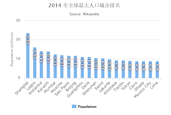
Highcharts 标签旋转柱形图
以下实例演示了标签旋转柱形图。
我们在前面的章节已经了解了 Highcharts 基本配置语法。接下来让我们来看下其他的配置。在 dataLabels 中添加 rotation 属性:
配置
dataLabels : 数据标签
dataLabels 定义图上是否显示数据标签。
文本旋转程度由 rotation 属性决定。我们还可以通过其他属性来定义文本标签的背景,间隔,边框等。
dataLabels = { enabled: true, rotation: -90, color: '#FFFFFF', align: 'right', format: '{point.y:.1f}', // 一个小数 y: 10, // 从上到下 10 像素 style: { fontSize: '13px', fontFamily: 'Verdana, sans-serif' } }
实例
文件名:highcharts_column_rotated.htm
<html> <head> <title>Highcharts 教程 | 菜鸟教程(runoob.com)</title> <script src="http://apps.bdimg.com/libs/jquery/2.1.4/jquery.min.js"></script> <script src="/try/demo_source/highcharts.js"></script> </head> <body> <div id="container" style="width: 550px; height: 400px; margin: 0 auto"></div> <script language="JavaScript"> $(document).ready(function() { var chart = { type: 'column' }; var title = { text: '2014 年全球最大人口城市排名' }; var subtitle = { text: 'Source: <a href="http://en.wikipedia.org/wiki/List_of_cities_proper_by_population">Wikipedia</a>' }; var xAxis = { type: 'category', labels: { rotation: -45, style: { fontSize: '13px', fontFamily: 'Verdana, sans-serif' } } }; var yAxis ={ min: 0, title: { text: 'Population (millions)' } }; var tooltip = { pointFormat: '2008 年人口: <b>{point.y:.1f} 百万</b>' }; var credits = { enabled: false }; var series= [{ name: 'Population', data: [ ['Shanghai', 23.7], ['Lagos', 16.1], ['Instanbul', 14.2], ['Karachi', 14.0], ['Mumbai', 12.5], ['Moscow', 12.1], ['Sao Paulo', 11.8], ['Beijing', 11.7], ['Guangzhou', 11.1], ['Delhi', 11.1], ['Shenzhen', 10.5], ['Seoul', 10.4], ['Jakarta', 10.0], ['Kinshasa', 9.3], ['Tianjin', 9.3], ['Tokyo', 9.0], ['Cairo', 8.9], ['Dhaka', 8.9], ['Mexico City', 8.9], ['Lima', 8.9] ], dataLabels: { enabled: true, rotation: -90, color: '#FFFFFF', align: 'right', format: '{point.y:.1f}', // one decimal y: 10, // 10 pixels down from the top style: { fontSize: '13px', fontFamily: 'Verdana, sans-serif' } } }]; var json = {}; json.chart = chart; json.title = title; json.subtitle = subtitle; json.xAxis = xAxis; json.yAxis = yAxis; json.tooltip = tooltip; json.credits = credits; json.series = series; $('#container').highcharts(json); }); </script> </body> </html>
以上实例输出结果为:
Highcharts 堆叠组柱形图
以下实例演示了堆叠组柱形图。
我们在前面的章节已经了解了 Highcharts 基本配置语法。接下来让我们来看下其他的配置。在 drilldown 中添加 series 属性:
配置
drilldown:向下钻取
drilldown 用于向下钻取数据,深入到其中的具体数据。
drilldown: { series: drilldownSeries }
实例
文件名:highcharts_column_drilldown.htm
<html> <head> <title>Highcharts 教程 | 菜鸟教程(runoob.com)</title> <script src="http://apps.bdimg.com/libs/jquery/2.1.4/jquery.min.js"></script> <script src="http://code.highcharts.com/highcharts.js"></script> <script src="http://code.highcharts.com/modules/drilldown.js"></script> <script src="http://code.highcharts.com/modules/data.js"></script> </head> <body> <div id="container" style="width: 550px; height: 400px; margin: 0 auto"></div> <script language="JavaScript"> $(document).ready(function() { Highcharts.data({ csv: document.getElementById('tsv').innerHTML, itemDelimiter: '\t', parsed: function (columns) { var brands = {}, brandsData = [], versions = {}, drilldownSeries = []; // Parse percentage strings columns[1] = $.map(columns[1], function (value) { if (value.indexOf('%') === value.length - 1) { value = parseFloat(value); } return value; }); $.each(columns[0], function (i, name) { var brand, version; if (i > 0) { // Remove special edition notes name = name.split(' -')[0]; // Split into brand and version version = name.match(/([0-9]+[\.0-9x]*)/); if (version) { version = version[0]; } brand = name.replace(version, ''); // Create the main data if (!brands[brand]) { brands[brand] = columns[1][i]; } else { brands[brand] += columns[1][i]; } // Create the version data if (version !== null) { if (!versions[brand]) { versions[brand] = []; } versions[brand].push(['v' + version, columns[1][i]]); } } }); $.each(brands, function (name, y) { brandsData.push({ name: name, y: y, drilldown: versions[name] ? name : null }); }); $.each(versions, function (key, value) { drilldownSeries.push({ name: key, id: key, data: value }); }); var chart = { type: 'column' }; var title = { text: '2013 年 11 月份 浏览器市场占有率' }; var subtitle = { text: '点击条形图查看具体月份 Source: runoob.com.' }; var xAxis = { type: 'category' }; var yAxis ={ title: { text: '市场占有率百分比' } }; var tooltip = { headerFormat: '<span style="font-size:11px">{series.name}</span><br>', pointFormat: '<span style="color:{point.color}">{point.name}</span>: <b>{point.y:.2f}%</b> of total<br/>' }; var credits = { enabled: false }; var series= [{ name: 'Brands', colorByPoint: true, data: brandsData }]; var drilldown= { series: drilldownSeries } var json = {}; json.chart = chart; json.title = title; json.subtitle = subtitle; json.xAxis = xAxis; json.yAxis = yAxis; json.tooltip = tooltip; json.credits = credits; json.series = series; json.drilldown = drilldown; $('#container').highcharts(json); } }); }); </script> <!-- 去掉 pre 前面的空格 --> < pre id="tsv" style="display:none">
Browser Version Total Market Share
Microsoft Internet Explorer 8.0 26.61%
Microsoft Internet Explorer 9.0 16.96%
Chrome 18.0 8.01%
Chrome 19.0 7.73%
Firefox 12 6.72%
Microsoft Internet Explorer 6.0 6.40%
Firefox 11 4.72%
Microsoft Internet Explorer 7.0 3.55%
Safari 5.1 3.53%
Firefox 13 2.16%
Firefox 3.6 1.87%
Opera 11.x 1.30%
Chrome 17.0 1.13%
Firefox 10 0.90%
Safari 5.0 0.85%
Firefox 9.0 0.65%
Firefox 8.0 0.55%
Firefox 4.0 0.50%
Chrome 16.0 0.45%
Firefox 3.0 0.36%
Firefox 3.5 0.36%
Firefox 6.0 0.32%
Firefox 5.0 0.31%
Firefox 7.0 0.29%
Proprietary or Undetectable 0.29%
Chrome 18.0 - Maxthon Edition 0.26%
Chrome 14.0 0.25%
Chrome 20.0 0.24%
Chrome 15.0 0.18%
Chrome 12.0 0.16%
Opera 12.x 0.15%
Safari 4.0 0.14%
Chrome 13.0 0.13%
Safari 4.1 0.12%
Chrome 11.0 0.10%
Firefox 14 0.10%
Firefox 2.0 0.09%
Chrome 10.0 0.09%
Opera 10.x 0.09%
Microsoft Internet Explorer 8.0 - Tencent Traveler Edition 0.09%
< /pre><!-- 去掉 pre 前面的空格 --> </body> </html>
以上实例输出结果为:
Highcharts 固定布局柱形图
以下实例演示了固定布局柱形图。
我们在前面的章节已经了解了 Highcharts 基本配置语法。接下来让我们来看下其他的配置。在 series 下添加 pointPlacement 和 pointPadding 配置。
series.pointPadding
控制每列之间的距离值,当highcharts图表宽度固定的情况下,此值越大,柱子宽度越小,反之相反。默认此值为0.1
series.pointPlacement
在柱形图中,当 pointPlacement 设置为 "on" 时, X轴上的点没有间隔。如果 pointPlacement 设置为 "between", 列之间按刻度进行布局。
在 Highcharts 3.0.2 后的版本, pointPlacement 可以支持数字,0 为轴上的值, -0.5 为当前值与前面一个值的间隔, 0.5 为 当前值与下一个值的间隔。 不同与文字设置选项,数字设置不影响轴之间的间隔。
series: { name: 'Employees', color: 'rgba(165,170,217,1)', data: [150, 73, 20], pointPadding: 0.3, pointPlacement: -0.2 }
实例
文件名:highcharts_column_fixed.htm
<html> <head> <title>Highcharts 教程 | 菜鸟教程(runoob.com)</title> <script src="http://apps.bdimg.com/libs/jquery/2.1.4/jquery.min.js"></script> <script src="http://code.highcharts.com/highcharts.js"></script> </head> <body> <div id="container" style="width: 550px; height: 400px; margin: 0 auto"></div> <script language="JavaScript"> $(document).ready(function() { var chart = { type: 'column' }; var title = { text: 'Efficiency Optimization by Branch' }; var xAxis = { categories: ['Seattle HQ', 'San Francisco', 'Tokyo'] }; var yAxis = [{ min: 0, title: { text: 'Employees' } }, { title: { text: 'Profit (millions)' }, opposite: true }]; var legend = { shadow: false }; var tooltip = { shared: true }; var credits = { enabled: false }; var plotOptions = { column: { grouping: false, shadow: false, borderWidth: 0 } }; var series= [{ name: 'Employees', color: 'rgba(165,170,217,1)', data: [150, 73, 20], pointPadding: 0.3, pointPlacement: -0.2 }, { name: 'Employees Optimized', color: 'rgba(126,86,134,.9)', data: [140, 90, 40], pointPadding: 0.4, pointPlacement: -0.2 }, { name: 'Profit', color: 'rgba(248,161,63,1)', data: [183.6, 178.8, 198.5], tooltip: { valuePrefix: '$', valueSuffix: ' M' }, pointPadding: 0.3, pointPlacement: 0.2, yAxis: 1 }, { name: 'Profit Optimized', color: 'rgba(186,60,61,.9)', data: [203.6, 198.8, 208.5], tooltip: { valuePrefix: '$', valueSuffix: ' M' }, pointPadding: 0.4, pointPlacement: 0.2, yAxis: 1 }]; var json = {}; json.chart = chart; json.title = title; json.xAxis = xAxis; json.yAxis = yAxis; json.credits = credits; json.legend = legend; json.tooltip = tooltip; json.plotOptions = plotOptions; json.series = series; $('#container').highcharts(json); }); </script> </body> </html>
以上实例输出结果为:
Highcharts 使用 HTML 表格数据的柱形图
以下实例演示了使用 HTML 表格数据的柱形图。
我们在前面的章节已经了解了 Highcharts 基本配置语法。接下来让我们来看下其他的配置。在 data 下添加 table 配置。
data
数据模块提供了一些简单的接口用于添加数据,我们可以使用例如 CVS, HTML 表格或者网格视图中的数据。
data.table
Html 表格中设置id,并对应参数 data.table 即能解析数据。相关设置选项有 startRow, endRow, startColumn 和 endColumn 。
data: { table: 'dataTable' }
实例
文件名:highcharts_column_table.htm
<html> <head> <title>Highcharts 教程 | 菜鸟教程(runoob.com)</title> <script src="http://apps.bdimg.com/libs/jquery/2.1.4/jquery.min.js"></script> <script src="http://code.highcharts.com/highcharts.js"></script> <script src="http://code.highcharts.com/modules/data.js"></script> </head> <body> <div id="container" style="width: 550px; height: 400px; margin: 0 auto"></div> <script language="JavaScript"> $(document).ready(function() { var data = { table: 'datatable' }; var chart = { type: 'column' }; var title = { text: '从网页中的 HTML 表格中读取数据' }; var yAxis = { allowDecimals: false, title: { text: 'Units' } }; var tooltip = { formatter: function () { return '<b>' + this.series.name + '</b><br/>' + this.point.y + ' ' + this.point.name.toLowerCase(); } }; var credits = { enabled: false }; var json = {}; json.chart = chart; json.title = title; json.data = data; json.yAxis = yAxis; json.credits = credits; json.tooltip = tooltip; $('#container').highcharts(json); }); </script> <table id="datatable"> <thead> <tr><th></th><th>Jane</th><th>John</th></tr> </thead> <tbody> <tr><th>Apples</th><td>3</td><td>4</td></tr> <tr><th>Pears</th><td>2</td><td>0</td></tr> <tr><th>Plums</th><td>5</td><td>11</td></tr> <tr><th>Bananas</th><td>1</td><td>1</td></tr> <tr><th>Oranges</th><td>2</td><td>4</td></tr> </tbody> </table> </body> </html>
以上实例输出结果为:
Highcharts 区间柱形图
以下实例演示了区间柱形图。
我们在前面的章节已经了解了 Highcharts 基本配置语法。接下来让我们来看下其他的配置。
chart 配置
配置 chart 的 type 为 'columnrange' 。chart.type 描述了图表类型。默认值为 "line"。
var chart = { type: 'columnrange', inverted: true };
实例
文件名:highcharts_column_range.htm
<html> <head> <title>Highcharts 教程 | 菜鸟教程(runoob.com)</title> <script src="http://apps.bdimg.com/libs/jquery/2.1.4/jquery.min.js"></script> <script src="http://code.highcharts.com/highcharts.js"></script> <script src="http://code.highcharts.com/highcharts-more.js"></script> </head> <body> <div id="container" style="width: 550px; height: 400px; margin: 0 auto"></div> <script language="JavaScript"> $(document).ready(function() { var chart = { type: 'columnrange', inverted:true }; var title = { text: 'Temperature variation by month' }; var subtitle = { text: 'Observed in Vik i Sogn, Norway, 2009' }; var xAxis = { categories: ['Jan','Feb','Mar','Apr','May','Jun','Jul','Aug','Sep','Oct','Nov','Dec'] }; var yAxis = { title: { text: 'Temperature ( \xB0C )' } }; var tooltip = { headerFormat: '<span style="font-size:10px">{point.key}</span><table>', pointFormat: '<tr><td style="color:{series.color};padding:0">{series.name}: </td>' + '<td style="padding:0"><b>{point.y:.1f} mm</b></td></tr>', footerFormat: '</table>', shared: true, useHTML: true }; var plotOptions = { columnrange: { dataLabels: { enabled: true, formatter: function () { return this.y + '\xB0C'; } } } }; var credits = { enabled: false }; var series= [{ name: 'Temperatures', data: [ [-9.7, 9.4], [-8.7, 6.5], [-3.5, 9.4], [-1.4, 19.9], [0.0, 22.6], [2.9, 29.5], [9.2, 30.7], [7.3, 26.5], [4.4, 18.0], [-3.1, 11.4], [-5.2, 10.4], [-13.5, 9.8] ] }]; var json = {}; json.chart = chart; json.title = title; json.subtitle = subtitle; json.tooltip = tooltip; json.xAxis = xAxis; json.yAxis = yAxis; json.series = series; json.plotOptions = plotOptions; json.credits = credits; $('#container').highcharts(json); }); </script> </body> </html>
以上实例输出结果为:
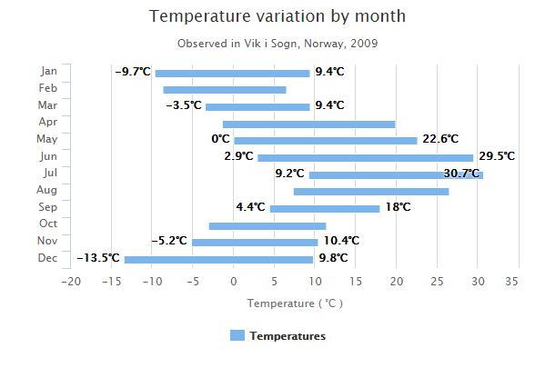
Highcharts 饼图
Highcharts 基本饼图
以下实例演示了基本饼图。
我们在前面的章节已经了解了 Highcharts 基本配置语法。接下来让我们来看下其他的配置。
配置
series 配置
设置 series 的 type 属性为 pie ,series.type 描述了数据列类型。默认值为 "line"。
var series = { type: 'pie' };
实例
文件名:highcharts_pie_basic.htm
<html> <head> <title>Highcharts 教程 | 菜鸟教程(runoob.com)</title> <script src="http://apps.bdimg.com/libs/jquery/2.1.4/jquery.min.js"></script> <script src="/try/demo_source/highcharts.js"></script> </head> <body> <div id="container" style="width: 550px; height: 400px; margin: 0 auto"></div> <script language="JavaScript"> $(document).ready(function() { var chart = { plotBackgroundColor: null, plotBorderWidth: null, plotShadow: false }; var title = { text: '2014 年各浏览器市场占有比例' }; var tooltip = { pointFormat: '{series.name}: <b>{point.percentage:.1f}%</b>' }; var plotOptions = { pie: { allowPointSelect: true, cursor: 'pointer', dataLabels: { enabled: true, format: '<b>{point.name}%</b>: {point.percentage:.1f} %', style: { color: (Highcharts.theme && Highcharts.theme.contrastTextColor) || 'black' } } } }; var series= [{ type: 'pie', name: 'Browser share', data: [ ['Firefox', 45.0], ['IE', 26.8], { name: 'Chrome', y: 12.8, sliced: true, selected: true }, ['Safari', 8.5], ['Opera', 6.2], ['Others', 0.7] ] }]; var json = {}; json.chart = chart; json.title = title; json.tooltip = tooltip; json.series = series; json.plotOptions = plotOptions; $('#container').highcharts(json); }); </script> </body> </html>
以上实例输出结果为:
Highcharts 显示图例饼图
以下实例演示了显示图例饼图。
我们在前面的章节已经了解了 Highcharts 基本配置语法。接下来让我们来看下其他的配置。
配置
series 配置
设置 series 的 type 属性为 pie ,series.type 描述了数据列类型。默认值为 "line"。
var series = { type: 'pie' };
plotOptions
plotOptions 使用 plotOptions.pie.showInLegend 属性来设置是否显示图例。
var plotOptions = { pie: { allowPointSelect: true, cursor: 'pointer', dataLabels: { enabled: false }, showInLegend: true } };
实例
文件名:highcharts_pie_legends.htm
<html> <head> <title>Highcharts 教程 | 菜鸟教程(runoob.com)</title> <script src="http://apps.bdimg.com/libs/jquery/2.1.4/jquery.min.js"></script> <script src="/try/demo_source/highcharts.js"></script> </head> <body> <div id="container" style="width: 550px; height: 400px; margin: 0 auto"></div> <script language="JavaScript"> $(document).ready(function() { var chart = { plotBackgroundColor: null, plotBorderWidth: null, plotShadow: false }; var title = { text: 'Browser market shares at a specific website, 2014' }; var tooltip = { pointFormat: '{series.name}: <b>{point.percentage:.1f}%</b>' }; var plotOptions = { pie: { allowPointSelect: true, cursor: 'pointer', dataLabels: { enabled: false }, showInLegend: true } }; var series= [{ type: 'pie', name: 'Browser share', data: [ ['Firefox', 45.0], ['IE', 26.8], { name: 'Chrome', y: 12.8, sliced: true, selected: true }, ['Safari', 8.5], ['Opera', 6.2], ['Others', 0.7] ] }]; var json = {}; json.chart = chart; json.title = title; json.tooltip = tooltip; json.series = series; json.plotOptions = plotOptions; $('#container').highcharts(json); }); </script> </body> </html>
以上实例输出结果为:
Highcharts 圆环图
以下实例演示了圆环图。
我们在前面的章节已经了解了 Highcharts 基本配置语法。接下来让我们来看下其他的配置。
配置
chart 配置
设置 chart 的 type 属性为 pie chart.type 描述了图表类型。默认值为 "line"。
var chart = { type: 'pie' };
实例
文件名:highcharts_pie_donut.htm
<html> <head> <title>Highcharts 教程 | 菜鸟教程(runoob.com)</title> <script src="http://apps.bdimg.com/libs/jquery/2.1.4/jquery.min.js"></script> <script src="/try/demo_source/highcharts.js"></script> </head> <body> <div id="container" style="width: 550px; height: 400px; margin: 0 auto"></div> <script language="JavaScript"> $(document).ready(function() { var colors = Highcharts.getOptions().colors; var categories = ['MSIE', 'Firefox', 'Chrome', 'Safari', 'Opera']; var data = [{ y: 55.11, color: colors[0], drilldown: { name: 'MSIE versions', categories: ['MSIE 6.0', 'MSIE 7.0', 'MSIE 8.0', 'MSIE 9.0'], data: [10.85, 7.35, 33.06, 2.81], color: colors[0] } }, { y: 21.63, color: colors[1], drilldown: { name: 'Firefox versions', categories: ['Firefox 2.0', 'Firefox 3.0', 'Firefox 3.5', 'Firefox 3.6', 'Firefox 4.0'], data: [0.20, 0.83, 1.58, 13.12, 5.43], color: colors[1] } }, { y: 11.94, color: colors[2], drilldown: { name: 'Chrome versions', categories: ['Chrome 5.0', 'Chrome 6.0', 'Chrome 7.0', 'Chrome 8.0', 'Chrome 9.0', 'Chrome 10.0', 'Chrome 11.0', 'Chrome 12.0'], data: [0.12, 0.19, 0.12, 0.36, 0.32, 9.91, 0.50, 0.22], color: colors[2] } }, { y: 7.15, color: colors[3], drilldown: { name: 'Safari versions', categories: ['Safari 5.0', 'Safari 4.0', 'Safari Win 5.0', 'Safari 4.1', 'Safari/Maxthon', 'Safari 3.1', 'Safari 4.1'], data: [4.55, 1.42, 0.23, 0.21, 0.20, 0.19, 0.14], color: colors[3] } }, { y: 2.14, color: colors[4], drilldown: { name: 'Opera versions', categories: ['Opera 9.x', 'Opera 10.x', 'Opera 11.x'], data: [ 0.12, 0.37, 1.65], color: colors[4] } }]; var browserData = []; var versionsData = []; var i, j; var dataLen = data.length; var drillDataLen; var brightness; // Build the data arrays for (i = 0; i < dataLen; i += 1) { // add browser data browserData.push({ name: categories[i], y: data[i].y, color: data[i].color }); // add version data drillDataLen = data[i].drilldown.data.length; for (j = 0; j < drillDataLen; j += 1) { brightness = 0.2 - (j / drillDataLen) / 5; versionsData.push({ name: data[i].drilldown.categories[j], y: data[i].drilldown.data[j], color: Highcharts.Color(data[i].color).brighten(brightness).get() }); } } var chart = { type: pie }; var title = { text: 'Browser market share, April, 2011' }; var yAxis = { title: { text: 'Total percent market share' } }; var tooltip = { valueSuffix: '%' }; var plotOptions = { pie: { shadow: false, center: ['50%', '50%'] } }; var series= [{ name: 'Browsers', data: browserData, size: '60%', dataLabels: { formatter: function () { return this.y > 5 ? this.point.name : null; }, color: 'white', distance: -30 } }, { name: 'Versions', data: versionsData, size: '80%', innerSize: '60%', dataLabels: { formatter: function () { // display only if larger than 1 return this.y > 1 ? '' + this.point.name + ': ' + this.y + '%' : null; } } } ]; var json = {}; json.chart = chart; json.title = title; json.yAxis = yAxis; json.tooltip = tooltip; json.series = series; json.plotOptions = plotOptions; $('#container').highcharts(json); }); </script> </body> </html>
以上实例输出结果为:
Highcharts 半圈圆环图
以下实例演示了半圈圆环图。
我们在前面的章节已经了解了 Highcharts 基本配置语法。接下来让我们来看下其他的配置。
配置
series 配置
设置 series 的 type 属性为 pie series.type 描述了数据列类型。默认值为 "line"。配置饼图大小使用 innerSize 属性并设置为innerSize: '50%'。
var series = { type: 'pie', innerSize: '50%' };
实例
文件名:highcharts_pie_semicircle_donut.htm
<html> <head> <title>Highcharts 教程 | 菜鸟教程(runoob.com)</title> <script src="http://apps.bdimg.com/libs/jquery/2.1.4/jquery.min.js"></script> <script src="/try/demo_source/highcharts.js"></script> </head> <body> <div id="container" style="width: 550px; height: 400px; margin: 0 auto"></div> <script language="JavaScript"> $(document).ready(function() { var chart = { plotBackgroundColor: null, plotBorderWidth: 0, plotShadow: false }; var title = { text: 'Browser<br>shares', align: 'center', verticalAlign: 'middle', y: 50 }; var tooltip = { pointFormat: '{series.name}: <b>{point.percentage:.1f}%</b>' }; var plotOptions = { pie: { dataLabels: { enabled: true, distance: -50, style: { fontWeight: 'bold', color: 'white', textShadow: '0px 1px 2px black' } }, startAngle: -90, endAngle: 90, center: ['50%', '75%'] } }; var series= [{ type: 'pie', name: 'Browser share', innerSize: '50%', data: [ ['Firefox', 45.0], ['IE', 26.8], ['Chrome', 12.8], ['Safari', 8.5], ['Opera', 6.2], { name: 'Others', y: 0.7, dataLabels: { enabled: false } } ] }]; var json = {}; json.chart = chart; json.title = title; json.tooltip = tooltip; json.series = series; json.plotOptions = plotOptions; $('#container').highcharts(json); }); </script> </body> </html>
以上实例输出结果为:
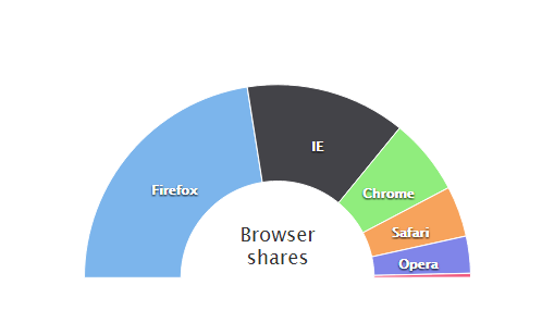
Highcharts 向下钻取饼图
以下实例演示了向下钻取饼图。
我们在前面的章节已经了解了 Highcharts 基本配置语法。接下来让我们来看下其他的配置。
配置
drilldown 配置
drilldown 用于向下钻取数据,通过点击某项深入到其中的具体数据。
drilldown: { series: drilldownSeries }
实例
文件名:highcharts_pie_drilldown.htm
<html> <head> <title>Highcharts 教程 | 菜鸟教程(runoob.com)</title> <script src="http://apps.bdimg.com/libs/jquery/2.1.4/jquery.min.js"></script> <script src="/try/demo_source/highcharts.js"></script> <script src="http://code.highcharts.com/modules/drilldown.js"></script> <script src="http://code.highcharts.com/modules/data.js"></script> </head> <body> <div id="container" style="width: 550px; height: 400px; margin: 0 auto"></div> <script language="JavaScript"> $(document).ready(function() { Highcharts.data({ csv: document.getElementById('tsv').innerHTML, itemDelimiter: '\t', parsed: function (columns) { var brands = {}, brandsData = [], versions = {}, drilldownSeries = []; // Parse percentage strings columns[1] = $.map(columns[1], function (value) { if (value.indexOf('%') === value.length - 1) { value = parseFloat(value); } return value; }); $.each(columns[0], function (i, name) { var brand, version; if (i > 0) { // Remove special edition notes name = name.split(' -')[0]; // Split into brand and version version = name.match(/([0-9]+[\.0-9x]*)/); if (version) { version = version[0]; } brand = name.replace(version, ''); // Create the main data if (!brands[brand]) { brands[brand] = columns[1][i]; } else { brands[brand] += columns[1][i]; } // Create the version data if (version !== null) { if (!versions[brand]) { versions[brand] = []; } versions[brand].push(['v' + version, columns[1][i]]); } } }); $.each(brands, function (name, y) { brandsData.push({ name: name, y: y, drilldown: versions[name] ? name : null }); }); $.each(versions, function (key, value) { drilldownSeries.push({ name: key, id: key, data: value }); }); var chart = { type: 'pie' }; var title = { text: 'Browser market shares. November, 2013' }; var subtitle = { text: 'Click the slices to view versions. Source: netmarketshare.com.' }; var xAxis = { type: 'category' }; var yAxis ={ title: { text: 'Total percent market share' } }; var tooltip = { headerFormat: '<span style="font-size:11px">{series.name}</span><br>', pointFormat: '<span style="color:{point.color}">{point.name}</span>: <b>{point.y:.2f}%</b> of total<br/>' }; var credits = { enabled: false }; var series= [{ name: 'Brands', colorByPoint: true, data: brandsData }]; var drilldown= { series: drilldownSeries } var json = {}; json.chart = chart; json.title = title; json.subtitle = subtitle; json.xAxis = xAxis; json.yAxis = yAxis; json.tooltip = tooltip; json.credits = credits; json.series = series; json.drilldown = drilldown; $('#container').highcharts(json); } }); }); </script> <!-- Data from www.netmarketshare.com. Select Browsers => Desktop share by version. Download as tsv. --> <pre id="tsv" style="display:none"> Browser Version Total Market Share
Microsoft Internet Explorer 8.0 26.61%
Microsoft Internet Explorer 9.0 16.96%
Chrome 18.0 8.01%
Chrome 19.0 7.73%
Firefox 12 6.72%
Microsoft Internet Explorer 6.0 6.40%
Firefox 11 4.72%
Microsoft Internet Explorer 7.0 3.55%
Safari 5.1 3.53%
Firefox 13 2.16%
Firefox 3.6 1.87%
Opera 11.x 1.30%
Chrome 17.0 1.13%
Firefox 10 0.90%
Safari 5.0 0.85%
Firefox 9.0 0.65%
Firefox 8.0 0.55%
Firefox 4.0 0.50%
Chrome 16.0 0.45%
Firefox 3.0 0.36%
Firefox 3.5 0.36%
Firefox 6.0 0.32%
Firefox 5.0 0.31%
Firefox 7.0 0.29%
Proprietary or Undetectable 0.29%
Chrome 18.0 - Maxthon Edition 0.26%
Chrome 14.0 0.25%
Chrome 20.0 0.24%
Chrome 15.0 0.18%
Chrome 12.0 0.16%
Opera 12.x 0.15%
Safari 4.0 0.14%
Chrome 13.0 0.13%
Safari 4.1 0.12%
Chrome 11.0 0.10%
Firefox 14 0.10%
Firefox 2.0 0.09%
Chrome 10.0 0.09%
Opera 10.x 0.09%
Microsoft Internet Explorer 8.0 - Tencent Traveler Edition 0.09%
Highcharts 渐变饼图
以下实例演示了渐变饼图。
我们在前面的章节已经了解了 Highcharts 基本配置语法。接下来让我们来看下其他的配置。
配置
colors 配置
使用 Highcharts.getOptions().colors 属性来配置颜色。
//颜色的填充 Highcharts.getOptions().colors = Highcharts.map(Highcharts.getOptions().colors, function (color) { return { radialGradient: { cx: 0.5, cy: 0.3, r: 0.7 }, stops: [ [0, color], [1, Highcharts.Color(color).brighten(-0.3).get('rgb')] // darken ] }; });
实例
文件名:highcharts_pie_gradient.htm
<html> <head> <title>Highcharts 教程 | 菜鸟教程(runoob.com)</title> <script src="http://apps.bdimg.com/libs/jquery/2.1.4/jquery.min.js"></script> <script src="/try/demo_source/highcharts.js"></script> </head> <body> <div id="container" style="width: 550px; height: 400px; margin: 0 auto"></div> <script language="JavaScript"> $(document).ready(function() { var chart = { plotBackgroundColor: null, plotBorderWidth: null, plotShadow: false }; var title = { text: 'Browser market shares at a specific website, 2014' }; var tooltip = { pointFormat: '{series.name}: <b>{point.percentage:.1f}%</b>' }; var plotOptions = { pie: { allowPointSelect: true, cursor: 'pointer', dataLabels: { enabled: true, format: '<b>{point.name}%</b>: {point.percentage:.1f} %', style: { color: (Highcharts.theme && Highcharts.theme.contrastTextColor) || 'black' } } } }; var series= [{ type: 'pie', name: 'Browser share', data: [ ['Firefox', 45.0], ['IE', 26.8], { name: 'Chrome', y: 12.8, sliced: true, selected: true }, ['Safari', 8.5], ['Opera', 6.2], ['Others', 0.7] ] }]; // Radialize the colors Highcharts.getOptions().colors = Highcharts.map(Highcharts.getOptions().colors, function (color) { return { radialGradient: { cx: 0.5, cy: 0.3, r: 0.7 }, stops: [ [0, color], [1, Highcharts.Color(color).brighten(-0.3).get('rgb')] // darken ] }; }); var json = {}; json.chart = chart; json.title = title; json.tooltip = tooltip; json.series = series; json.plotOptions = plotOptions; $('#container').highcharts(json); }); </script> </body> </html>
以上实例输出结果为:
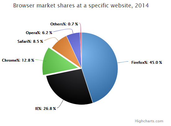
Highcharts 单色饼图
以下实例演示了单色饼图。
我们在前面的章节已经了解了 Highcharts 基本配置语法。接下来让我们来看下其他的配置。
配置
colors 配置
使用 Highcharts.getOptions().plotOptions.pie.colors 属性来配置每个饼的颜色。
// 设置单色并为所有饼设置默认主题 Highcharts.getOptions().plotOptions.pie.colors = (function () { var colors = []; var base = Highcharts.getOptions().colors[0]; var i; for (i = 0; i < 10; i += 1) { // 以一暗色开始并以亮色结束 colors.push(Highcharts.Color(base).brighten((i - 3) / 7).get()); } return colors; }());
实例
文件名:highcharts_pie_monochrome.htm
<html> <head> <title>Highcharts 教程 | 菜鸟教程(runoob.com)</title> <script src="http://apps.bdimg.com/libs/jquery/2.1.4/jquery.min.js"></script> <script src="/try/demo_source/highcharts.js"></script> </head> <body> <div id="container" style="width: 550px; height: 400px; margin: 0 auto"></div> <script language="JavaScript"> $(document).ready(function() { var chart = { plotBackgroundColor: null, plotBorderWidth: null, plotShadow: false }; var title = { text: 'Browser market shares at a specific website, 2014' }; var tooltip = { pointFormat: '{series.name}: <b>{point.percentage:.1f}%</b>' }; var plotOptions = { pie: { allowPointSelect: true, cursor: 'pointer', dataLabels: { enabled: true, format: '<b>{point.name}%</b>: {point.percentage:.1f} %', style: { color: (Highcharts.theme && Highcharts.theme.contrastTextColor) || 'black' } } } }; var series= [{ type: 'pie', name: 'Browser share', data: [ ['Firefox', 45.0], ['IE', 26.8], { name: 'Chrome', y: 12.8, sliced: true, selected: true }, ['Safari', 8.5], ['Opera', 6.2], ['Others', 0.7] ] }]; // Make monochrome colors and set them as default for all pies Highcharts.getOptions().plotOptions.pie.colors = (function () { var colors = []; var base = Highcharts.getOptions().colors[0]; var i; for (i = 0; i < 10; i += 1) { // Start out with a darkened base color (negative brighten), and end // up with a much brighter color colors.push(Highcharts.Color(base).brighten((i - 3) / 7).get()); } return colors; }()); var json = {}; json.chart = chart; json.title = title; json.tooltip = tooltip; json.series = series; json.plotOptions = plotOptions; $('#container').highcharts(json); }); </script> </body> </html>
以上实例输出结果为:
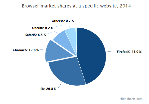
Highcharts 散点图
本章节我们将为大家介绍 Highcharts 的散点图。
我们在前面的章节已经了解了 Highcharts 配置语法。接下来让我们来看下 Highcharts 的其他配置。
配置
chart 配置
配置 chart 的 type 为 'scatter' 。chart.type 描述了图表类型。默认值为 "line"。
chart.zoomType 属性可配置图表放大 ,通过拖动鼠标进行缩放,沿x轴或y轴进行缩放,可以设置为:'x','y','xy'。
var chart = {
type: 'scatter',
zoomType: 'xy'
};
实例
文件名:highcharts_scatter_basic.htm
<html>
<head>
<title>Highcharts 教程 | 菜鸟教程(runoob.com)</title>
<script src="http://apps.bdimg.com/libs/jquery/2.1.4/jquery.min.js"></script>
<script src="/try/demo_source/highcharts.js"></script>
</head>
<body>
<div id="container" style="width: 550px; height: 400px; margin: 0 auto"></div>
<script language="JavaScript">
$(document).ready(function() {
var chart = {
type: 'scatter',
zoomType: 'xy'
};
var title = {
text: 'Height Versus Weight of 507 Individuals by Gender'
};
var subtitle = {
text: 'Source: Heinz 2003'
};
var xAxis = {
title: {
enabled: true,
text: 'Height (cm)'
},
startOnTick: true,
endOnTick: true,
showLastLabel: true
};
var yAxis = {
title: {
text: 'Weight (kg)'
}
};
var legend = {
layout: 'vertical',
align: 'left',
verticalAlign: 'top',
x: 100,
y: 70,
floating: true,
backgroundColor: (Highcharts.theme && Highcharts.theme.legendBackgroundColor) || '#FFFFFF',
borderWidth: 1
}
var plotOptions = {
scatter: {
marker: {
radius: 5,
states: {
hover: {
enabled: true,
lineColor: 'rgb(100,100,100)'
}
}
},
states: {
hover: {
marker: {
enabled: false
}
}
},
tooltip: {
headerFormat: '<b>{series.name}</b><br>',
pointFormat: '{point.x} cm, {point.y} kg'
}
}
};
var series= [{
name: 'Female',
color: 'rgba(223, 83, 83, .5)',
data: [[161.2, 51.6], [167.5, 59.0], [159.5, 49.2], [157.0, 63.0], [155.8, 53.6],
[170.0, 59.0], [159.1, 47.6], [166.0, 69.8], [176.2, 66.8], [160.2, 75.2],
[172.5, 55.2], [170.9, 54.2], [172.9, 62.5], [153.4, 42.0], [160.0, 50.0],
[147.2, 49.8], [168.2, 49.2], [175.0, 73.2], [157.0, 47.8], [167.6, 68.8],
[159.5, 50.6], [175.0, 82.5], [166.8, 57.2], [176.5, 87.8], [170.2, 72.8],
[174.0, 54.5], [173.0, 59.8], [179.9, 67.3], [170.5, 67.8], [160.0, 47.0],
[154.4, 46.2], [162.0, 55.0], [176.5, 83.0], [160.0, 54.4], [152.0, 45.8],
[162.1, 53.6], [170.0, 73.2], [160.2, 52.1], [161.3, 67.9], [166.4, 56.6],
[168.9, 62.3], [163.8, 58.5], [167.6, 54.5], [160.0, 50.2], [161.3, 60.3],
[167.6, 58.3], [165.1, 56.2], [160.0, 50.2], [170.0, 72.9], [157.5, 59.8],
[167.6, 61.0], [160.7, 69.1], [163.2, 55.9], [152.4, 46.5], [157.5, 54.3],
[168.3, 54.8], [180.3, 60.7], [165.5, 60.0], [165.0, 62.0], [164.5, 60.3],
[156.0, 52.7], [160.0, 74.3], [163.0, 62.0], [165.7, 73.1], [161.0, 80.0],
[162.0, 54.7], [166.0, 53.2], [174.0, 75.7], [172.7, 61.1], [167.6, 55.7],
[151.1, 48.7], [164.5, 52.3], [163.5, 50.0], [152.0, 59.3], [169.0, 62.5],
[164.0, 55.7], [161.2, 54.8], [155.0, 45.9], [170.0, 70.6], [176.2, 67.2],
[170.0, 69.4], [162.5, 58.2], [170.3, 64.8], [164.1, 71.6], [169.5, 52.8],
[163.2, 59.8], [154.5, 49.0], [159.8, 50.0], [173.2, 69.2], [170.0, 55.9],
[161.4, 63.4], [169.0, 58.2], [166.2, 58.6], [159.4, 45.7], [162.5, 52.2],
[159.0, 48.6], [162.8, 57.8], [159.0, 55.6], [179.8, 66.8], [162.9, 59.4],
[161.0, 53.6], [151.1, 73.2], [168.2, 53.4], [168.9, 69.0], [173.2, 58.4],
[171.8, 56.2], [178.0, 70.6], [164.3, 59.8], [163.0, 72.0], [168.5, 65.2],
[166.8, 56.6], [172.7, 105.2], [163.5, 51.8], [169.4, 63.4], [167.8, 59.0],
[159.5, 47.6], [167.6, 63.0], [161.2, 55.2], [160.0, 45.0], [163.2, 54.0],
[162.2, 50.2], [161.3, 60.2], [149.5, 44.8], [157.5, 58.8], [163.2, 56.4],
[172.7, 62.0], [155.0, 49.2], [156.5, 67.2], [164.0, 53.8], [160.9, 54.4],
[162.8, 58.0], [167.0, 59.8], [160.0, 54.8], [160.0, 43.2], [168.9, 60.5],
[158.2, 46.4], [156.0, 64.4], [160.0, 48.8], [167.1, 62.2], [158.0, 55.5],
[167.6, 57.8], [156.0, 54.6], [162.1, 59.2], [173.4, 52.7], [159.8, 53.2],
[170.5, 64.5], [159.2, 51.8], [157.5, 56.0], [161.3, 63.6], [162.6, 63.2],
[160.0, 59.5], [168.9, 56.8], [165.1, 64.1], [162.6, 50.0], [165.1, 72.3],
[166.4, 55.0], [160.0, 55.9], [152.4, 60.4], [170.2, 69.1], [162.6, 84.5],
[170.2, 55.9], [158.8, 55.5], [172.7, 69.5], [167.6, 76.4], [162.6, 61.4],
[167.6, 65.9], [156.2, 58.6], [175.2, 66.8], [172.1, 56.6], [162.6, 58.6],
[160.0, 55.9], [165.1, 59.1], [182.9, 81.8], [166.4, 70.7], [165.1, 56.8],
[177.8, 60.0], [165.1, 58.2], [175.3, 72.7], [154.9, 54.1], [158.8, 49.1],
[172.7, 75.9], [168.9, 55.0], [161.3, 57.3], [167.6, 55.0], [165.1, 65.5],
[175.3, 65.5], [157.5, 48.6], [163.8, 58.6], [167.6, 63.6], [165.1, 55.2],
[165.1, 62.7], [168.9, 56.6], [162.6, 53.9], [164.5, 63.2], [176.5, 73.6],
[168.9, 62.0], [175.3, 63.6], [159.4, 53.2], [160.0, 53.4], [170.2, 55.0],
[162.6, 70.5], [167.6, 54.5], [162.6, 54.5], [160.7, 55.9], [160.0, 59.0],
[157.5, 63.6], [162.6, 54.5], [152.4, 47.3], [170.2, 67.7], [165.1, 80.9],
[172.7, 70.5], [165.1, 60.9], [170.2, 63.6], [170.2, 54.5], [170.2, 59.1],
[161.3, 70.5], [167.6, 52.7], [167.6, 62.7], [165.1, 86.3], [162.6, 66.4],
[152.4, 67.3], [168.9, 63.0], [170.2, 73.6], [175.2, 62.3], [175.2, 57.7],
[160.0, 55.4], [165.1, 104.1], [174.0, 55.5], [170.2, 77.3], [160.0, 80.5],
[167.6, 64.5], [167.6, 72.3], [167.6, 61.4], [154.9, 58.2], [162.6, 81.8],
[175.3, 63.6], [171.4, 53.4], [157.5, 54.5], [165.1, 53.6], [160.0, 60.0],
[174.0, 73.6], [162.6, 61.4], [174.0, 55.5], [162.6, 63.6], [161.3, 60.9],
[156.2, 60.0], [149.9, 46.8], [169.5, 57.3], [160.0, 64.1], [175.3, 63.6],
[169.5, 67.3], [160.0, 75.5], [172.7, 68.2], [162.6, 61.4], [157.5, 76.8],
[176.5, 71.8], [164.4, 55.5], [160.7, 48.6], [174.0, 66.4], [163.8, 67.3]]
}, {
name: 'Male',
color: 'rgba(119, 152, 191, .5)',
data: [[174.0, 65.6], [175.3, 71.8], [193.5, 80.7], [186.5, 72.6], [187.2, 78.8],
[181.5, 74.8], [184.0, 86.4], [184.5, 78.4], [175.0, 62.0], [184.0, 81.6],
[180.0, 76.6], [177.8, 83.6], [192.0, 90.0], [176.0, 74.6], [174.0, 71.0],
[184.0, 79.6], [192.7, 93.8], [171.5, 70.0], [173.0, 72.4], [176.0, 85.9],
[176.0, 78.8], [180.5, 77.8], [172.7, 66.2], [176.0, 86.4], [173.5, 81.8],
[178.0, 89.6], [180.3, 82.8], [180.3, 76.4], [164.5, 63.2], [173.0, 60.9],
[183.5, 74.8], [175.5, 70.0], [188.0, 72.4], [189.2, 84.1], [172.8, 69.1],
[170.0, 59.5], [182.0, 67.2], [170.0, 61.3], [177.8, 68.6], [184.2, 80.1],
[186.7, 87.8], [171.4, 84.7], [172.7, 73.4], [175.3, 72.1], [180.3, 82.6],
[182.9, 88.7], [188.0, 84.1], [177.2, 94.1], [172.1, 74.9], [167.0, 59.1],
[169.5, 75.6], [174.0, 86.2], [172.7, 75.3], [182.2, 87.1], [164.1, 55.2],
[163.0, 57.0], [171.5, 61.4], [184.2, 76.8], [174.0, 86.8], [174.0, 72.2],
[177.0, 71.6], [186.0, 84.8], [167.0, 68.2], [171.8, 66.1], [182.0, 72.0],
[167.0, 64.6], [177.8, 74.8], [164.5, 70.0], [192.0, 101.6], [175.5, 63.2],
[171.2, 79.1], [181.6, 78.9], [167.4, 67.7], [181.1, 66.0], [177.0, 68.2],
[174.5, 63.9], [177.5, 72.0], [170.5, 56.8], [182.4, 74.5], [197.1, 90.9],
[180.1, 93.0], [175.5, 80.9], [180.6, 72.7], [184.4, 68.0], [175.5, 70.9],
[180.6, 72.5], [177.0, 72.5], [177.1, 83.4], [181.6, 75.5], [176.5, 73.0],
[175.0, 70.2], [174.0, 73.4], [165.1, 70.5], [177.0, 68.9], [192.0, 102.3],
[176.5, 68.4], [169.4, 65.9], [182.1, 75.7], [179.8, 84.5], [175.3, 87.7],
[184.9, 86.4], [177.3, 73.2], [167.4, 53.9], [178.1, 72.0], [168.9, 55.5],
[157.2, 58.4], [180.3, 83.2], [170.2, 72.7], [177.8, 64.1], [172.7, 72.3],
[165.1, 65.0], [186.7, 86.4], [165.1, 65.0], [174.0, 88.6], [175.3, 84.1],
[185.4, 66.8], [177.8, 75.5], [180.3, 93.2], [180.3, 82.7], [177.8, 58.0],
[177.8, 79.5], [177.8, 78.6], [177.8, 71.8], [177.8, 116.4], [163.8, 72.2],
[188.0, 83.6], [198.1, 85.5], [175.3, 90.9], [166.4, 85.9], [190.5, 89.1],
[166.4, 75.0], [177.8, 77.7], [179.7, 86.4], [172.7, 90.9], [190.5, 73.6],
[185.4, 76.4], [168.9, 69.1], [167.6, 84.5], [175.3, 64.5], [170.2, 69.1],
[190.5, 108.6], [177.8, 86.4], [190.5, 80.9], [177.8, 87.7], [184.2, 94.5],
[176.5, 80.2], [177.8, 72.0], [180.3, 71.4], [171.4, 72.7], [172.7, 84.1],
[172.7, 76.8], [177.8, 63.6], [177.8, 80.9], [182.9, 80.9], [170.2, 85.5],
[167.6, 68.6], [175.3, 67.7], [165.1, 66.4], [185.4, 102.3], [181.6, 70.5],
[172.7, 95.9], [190.5, 84.1], [179.1, 87.3], [175.3, 71.8], [170.2, 65.9],
[193.0, 95.9], [171.4, 91.4], [177.8, 81.8], [177.8, 96.8], [167.6, 69.1],
[167.6, 82.7], [180.3, 75.5], [182.9, 79.5], [176.5, 73.6], [186.7, 91.8],
[188.0, 84.1], [188.0, 85.9], [177.8, 81.8], [174.0, 82.5], [177.8, 80.5],
[171.4, 70.0], [185.4, 81.8], [185.4, 84.1], [188.0, 90.5], [188.0, 91.4],
[182.9, 89.1], [176.5, 85.0], [175.3, 69.1], [175.3, 73.6], [188.0, 80.5],
[188.0, 82.7], [175.3, 86.4], [170.5, 67.7], [179.1, 92.7], [177.8, 93.6],
[175.3, 70.9], [182.9, 75.0], [170.8, 93.2], [188.0, 93.2], [180.3, 77.7],
[177.8, 61.4], [185.4, 94.1], [168.9, 75.0], [185.4, 83.6], [180.3, 85.5],
[174.0, 73.9], [167.6, 66.8], [182.9, 87.3], [160.0, 72.3], [180.3, 88.6],
[167.6, 75.5], [186.7, 101.4], [175.3, 91.1], [175.3, 67.3], [175.9, 77.7],
[175.3, 81.8], [179.1, 75.5], [181.6, 84.5], [177.8, 76.6], [182.9, 85.0],
[177.8, 102.5], [184.2, 77.3], [179.1, 71.8], [176.5, 87.9], [188.0, 94.3],
[174.0, 70.9], [167.6, 64.5], [170.2, 77.3], [167.6, 72.3], [188.0, 87.3],
[174.0, 80.0], [176.5, 82.3], [180.3, 73.6], [167.6, 74.1], [188.0, 85.9],
[180.3, 73.2], [167.6, 76.3], [183.0, 65.9], [183.0, 90.9], [179.1, 89.1],
[170.2, 62.3], [177.8, 82.7], [179.1, 79.1], [190.5, 98.2], [177.8, 84.1],
[180.3, 83.2], [180.3, 83.2]]
}
];
var json = {};
json.chart = chart;
json.title = title;
json.subtitle = subtitle;
json.legend = legend;
json.xAxis = xAxis;
json.yAxis = yAxis;
json.series = series;
json.plotOptions = plotOptions;
$('#container').highcharts(json);
});
</script>
</body>
</html>
以上实例输出结果为:
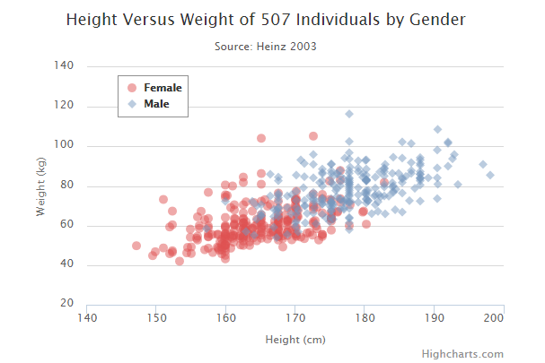
Highcharts 气泡图
本章节我们将为大家介绍 Highcharts 的气泡图。
我们在前面的章节已经了解了 Highcharts 配置语法。接下来让我们来看下 Highcharts 的其他配置。
配置
chart 配置
配置 chart 的 type 为 'bubble' 。chart.type 描述了图表类型。默认值为 "line"。
chart.zoomType 属性可配置图表放大 ,通过拖动鼠标进行缩放,沿x轴或y轴进行缩放,可以设置为:'x','y','xy'。
var chart = {
type: 'bubble',
zoomType: 'xy'
};
实例
文件名:highcharts_bubble_basic.htm
<html>
<head>
<title>Highcharts 教程 | 菜鸟教程(runoob.com)</title>
<script src="http://apps.bdimg.com/libs/jquery/2.1.4/jquery.min.js"></script>
<script src="/try/demo_source/highcharts.js"></script>
<script src="http://code.highcharts.com/highcharts-more.js"></script>
</head>
<body>
<div id="container" style="width: 550px; height: 400px; margin: 0 auto"></div>
<script language="JavaScript">
$(document).ready(function() {
var chart = {
type: 'bubble',
zoomType: 'xy'
};
var title = {
text: 'Highcharts Bubbles'
};
var series= [{
data: [[97, 36, 79], [94, 74, 60], [68, 76, 58], [64, 87, 56], [68, 27, 73], [74, 99, 42], [7, 93, 87], [51, 69, 40], [38, 23, 33], [57, 86, 31]]
}, {
data: [[25, 10, 87], [2, 75, 59], [11, 54, 8], [86, 55, 93], [5, 3, 58], [90, 63, 44], [91, 33, 17], [97, 3, 56], [15, 67, 48], [54, 25, 81]]
}, {
data: [[47, 47, 21], [20, 12, 4], [6, 76, 91], [38, 30, 60], [57, 98, 64], [61, 17, 80], [83, 60, 13], [67, 78, 75], [64, 12, 10], [30, 77, 82]]
}
];
var json = {};
json.chart = chart;
json.title = title;
json.series = series;
$('#container').highcharts(json);
});
</script>
</body>
</html>
以上实例输出结果为:
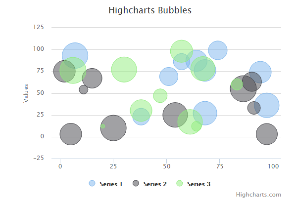
3D 气泡图
series.marker
设置 series.marker 渐变让其看起来有 3D 的效果。
marker: {
fillColor: {
radialGradient: { cx: 0.4, cy: 0.3, r: 0.7 },
stops: [
[0, 'rgba(255,255,255,0.5)'],
[1, Highcharts.Color(Highcharts.getOptions().colors[0]).setOpacity(0.5).get('rgba')]
]
}
}
实例
文件名:highcharts_bubble_3d.htm
<html>
<head>
<title>Highcharts 教程 | 菜鸟教程(runoob.com)</title>
<script src="http://apps.bdimg.com/libs/jquery/2.1.4/jquery.min.js"></script>
<script src="/try/demo_source/highcharts.js"></script>
<script src="http://code.highcharts.com/highcharts-more.js"></script>
</head>
<body>
<div id="container" style="width: 550px; height: 400px; margin: 0 auto"></div>
<script language="JavaScript">
$(document).ready(function() {
var chart = {
type: 'bubble',
plotBorderWidth: 1,
zoomType: 'xy'
};
var title = {
text: 'Highcharts bubbles with radial gradient fill'
};
var xAxis = {
gridLineWidth: 1
};
var yAxis = {
startOnTick: false,
endOnTick: false
};
var series= [{
data: [
[9, 81, 63],
[98, 5, 89],
[51, 50, 73],
[41, 22, 14],
[58, 24, 20],
[78, 37, 34],
[55, 56, 53],
[18, 45, 70],
[42, 44, 28],
[3, 52, 59],
[31, 18, 97],
[79, 91, 63],
[93, 23, 23],
[44, 83, 22]
],
marker: {
fillColor: {
radialGradient: { cx: 0.4, cy: 0.3, r: 0.7 },
stops: [
[0, 'rgba(255,255,255,0.5)'],
[1, Highcharts.Color(Highcharts.getOptions().colors[0]).setOpacity(0.5).get('rgba')]
]
}
}
}, {
data: [
[42, 38, 20],
[6, 18, 1],
[1, 93, 55],
[57, 2, 90],
[80, 76, 22],
[11, 74, 96],
[88, 56, 10],
[30, 47, 49],
[57, 62, 98],
[4, 16, 16],
[46, 10, 11],
[22, 87, 89],
[57, 91, 82],
[45, 15, 98]
],
marker: {
fillColor: {
radialGradient: { cx: 0.4, cy: 0.3, r: 0.7 },
stops: [
[0, 'rgba(255,255,255,0.5)'],
[1, Highcharts.Color(Highcharts.getOptions().colors[1]).setOpacity(0.5).get('rgba')]
]
}
}
}
];
var json = {};
json.chart = chart;
json.title = title;
json.xAxis = xAxis;
json.yAxis = yAxis;
json.series = series;
$('#container').highcharts(json);
});
</script>
</body>
</html>
以上实例输出结果为:
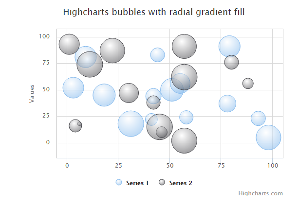
Highcharts 动态图
本章节我们将为大家介绍 Highcharts 的动态图。
我们在前面的章节已经了解了 Highcharts 配置语法。接下来让我们来看下 Highcharts 的其他配置。
每秒更新曲线图
chart.events
chart.event 属性中添加 load 方法(图表加载事件)。在 1000 毫秒内随机产生数据点并生成图表。
chart: {
events: {
load: function () {
// 图表每秒更新一次
var series = this.series[0];
setInterval(function () {
var x = (new Date()).getTime(), // 当期时间
y = Math.random();
series.addPoint([x, y], true, true);
}, 1000);
}
}
}
实例
文件名:highcharts_dynamic_spline.htm
<html>
<head>
<title>Highcharts 教程 | 菜鸟教程(runoob.com)</title>
<script src="http://apps.bdimg.com/libs/jquery/2.1.4/jquery.min.js"></script>
<script src="/try/demo_source/highcharts.js"></script>
</head>
<body>
<div id="container" style="width: 550px; height: 400px; margin: 0 auto"></div>
<script language="JavaScript">
$(document).ready(function() {
var chart = {
type: 'spline',
animation: Highcharts.svg, // don't animate in IE < IE 10.
marginRight: 10,
events: {
load: function () {
// set up the updating of the chart each second
var series = this.series[0];
setInterval(function () {
var x = (new Date()).getTime(), // current time
y = Math.random();
series.addPoint([x, y], true, true);
}, 1000);
}
}
};
var title = {
text: 'Live random data'
};
var xAxis = {
type: 'datetime',
tickPixelInterval: 150
};
var yAxis = {
title: {
text: 'Value'
},
plotLines: [{
value: 0,
width: 1,
color: '#808080'
}]
};
var tooltip = {
formatter: function () {
return '<b>' + this.series.name + '</b><br/>' +
Highcharts.dateFormat('%Y-%m-%d %H:%M:%S', this.x) + '<br/>' +
Highcharts.numberFormat(this.y, 2);
}
};
var plotOptions = {
area: {
pointStart: 1940,
marker: {
enabled: false,
symbol: 'circle',
radius: 2,
states: {
hover: {
enabled: true
}
}
}
}
};
var legend = {
enabled: false
};
var exporting = {
enabled: false
};
var series= [{
name: 'Random data',
data: (function () {
// generate an array of random data
var data = [],time = (new Date()).getTime(),i;
for (i = -19; i <= 0; i += 1) {
data.push({
x: time + i * 1000,
y: Math.random()
});
}
return data;
}())
}];
var json = {};
json.chart = chart;
json.title = title;
json.tooltip = tooltip;
json.xAxis = xAxis;
json.yAxis = yAxis;
json.legend = legend;
json.exporting = exporting;
json.series = series;
json.plotOptions = plotOptions;
Highcharts.setOptions({
global: {
useUTC: false
}
});
$('#container').highcharts(json);
});
</script>
</body>
</html>
以上实例输出结果为:
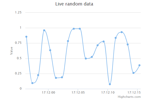
通过点击添加数据
chart.events
在 chart.event 属性中添加 click 方法(整个图表的绘图区上所发生的点击事件)。该方法在图表绘图区上发生点击时会添加新的数据点。
chart: {
events: {
click: function (e) {
// 获取点击坐标和数据项
var x = e.xAxis[0].value,
y = e.yAxis[0].value,
series = this.series[0];
// 添加点击的坐标
series.addPoint([x, y]);
}
}
}
实例
文件名:highcharts_dynamic_click.htm
<html>
<head>
<title>Highcharts 教程 | 菜鸟教程(runoob.com)</title>
<script src="http://apps.bdimg.com/libs/jquery/2.1.4/jquery.min.js"></script>
<script src="/try/demo_source/highcharts.js"></script>
</head>
<body>
<div id="container" style="width: 550px; height: 400px; margin: 0 auto"></div>
<script language="JavaScript">
$(document).ready(function() {
var chart = {
type: 'scatter',
margin: [70, 50, 60, 80],
events: {
click: function (e) {
// find the clicked values and the series
var x = e.xAxis[0].value,
y = e.yAxis[0].value,
series = this.series[0];
// Add it
series.addPoint([x, y]);
}
}
};
var title = {
text: 'User supplied data'
};
var subtitle = {
text: 'Click the plot area to add a point. Click a point to remove it.'
};
var xAxis = {
gridLineWidth: 1,
minPadding: 0.2,
maxPadding: 0.2,
maxZoom: 60
};
var yAxis = {
title: {
text: 'Value'
},
minPadding: 0.2,
maxPadding: 0.2,
maxZoom: 60,
plotLines: [{
value: 0,
width: 1,
color: '#808080'
}]
};
var legend = {
enabled: false
};
var exporting = {
enabled: false
};
var plotOptions = {
series: {
lineWidth: 1,
point: {
events: {
'click': function () {
if (this.series.data.length > 1) {
this.remove();
}
}
}
}
}
};
var series= [{
data: [[20, 20], [80, 80]]
}];
var json = {};
json.chart = chart;
json.title = title;
json.subtitle = subtitle;
json.xAxis = xAxis;
json.yAxis = yAxis;
json.legend = legend;
json.exporting = exporting;
json.series = series;
json.plotOptions = plotOptions;
$('#container').highcharts(json);
});
</script>
</body>
</html>
以上实例输出结果为:
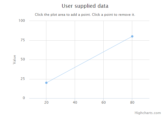
Highcharts 组合图
Highcharts 柱形图,线条图,饼图组合
以下实例演示了柱形图,线条图,饼图的组合。
我们在前面的章节已经了解了 Highcharts 基本配置语法。接下来让我们来看下其他的配置。
配置
series 配置
设置 series 的 type 属性为 column/line/pie ,series.type 描述了数据列类型。默认值为 "line"。
var series = { type: 'column' };
实例
文件名:highcharts_combinations_column.htm
<html> <head> <title>Highcharts 教程 | 菜鸟教程(runoob.com)</title> <script src="http://apps.bdimg.com/libs/jquery/2.1.4/jquery.min.js"></script> <script src="/try/demo_source/highcharts.js"></script> </head> <body> <div id="container" style="width: 550px; height: 400px; margin: 0 auto"></div> <script language="JavaScript"> $(document).ready(function() { var title = { text: 'Combination chart' }; var xAxis = { categories: ['Apples', 'Oranges', 'Pears', 'Bananas', 'Plums'] }; var labels = { items: [{ html: '水果消费', style: { left: '50px', top: '18px', color: (Highcharts.theme && Highcharts.theme.textColor) || 'black' } }] }; var series= [{ type: 'column', name: 'Jane', data: [3, 2, 1, 3, 4] }, { type: 'column', name: 'John', data: [2, 3, 5, 7, 6] }, { type: 'column', name: 'Joe', data: [4, 3, 3, 9, 0] }, { type: 'spline', name: 'Average', data: [3, 2.67, 3, 6.33, 3.33], marker: { lineWidth: 2, lineColor: Highcharts.getOptions().colors[3], fillColor: 'white' } }, { type: 'pie', name: '总消费', data: [{ name: 'Jane', y: 13, color: Highcharts.getOptions().colors[0] // Jane 的颜色 }, { name: 'John', y: 23, color: Highcharts.getOptions().colors[1] // John 的颜色 }, { name: 'Joe', y: 19, color: Highcharts.getOptions().colors[2] // Joe 的颜色 }], center: [100, 80], size: 100, showInLegend: false, dataLabels: { enabled: false } } ]; var json = {}; json.title = title; json.xAxis = xAxis; json.labels = labels; json.series = series; $('#container').highcharts(json); }); </script> </body> </html>
以上实例输出结果为:
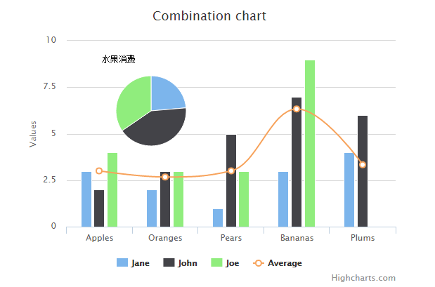
Highcharts 双Y轴, 柱形图,线条图组合
以下实例演示了双Y轴, 柱形图,线条图组合。
我们在前面的章节已经了解了 Highcharts 基本配置语法。接下来让我们来看下其他的配置。
配置
yAxis 配置
在 yAxis 属性中添加两条Y轴的值 。
var yAxis = [{ // 第一条Y轴 }, { // 第二条Y轴 } }]
实例
文件名:highcharts_combinations_dualaxes.htm
<html> <head> <title>Highcharts 教程 | 菜鸟教程(runoob.com)</title> <script src="http://apps.bdimg.com/libs/jquery/2.1.4/jquery.min.js"></script> <script src="/try/demo_source/highcharts.js"></script> </head> <body> <div id="container" style="width: 550px; height: 400px; margin: 0 auto"></div> <script language="JavaScript"> $(document).ready(function() { var chart = { zoomType: 'xy' }; var subtitle = { text: 'Source: runoob.com' }; var title = { text: '东京的月平均气温和降雨量' }; var xAxis = { categories: ['Jan', 'Feb', 'Mar', 'Apr', 'May', 'Jun','Jul', 'Aug', 'Sep', 'Oct', 'Nov', 'Dec'], crosshair: true }; var yAxis= [{ // 第一条Y轴 labels: { format: '{value}\xB0C', style: { color: Highcharts.getOptions().colors[1] } }, title: { text: 'Temperature', style: { color: Highcharts.getOptions().colors[1] } } }, { // 第二条Y轴 title: { text: 'Rainfall', style: { color: Highcharts.getOptions().colors[0] } }, labels: { format: '{value} mm', style: { color: Highcharts.getOptions().colors[0] } }, opposite: true }]; var tooltip = { shared: true }; var legend = { layout: 'vertical', align: 'left', x: 120, verticalAlign: 'top', y: 100, floating: true, backgroundColor: (Highcharts.theme && Highcharts.theme.legendBackgroundColor) || '#FFFFFF' }; var series= [{ name: 'Rainfall', type: 'column', yAxis: 1, data: [49.9, 71.5, 106.4, 129.2, 144.0, 176.0, 135.6, 148.5, 216.4, 194.1, 95.6, 54.4], tooltip: { valueSuffix: ' mm' } }, { name: 'Temperature', type: 'spline', data: [7.0, 6.9, 9.5, 14.5, 18.2, 21.5, 25.2, 26.5, 23.3, 18.3, 13.9, 9.6], tooltip: { valueSuffix: '\xB0C' } } ]; var json = {}; json.chart = chart; json.title = title; json.subtitle = subtitle; json.xAxis = xAxis; json.yAxis = yAxis; json.tooltip = tooltip; json.legend = legend; json.series = series; $('#container').highcharts(json); }); </script> </body> </html>
以上实例输出结果为:
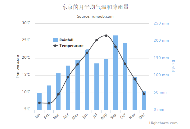
Highcharts 多Y轴组合
以下实例演示了多Y轴的组合。
我们在前面的章节已经了解了 Highcharts 基本配置语法。接下来让我们来看下其他的配置。
配置
yAxis 配置
在 yAxis 属性中添加多条Y轴的值 。
var yAxis = [{ // 第一条Y轴 }, { // 第二条Y轴 },{ // 第三题Y轴 } }]
实例
文件名:highcharts_combinations_axes.htm
<html> <head> <title>Highcharts 教程 | 菜鸟教程(runoob.com)</title> <script src="http://apps.bdimg.com/libs/jquery/2.1.4/jquery.min.js"></script> <script src="/try/demo_source/highcharts.js"></script> </head> <body> <div id="container" style="width: 550px; height: 400px; margin: 0 auto"></div> <script language="JavaScript"> $(document).ready(function() { var chart = { zoomType: 'xy' }; var subtitle = { text: 'Source: runoob.com' }; var title = { text: '东京月平均气象数据' }; var xAxis = { categories: ['Jan', 'Feb', 'Mar', 'Apr', 'May', 'Jun','Jul', 'Aug', 'Sep', 'Oct', 'Nov', 'Dec'], crosshair: true }; var yAxis= [{ // 第一条Y轴 labels: { format: '{value}\xB0C', style: { color: Highcharts.getOptions().colors[2] } }, title: { text: '气温', style: { color: Highcharts.getOptions().colors[2] } }, opposite: true }, { // 第二条Y轴 title: { text: '降雨量', style: { color: Highcharts.getOptions().colors[0] } }, labels: { format: '{value} mm', style: { color: Highcharts.getOptions().colors[0] } } }, { // 第三条Y轴 gridLineWidth: 0, title: { text: '海平面气压', style: { color: Highcharts.getOptions().colors[1] } }, labels: { format: '{value} mb', style: { color: Highcharts.getOptions().colors[1] } }, opposite:true }]; var tooltip = { shared: true }; var legend = { layout: 'vertical', align: 'left', x: 120, verticalAlign: 'top', y: 100, floating: true, backgroundColor: (Highcharts.theme && Highcharts.theme.legendBackgroundColor) || '#FFFFFF' }; var series= [{ name: '降雨量', type: 'column', yAxis: 1, data: [49.9, 71.5, 106.4, 129.2, 144.0, 176.0, 135.6, 148.5, 216.4, 194.1, 95.6, 54.4], tooltip: { valueSuffix: ' mm' } },{ name: '海平面气压', type: 'spline', yAxis: 2, data: [1016, 1016, 1015.9, 1015.5, 1012.3, 1009.5, 1009.6, 1010.2, 1013.1, 1016.9, 1018.2, 1016.7], marker: { enabled: false }, dashStyle: 'shortdot', tooltip: { valueSuffix: ' mb' } },{ name: '气温', type: 'spline', data: [7.0, 6.9, 9.5, 14.5, 18.2, 21.5, 25.2, 26.5, 23.3, 18.3, 13.9, 9.6], tooltip: { valueSuffix: '\xB0C' } } ]; var json = {}; json.chart = chart; json.title = title; json.subtitle = subtitle; json.xAxis = xAxis; json.yAxis = yAxis; json.tooltip = tooltip; json.legend = legend; json.series = series; $('#container').highcharts(json); }); </script> </body> </html>
以上实例输出结果为:
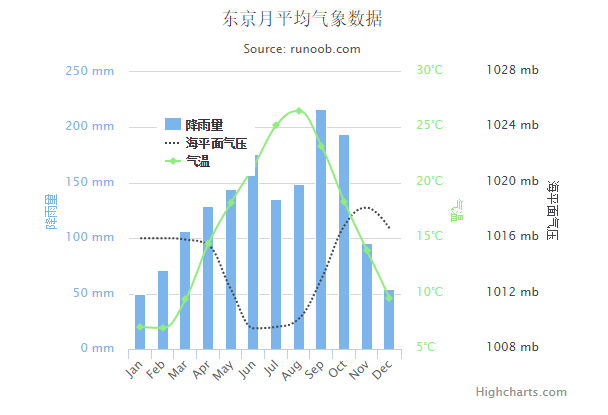
Highcharts 散点图上添加回归线
以下实例演示了散点图上添加回归线。
我们在前面的章节已经了解了 Highcharts 基本配置语法。接下来让我们来看下其他的配置。
配置
series 配置
设置 series 的 type 属性为 line/scatter ,series.type 描述了数据列类型。默认值为 "line"。
var series = { type: 'scatter' };
实例
文件名:highcharts_combinations_scatter.htm
<html> <head> <title>Highcharts 教程 | 菜鸟教程(runoob.com)</title> <script src="http://apps.bdimg.com/libs/jquery/2.1.4/jquery.min.js"></script> <script src="/try/demo_source/highcharts.js"></script> </head> <body> <div id="container" style="width: 550px; height: 400px; margin: 0 auto"></div> <script language="JavaScript"> $(document).ready(function() { var title = { text: '散点图上添加回归线' }; var xAxis = { min: -0.5, max: 5.5 }; var yAxis= { min: 0 }; var series= [{ type: 'line', name: '回归线', data: [[0, 1.11], [5, 4.51]], marker: { enabled: false }, states: { hover: { lineWidth: 0 } }, enableMouseTracking: false }, { type: 'scatter', name: '观察点', data: [1, 1.5, 2.8, 3.5, 3.9, 4.2], marker: { radius: 4 } } ]; var json = {}; json.title = title; json.xAxis = xAxis; json.yAxis = yAxis; json.series = series; $('#container').highcharts(json); }); </script> </body> </html>
以上实例输出结果为:
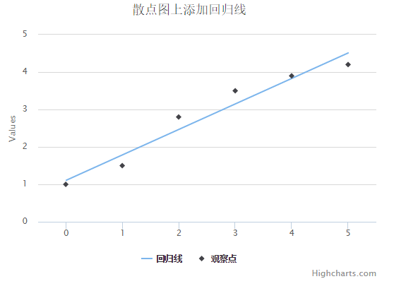
Highcharts 3D图
Highcharts 3D柱形图
以下实例演示了3D柱形图。
我们在前面的章节已经了解了 Highcharts 基本配置语法。接下来让我们来看下其他的配置。
配置
chart.options3d 配置
以下列出了 3D 图的基本配置,设置 chart 的 type 属性为 column,options3d 选项可设置三维效果。
var chart = { type: 'column', options3d: { enabled: true, //显示图表是否设置为3D, 我们将其设置为 true alpha: 15, //图表视图旋转角度 beta: 15, //图表视图旋转角度 depth: 50, //图表的合计深度,默认为100 viewDistance: 25 //定义图表的浏览长度 } };
实例
文件名:highcharts_3d_column.htm
<html> <head> <title>Highcharts 教程 | 菜鸟教程(runoob.com)</title> <script src="http://apps.bdimg.com/libs/jquery/2.1.4/jquery.min.js"></script> <script src="/try/demo_source/highcharts.js"></script> <script src="/try/demo_source/highcharts-3d.js"></script> </head> <body> <div id="container" style="width: 550px; height: 400px; margin: 0 auto"></div> <div id="sliders"> <table> <tr><td>Alpha Angle</td><td><input id="R0" type="range" min="0" max="45" value="15"/> <span id="R0-value" class="value"></span></td></tr> <tr><td>Beta Angle</td><td><input id="R1" type="range" min="0" max="45" value="15"/> <span id="R1-value" class="value"></span></td></tr> </table> </div> <script language="JavaScript"> $(document).ready(function() { var chart = { renderTo: 'container', type: 'column', margin: 75, options3d: { enabled: true, alpha: 15, beta: 15, depth: 50, viewDistance: 25 } }; var title = { text: '图表旋转实例' }; var subtitle = { text: '通过拖动下面的滑块测试' }; var plotOptions = { column: { depth: 25 } }; var series= [{ data: [29.9, 71.5, 106.4, 129.2, 144.0, 176.0, 135.6, 148.5, 216.4, 194.1, 95.6, 54.4] }]; var json = {}; json.chart = chart; json.title = title; json.subtitle = subtitle; json.series = series; json.plotOptions = plotOptions; var highchart = new Highcharts.Chart(json); function showValues() { $('#R0-value').html(highchart.options.chart.options3d.alpha); $('#R1-value').html(highchart.options.chart.options3d.beta); } // Activate the sliders $('#R0').on('change', function () { highchart.options.chart.options3d.alpha = this.value; showValues(); highchart.redraw(false); }); $('#R1').on('change', function () { highchart.options.chart.options3d.beta = this.value; showValues(); highchart.redraw(false); }); showValues(); }); </script> </body> </html>
以上实例输出结果为:
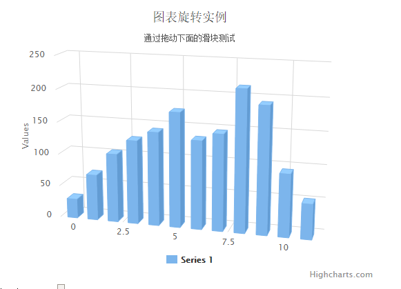
Highcharts 带空值(null)和0的3D柱形图
以下实例演示了带空值(null)和0的3D柱形图。
我们在前面的章节已经了解了 Highcharts 基本配置语法。接下来让我们来看下其他的配置。
配置
chart.options3d 配置
以下列出了 3D 图的基本配置,设置 chart 的 type 属性为 column,options3d 选项可设置三维效果。
var chart = { type: 'column', options3d: { enabled: true, //显示图表是否设置为3D, 我们将其设置为 true alpha: 15, //图表视图旋转角度 beta: 15, //图表视图旋转角度 depth: 50, //图表的合计深度,默认为100 viewDistance: 25 //定义图表的浏览长度 } };
实例
文件名:highcharts_3d_column_null.htm
<html> <head> <title>Highcharts 教程 | 菜鸟教程(runoob.com)</title> <script src="http://apps.bdimg.com/libs/jquery/2.1.4/jquery.min.js"></script> <script src="/try/demo_source/highcharts.js"></script> <script src="/try/demo_source/highcharts-3d.js"></script> </head> <body> <div id="container" style="width: 550px; height: 400px; margin: 0 auto"></div> <script language="JavaScript"> $(document).ready(function() { var chart = { type: 'column', margin: 75, options3d: { enabled: true, alpha: 10, beta: 25, depth: 70 } }; var title = { text: '带空值的 3D 图' }; var subtitle = { text: '注意 0 和 null 的区别' }; var xAxis = { categories: Highcharts.getOptions().lang.shortMonths }; var yAxis = { title: { text: null } }; var series= [{ name: 'Sales', data: [2, 3, null, 4, 0, 5, 1, 4, 6, 3] }]; var json = {}; json.chart = chart; json.title = title; json.subtitle = subtitle; json.xAxis = xAxis; json.yAxis = yAxis; json.series = series; $('#container').highcharts(json); }); </script> </body> </html>
以上实例输出结果为:
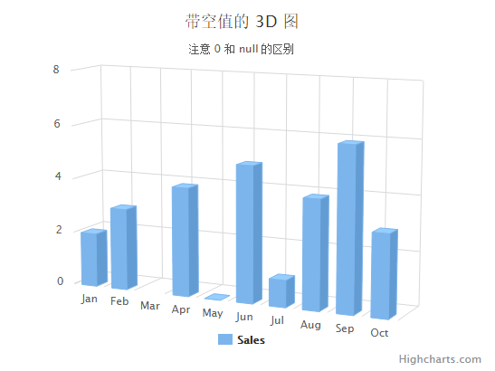
Highcharts 堆叠3D柱形图
以下实例演示了堆叠3D柱形图。
我们在前面的章节已经了解了 Highcharts 基本配置语法。接下来让我们来看下其他的配置。
配置
chart.options3d 配置
以下列出了 3D 图的基本配置,设置 chart 的 type 属性为 column,options3d 选项可设置三维效果。
var chart = { type: 'column', options3d: { enabled: true, //显示图表是否设置为3D, 我们将其设置为 true alpha: 15, //图表视图旋转角度 beta: 15, //图表视图旋转角度 depth: 50, //图表的合计深度,默认为100 viewDistance: 25 //定义图表的浏览长度 } };
实例
文件名:highcharts_3d_stacking.htm
<html> <head> <title>Highcharts 教程 | 菜鸟教程(runoob.com)</title> <script src="http://apps.bdimg.com/libs/jquery/2.1.4/jquery.min.js"></script> <script src="/try/demo_source/highcharts.js"></script> <script src="/try/demo_source/highcharts-3d.js"></script> </head> <body> <div id="container" style="width: 550px; height: 400px; margin: 0 auto"></div> <script language="JavaScript"> $(document).ready(function() { var chart = { type: 'column', marginTop: 80, marginRight: 40, options3d: { enabled: true, alpha: 15, beta: 15, viewDistance: 25, depth: 40 } }; var title = { text: '水果总消费量,按类别分组' }; var xAxis = { categories: ['Apples', 'Oranges', 'Pears', 'Grapes', 'Bananas'] }; var yAxis = { allowDecimals: false, min: 0, title: { text: '水果数量' } }; var tooltip = { headerFormat: '<b>{point.key}</b><br>', pointFormat: '<span style="color:{series.color}">\u25CF</span> {series.name}: {point.y} / {point.stackTotal}' }; var plotOptions = { column: { stacking: 'normal', depth: 40 } }; var series= [{ name: 'John', data: [5, 3, 4, 7, 2], stack: 'male' }, { name: 'Joe', data: [3, 4, 4, 2, 5], stack: 'male' }, { name: 'Jane', data: [2, 5, 6, 2, 1], stack: 'female' }, { name: 'Janet', data: [3, 0, 4, 4, 3], stack: 'female' }]; var json = {}; json.chart = chart; json.title = title; json.xAxis = xAxis; json.yAxis = yAxis; json.tooltip = tooltip; json.plotOptions = plotOptions; json.series = series; $('#container').highcharts(json); }); </script> </body> </html>
以上实例输出结果为:
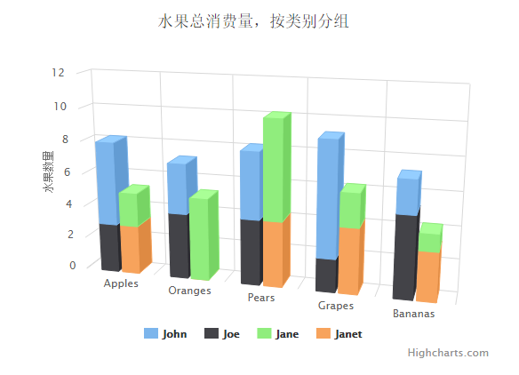
Highcharts 3D饼图
以下实例演示了3D饼图。
我们在前面的章节已经了解了 Highcharts 基本配置语法。接下来让我们来看下其他的配置。
配置
chart.options3d 配置
以下列出了 3D 图的基本配置,设置 chart 的 type 属性为 pie,options3d 选项可设置三维效果。
var chart = { type: 'pie', options3d: { enabled: true, //显示图表是否设置为3D, 我们将其设置为 true alpha: 15, //图表视图旋转角度 beta: 15, //图表视图旋转角度 depth: 50, //图表的合计深度,默认为100 viewDistance: 25 //定义图表的浏览长度 } };
实例
文件名:highcharts_3d_pie.htm
<html> <head> <title>Highcharts 教程 | 菜鸟教程(runoob.com)</title> <script src="http://apps.bdimg.com/libs/jquery/2.1.4/jquery.min.js"></script> <script src="/try/demo_source/highcharts.js"></script> <script src="/try/demo_source/highcharts-3d.js"></script> </head> <body> <div id="container" style="width: 550px; height: 400px; margin: 0 auto"></div> <script language="JavaScript"> $(document).ready(function() { var chart = { type: 'pie', options3d: { enabled: true, alpha: 45, beta: 0 } }; var title = { text: '2014 年特定网站各浏览器占有率' }; var tooltip = { pointFormat: '{series.name}: <b>{point.percentage:.1f}%</b>' }; var plotOptions = { pie: { allowPointSelect: true, cursor: 'pointer', depth: 35, dataLabels: { enabled: true, format: '{point.name}' } } }; var series= [{ type: 'pie', name: 'Browser share', data: [ ['Firefox', 45.0], ['IE', 26.8], { name: 'Chrome', y: 12.8, sliced: true, selected: true }, ['Safari', 8.5], ['Opera', 6.2], ['Others', 0.7] ] }]; var json = {}; json.chart = chart; json.title = title; json.tooltip = tooltip; json.plotOptions = plotOptions; json.series = series; $('#container').highcharts(json); }); </script> </body> </html>
以上实例输出结果为:
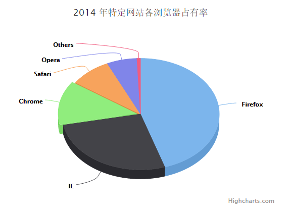
Highcharts 3D圆环图
以下实例演示了3D饼图。
我们在前面的章节已经了解了 Highcharts 基本配置语法。接下来让我们来看下其他的配置。
配置
chart.options3d 配置
以下列出了 3D 图的基本配置,设置 chart 的 type 属性为 pie,options3d 选项可设置三维效果。
var chart = { type: 'pie', options3d: { enabled: true, //显示图表是否设置为3D, 我们将其设置为 true alpha: 15, //图表视图旋转角度 beta: 15, //图表视图旋转角度 depth: 50, //图表的合计深度,默认为100 viewDistance: 25 //定义图表的浏览长度 } };
plotOptions.pie.innerSize
plotOptions.pie.innerSize 用于绘制饼状图时,饼状图的圆心预留多大的空白。
plotOptions.pie.depth
3D饼图的厚度。
plotOptions: { pie: { innerSize: 100, depth: 45 } },
实例
文件名:highcharts_3d_donut.htm
<html> <head> <title>Highcharts 教程 | 菜鸟教程(runoob.com)</title> <script src="http://apps.bdimg.com/libs/jquery/2.1.4/jquery.min.js"></script> <script src="/try/demo_source/highcharts.js"></script> <script src="/try/demo_source/highcharts-3d.js"></script> </head> <body> <div id="container" style="width: 550px; height: 400px; margin: 0 auto"></div> <script language="JavaScript"> $(document).ready(function() { var chart = { type: 'pie', options3d: { enabled: true, alpha: 45 } }; var title = { text: '每周水果配送量' }; var subtitle = { text: 'Highcharts 3D圆环图' }; var plotOptions = { pie: { innerSize: 100, depth: 45 } }; var series= [{ name: '配送量', data: [ ['Bananas', 8], ['Kiwi', 3], ['Mixed nuts', 1], ['Oranges', 6], ['Apples', 8], ['Pears', 4], ['Clementines', 4], ['Reddish (bag)', 1], ['Grapes (bunch)', 1] ] }]; var json = {}; json.chart = chart; json.title = title; json.subtitle = subtitle; json.plotOptions = plotOptions; json.series = series; $('#container').highcharts(json); }); </script> </body> </html>
以上实例输出结果为:
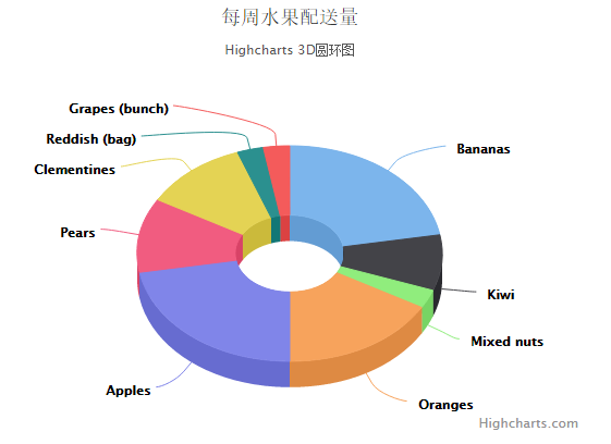
Highcharts 测量图
Highcharts 测量图
以下实例演示了测量图。
我们在前面的章节已经了解了 Highcharts 基本配置语法。接下来让我们来看下其他的配置。
配置
chart.type 配置
配置 chart 的 type 为 'gauge' 。chart.type 描述了图表类型。默认值为 "line"。
var chart = { type: 'guage' };
pane 配置
pane 只适用在极坐标图和角度测量仪。此可配置对象持有组合x轴和y周的常规选项。每个x轴和y轴都可以通过索引关联到窗格中。
var pane = { startAngle: -150, // x轴或测量轴的开始度数,以度数的方式给出。0是北 endAngle: 150 //x轴极坐标或角度轴的最终度数,以度数的方式给出。0是北 };
实例
文件名:highcharts_guage_angular.htm
<html> <head> <title>Highcharts 教程 | 菜鸟教程(runoob.com)</title> <script src="http://apps.bdimg.com/libs/jquery/2.1.4/jquery.min.js"></script> <script src="/try/demo_source/highcharts.js"></script> <script src="/try/demo_source/highcharts-more.js"></script> </head> <body> <div id="container" style="width: 550px; height: 400px; margin: 0 auto"></div> <script language="JavaScript"> $(document).ready(function() { var chart = { type: 'gauge', plotBackgroundColor: null, plotBackgroundImage: null, plotBorderWidth: 0, plotShadow: false }; var title = { text: '车速表' }; var pane = { startAngle: -150, endAngle: 150, background: [{ backgroundColor: { linearGradient: { x1: 0, y1: 0, x2: 0, y2: 1 }, stops: [ [0, '#FFF'], [1, '#333'] ] }, borderWidth: 0, outerRadius: '109%' }, { backgroundColor: { linearGradient: { x1: 0, y1: 0, x2: 0, y2: 1 }, stops: [ [0, '#333'], [1, '#FFF'] ] }, borderWidth: 1, outerRadius: '107%' }, { // default background }, { backgroundColor: '#DDD', borderWidth: 0, outerRadius: '105%', innerRadius: '103%' }] }; // the value axis var yAxis = { min: 0, max: 200, minorTickInterval: 'auto', minorTickWidth: 1, minorTickLength: 10, minorTickPosition: 'inside', minorTickColor: '#666', tickPixelInterval: 30, tickWidth: 2, tickPosition: 'inside', tickLength: 10, tickColor: '#666', labels: { step: 2, rotation: 'auto' }, title: { text: 'km/h' }, plotBands: [{ from: 0, to: 120, color: '#55BF3B' // green }, { from: 120, to: 160, color: '#DDDF0D' // yellow }, { from: 160, to: 200, color: '#DF5353' // red }] }; var series= [{ name: 'Speed', data: [80], tooltip: { valueSuffix: ' km/h' } }]; var json = {}; json.chart = chart; json.title = title; json.pane = pane; json.yAxis = yAxis; json.series = series; // Add some life var chartFunction = function (chart) { if (!chart.renderer.forExport) { setInterval(function () { var point = chart.series[0].points[0], newVal, inc = Math.round((Math.random() - 0.5) * 20); newVal = point.y + inc; if (newVal < 0 || newVal > 200) { newVal = point.y - inc; } point.update(newVal); }, 3000); } }; $('#container').highcharts(json,chartFunction); }); </script> </body> </html>
以上实例输出结果为:
Highcharts 圆形进度条式测量图
以下实例演示了圆形进度条式测量图。
我们在前面的章节已经了解了 Highcharts 基本配置语法。接下来让我们来看下其他的配置。
配置
chart.type 配置
配置 chart 的 type 为 'solidguage' 。chart.type 描述了图表类型。默认值为 "line"。
var chart = { type: 'solidguage' };
pane 配置
pane 只适用在极坐标图和角度测量仪。此可配置对象持有组合x轴和y周的常规选项。每个x轴和y轴都可以通过索引关联到窗格中。
var pane = { startAngle: -150, // x轴或测量轴的开始度数,以度数的方式给出。0是北 endAngle: 150 //x轴极坐标或角度轴的最终度数,以度数的方式给出。0是北 };
实例
文件名:highcharts_guage_solid.htm
<html> <head> <title>Highcharts 教程 | 菜鸟教程(runoob.com)</title> <script src="http://apps.bdimg.com/libs/jquery/2.1.4/jquery.min.js"></script> <script src="/try/demo_source/highcharts.js"></script> <script src="/try/demo_source/highcharts-more.js"></script> <script src="http://code.highcharts.com/modules/solid-gauge.js"></script> </head> <body> <div style="width: 600px; height: 400px; margin: 0 auto"> <div id="container-speed" style="width: 300px; height: 200px; float: left"></div> <div id="container-rpm" style="width: 300px; height: 200px; float: left"></div> </div> <script language="JavaScript"> $(document).ready(function() { var chart = { type: 'solidgauge' }; var title = null; var pane = { center: ['50%', '85%'], size: '140%', startAngle: -90, endAngle: 90, background: { backgroundColor: (Highcharts.theme && Highcharts.theme.background2) || '#EEE', innerRadius: '60%', outerRadius: '100%', shape: 'arc' } }; var tooltip = { enabled: false }; // the value axis var yAxis = { stops: [ [0.1, '#55BF3B'], // green [0.5, '#DDDF0D'], // yellow [0.9, '#DF5353'] // red ], lineWidth: 0, minorTickInterval: null, tickPixelInterval: 400, tickWidth: 0, title: { y: -70 }, labels: { y: 16 }, min: 0, max: 200, title: { text: 'Speed' } }; var plotOptions = { solidgauge: { dataLabels: { y: 5, borderWidth: 0, useHTML: true } } }; var credits = { enabled: false }; var series = [{ name: 'Speed', data: [80], dataLabels: { format: '<div style="text-align:center"><span style="font-size:25px;color:' + ((Highcharts.theme && Highcharts.theme.contrastTextColor) || 'black') + '">{y}</span><br/>' + '<span style="font-size:12px;color:silver">km/h</span></div>' }, tooltip: { valueSuffix: ' km/h' } }]; var json = {}; json.chart = chart; json.title = title; json.pane = pane; json.tooltip = tooltip; json.yAxis = yAxis; json.credits = credits; json.series = series; $('#container-speed').highcharts(json); // the value axis yAxis = { stops: [ [0.1, '#55BF3B'], // green [0.5, '#DDDF0D'], // yellow [0.9, '#DF5353'] // red ], lineWidth: 0, minorTickInterval: null, tickPixelInterval: 400, tickWidth: 0, title: { y: -70 }, labels: { y: 16 }, min: 0, max: 5, title: { text: 'RPM' } }; series = [{ name: 'RPM', data: [1], dataLabels: { format: '<div style="text-align:center"><span style="font-size:25px;color:' + ((Highcharts.theme && Highcharts.theme.contrastTextColor) || 'black') + '">{y:.1f}</span><br/>' + '<span style="font-size:12px;color:silver">* 1000 / min</span></div>' }, tooltip: { valueSuffix: ' revolutions/min' } }]; json.yAxis = yAxis; json.series = series; $('#container-rpm').highcharts(json); var chartFunction = function() { // Speed var chart = $('#container-speed').highcharts(); var point; var newVal; var inc; if (chart) { point = chart.series[0].points[0]; inc = Math.round((Math.random() - 0.5) * 100); newVal = point.y + inc; if (newVal < 0 || newVal > 200) { newVal = point.y - inc; } point.update(newVal); } // RPM chart = $('#container-rpm').highcharts(); if (chart) { point = chart.series[0].points[0]; inc = Math.random() - 0.5; newVal = point.y + inc; if (newVal < 0 || newVal > 5) { newVal = point.y - inc; } point.update(newVal); } }; // Bring life to the dials setInterval(chartFunction, 2000); }); </script> </body> </html>
Highcharts 时钟
以下实例演示了时钟。
我们在前面的章节已经了解了 Highcharts 基本配置语法。接下来让我们来看下其他的配置。
配置
chart.type 配置
配置 chart 的 type 为 'gauge' 。chart.type 描述了图表类型。默认值为 "line"。
var chart = { type: 'gauge' };
pane 配置
pane 只适用在极坐标图和角度测量仪。此可配置对象持有组合x轴和y周的常规选项。每个x轴和y轴都可以通过索引关联到窗格中。
var pane = { startAngle: -150, // x轴或测量轴的开始度数,以度数的方式给出。0是北 endAngle: 150 //x轴极坐标或角度轴的最终度数,以度数的方式给出。0是北 };
实例
文件名:highcharts_guage_clock.htm
<html> <head> <title>Highcharts 教程 | 菜鸟教程(runoob.com)</title> <script src="http://apps.bdimg.com/libs/jquery/2.1.4/jquery.min.js"></script> <script src="/try/demo_source/highcharts.js"></script> <script src="/try/demo_source/highcharts-more.js"></script> </head> <body> <div id="container" style="width: 550px; height: 400px; margin: 0 auto"></div> <script language="JavaScript"> $(document).ready(function() { /**
* 获取当前时间
*/ function getNow() { var now = new Date(); return { hours: now.getHours() + now.getMinutes() / 60, minutes: now.getMinutes() * 12 / 60 + now.getSeconds() * 12 / 3600, seconds: now.getSeconds() * 12 / 60 }; } /**
* Pad numbers
*/ function pad(number, length) { // Create an array of the remaining length + 1 and join it with 0's return new Array((length || 2) + 1 - String(number).length).join(0) + number; } var now = getNow(); var chart = { type: 'gauge', plotBackgroundColor: null, plotBackgroundImage: null, plotBorderWidth: 0, plotShadow: false, height: 200 }; var credits = { enabled: false }; var title = { text: 'Highcharts 时钟' }; var pane = { background: [{ // default background }, { // reflex for supported browsers backgroundColor: Highcharts.svg ? { radialGradient: { cx: 0.5, cy: -0.4, r: 1.9 }, stops: [ [0.5, 'rgba(255, 255, 255, 0.2)'], [0.5, 'rgba(200, 200, 200, 0.2)'] ] } : null }] }; // the value axis var yAxis = { labels: { distance: -20 }, min: 0, max: 12, lineWidth: 0, showFirstLabel: false, minorTickInterval: 'auto', minorTickWidth: 1, minorTickLength: 5, minorTickPosition: 'inside', minorGridLineWidth: 0, minorTickColor: '#666', tickInterval: 1, tickWidth: 2, tickPosition: 'inside', tickLength: 10, tickColor: '#666', title: { text: 'Powered by<br/>Highcharts', style: { color: '#BBB', fontWeight: 'normal', fontSize: '8px', lineHeight: '10px' }, y: 10 } }; var tooltip = { formatter: function () { return this.series.chart.tooltipText; } }; var series= [{ data: [{ id: 'hour', y: now.hours, dial: { radius: '60%', baseWidth: 4, baseLength: '95%', rearLength: 0 } }, { id: 'minute', y: now.minutes, dial: { baseLength: '95%', rearLength: 0 } }, { id: 'second', y: now.seconds, dial: { radius: '100%', baseWidth: 1, rearLength: '20%' } }], animation: false, dataLabels: { enabled: false } }]; var json = {}; json.chart = chart; json.credits = credits; json.title = title; json.pane = pane; json.yAxis = yAxis; json.tooltip = tooltip; json.series = series; $('#container').highcharts(json, chartFunction); // Add some life var chartFunction = function (chart) { setInterval(function () { now = getNow(); var hour = chart.get('hour'), minute = chart.get('minute'), second = chart.get('second'), // run animation unless we're wrapping around from 59 to 0 animation = now.seconds === 0 ? false :{ easing: 'easeOutElastic'}; // Cache the tooltip text chart.tooltipText = pad(Math.floor(now.hours), 2) + ':' + pad(Math.floor(now.minutes * 5), 2) + ':' + pad(now.seconds * 5, 2); hour.update(now.hours, true, animation); minute.update(now.minutes, true, animation); second.update(now.seconds, true, animation); }, 1000); }; }); // Extend jQuery with some easing (copied from jQuery UI) $.extend($.easing, { easeOutElastic: function (x, t, b, c, d) { var s=1.70158;var p=0;var a=c; if (t==0) return b; if ((t/=d)==1) return b+c; if (!p) p=d*.3; if (a < Math.abs(c)) { a=c; var s=p/4; } else var s = p/(2*Math.PI) * Math.asin (c/a); return a*Math.pow(2,-10*t) * Math.sin( (t*d-s)*(2*Math.PI)/p ) + c + b; } }); </script> </body> </html>
以上实例输出结果为:
Highcharts 双轴车速表
以下实例演示了双轴车速表。
我们在前面的章节已经了解了 Highcharts 基本配置语法。接下来让我们来看下其他的配置。
配置
chart.type 配置
配置 chart 的 type 为 'gauge' 。chart.type 描述了图表类型。默认值为 "line"。
var chart = { type: 'gauge' };
pane 配置
pane 只适用在极坐标图和角度测量仪。此可配置对象持有组合x轴和y周的常规选项。每个x轴和y轴都可以通过索引关联到窗格中。
var pane = { startAngle: -150, // x轴或测量轴的开始度数,以度数的方式给出。0是北 endAngle: 150 //x轴极坐标或角度轴的最终度数,以度数的方式给出。0是北 };
实例
文件名:highcharts_guage_dualaxes.htm
<html> <head> <title>Highcharts 教程 | 菜鸟教程(runoob.com)</title> <script src="http://apps.bdimg.com/libs/jquery/2.1.4/jquery.min.js"></script> <script src="/try/demo_source/highcharts.js"></script> <script src="/try/demo_source/highcharts-more.js"></script> </head> <body> <div id="container" style="width: 550px; height: 400px; margin: 0 auto"></div> <script language="JavaScript"> $(document).ready(function() { var chart = { type: 'gauge', plotBackgroundColor: null, plotBackgroundImage: null, plotBorderWidth: 0, plotShadow: false }; var credits = { enabled: false }; var title = { text: '双轴车速表' }; var pane = { startAngle: -150, endAngle: 150 }; // the value axis var yAxis = [{ min: 0, max: 200, lineColor: '#339', tickColor: '#339', minorTickColor: '#339', offset: -25, lineWidth: 2, labels: { distance: -20, rotation: 'auto' }, tickLength: 5, minorTickLength: 5, endOnTick: false }, { min: 0, max: 124, tickPosition: 'outside', lineColor: '#933', lineWidth: 2, minorTickPosition: 'outside', tickColor: '#933', minorTickColor: '#933', tickLength: 5, minorTickLength: 5, labels: { distance: 12, rotation: 'auto' }, offset: -20, endOnTick: false }]; var series= [{ name: 'Speed', data: [80], dataLabels: { formatter: function () { var kmh = this.y, mph = Math.round(kmh * 0.621); return '<span style="color:#339">' + kmh + ' km/h</span><br/>' + '<span style="color:#933">' + mph + ' mph</span>'; }, backgroundColor: { linearGradient: { x1: 0, y1: 0, x2: 0, y2: 1 }, stops: [ [0, '#DDD'], [1, '#FFF'] ] } }, tooltip: { valueSuffix: ' km/h' } }]; var json = {}; json.chart = chart; json.credits = credits; json.title = title; json.pane = pane; json.yAxis = yAxis; json.series = series; // Add some life var chartFunction = function (chart) { setInterval(function () { var point = chart.series[0].points[0], newVal, inc = Math.round((Math.random() - 0.5) * 20); newVal = point.y + inc; if (newVal < 0 || newVal > 200) { newVal = point.y - inc; } point.update(newVal); }, 3000); }; $('#container').highcharts(json, chartFunction); }); </script> </body> </html>
以上实例输出结果为:
Highcharts 音量表(VU Meter)
以下实例演示了音量表(VU Meter)。
我们在前面的章节已经了解了 Highcharts 基本配置语法。接下来让我们来看下其他的配置。
配置
chart.type 配置
配置 chart 的 type 为 'gauge' 。chart.type 描述了图表类型。默认值为 "line"。
var chart = { type: 'gauge' };
pane 配置
pane 只适用在极坐标图和角度测量仪。此可配置对象持有组合x轴和y周的常规选项。每个x轴和y轴都可以通过索引关联到窗格中。
var pane = { startAngle: -150, // x轴或测量轴的开始度数,以度数的方式给出。0是北 endAngle: 150 //x轴极坐标或角度轴的最终度数,以度数的方式给出。0是北 };
实例
文件名:highcharts_vumeter.htm
<html> <head> <title>Highcharts 教程 | 菜鸟教程(runoob.com)</title> <script src="http://apps.bdimg.com/libs/jquery/2.1.4/jquery.min.js"></script> <script src="/try/demo_source/highcharts.js"></script> <script src="/try/demo_source/highcharts-more.js"></script> </head> <body> <div id="container" style="width: 550px; height: 400px; margin: 0 auto"></div> <script language="JavaScript"> $(document).ready(function() { var chart = { type: 'gauge', plotBorderWidth: 1, plotBackgroundColor: { linearGradient: { x1: 0, y1: 0, x2: 0, y2: 1 }, stops: [ [0, '#FFF4C6'], [0.3, '#FFFFFF'], [1, '#FFF4C6'] ] }, plotBackgroundImage: null, height: 200 }; var credits = { enabled: false }; var title = { text: '音量表(VU Meter)' }; var pane = [{ startAngle: -45, endAngle: 45, background: null, center: ['25%', '145%'], size: 300 }, { startAngle: -45, endAngle: 45, background: null, center: ['75%', '145%'], size: 300 }]; var yAxis = [{ min: -20, max: 6, minorTickPosition: 'outside', tickPosition: 'outside', labels: { rotation: 'auto', distance: 20 }, plotBands: [{ from: 0, to: 6, color: '#C02316', innerRadius: '100%', outerRadius: '105%' }], pane: 0, title: { text: 'VU<br/><span style="font-size:8px">Channel A</span>', y: -40 } }, { min: -20, max: 6, minorTickPosition: 'outside', tickPosition: 'outside', labels: { rotation: 'auto', distance: 20 }, plotBands: [{ from: 0, to: 6, color: '#C02316', innerRadius: '100%', outerRadius: '105%' }], pane: 1, title: { text: 'VU<br/><span style="font-size:8px">Channel B</span>', y: -40 } }]; var plotOptions = { gauge: { dataLabels: { enabled: false }, dial: { radius: '100%' } } }; var series= [{ data: [-20], yAxis: 0 }, { data: [-20], yAxis: 1 }]; var json = {}; json.chart = chart; json.credits = credits; json.title = title; json.pane = pane; json.yAxis = yAxis; json.plotOptions = plotOptions; json.series = series; // Add some life var chartFunction = function (chart) { setInterval(function () { if (chart.series) { // the chart may be destroyed var left = chart.series[0].points[0], right = chart.series[1].points[0], leftVal, rightVal, inc = (Math.random() - 0.5) * 3; leftVal = left.y + inc; rightVal = leftVal + inc / 3; if (leftVal < -20 || leftVal > 6) { leftVal = left.y - inc; } if (rightVal < -20 || rightVal > 6) { rightVal = leftVal; } left.update(leftVal, false); right.update(rightVal, false); chart.redraw(); } }, 500); }; $('#container').highcharts(json, chartFunction); }); </script> </body> </html>
以上实例输出结果为:
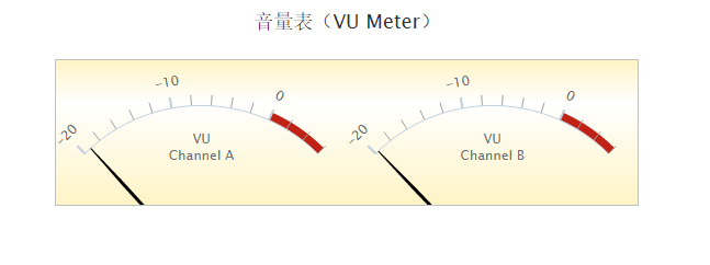
Highcharts 树状图(Treemap)
本章节我们将为大家介绍 Highcharts 的热点图。
我们在前面的章节已经了解了 Highcharts 配置语法。接下来让我们来看下 Highcharts 的其他配置。
树状图
series 配置
设置 series 的 type 属性为 treemap ,series.type 描述了数据列类型。默认值为 "line"。
var chart = { type: 'treemap' };
实例
文件名:highcharts_tree_map.htm
<html> <head> <title>Highcharts 教程 | 菜鸟教程(runoob.com)</title> <script src="http://apps.bdimg.com/libs/jquery/2.1.4/jquery.min.js"></script> <script src="/try/demo_source/highcharts.js"></script> <script src="http://code.highcharts.com/modules/treemap.js"></script> <script src="http://code.highcharts.com/modules/heatmap.js"></script> </head> <body> <div id="container" style="width: 550px; height: 400px; margin: 0 auto"></div> <script language="JavaScript"> $(document).ready(function() { var title = { text: 'Highcharts Treemap' }; var colorAxis = { minColor: '#FFFFFF', maxColor: Highcharts.getOptions().colors[0] }; var series= [{ type: "treemap", layoutAlgorithm: 'squarified', data: [{ name: 'A', value: 6, colorValue: 1 }, { name: 'B', value: 6, colorValue: 2 }, { name: 'C', value: 4, colorValue: 3 }, { name: 'D', value: 3, colorValue: 4 }, { name: 'E', value: 2, colorValue: 5 }, { name: 'F', value: 2, colorValue: 6 }, { name: 'G', value: 1, colorValue: 7 }] }]; var json = {}; json.title = title; json.colorAxis = colorAxis; json.series = series; $('#container').highcharts(json); }); </script> </body> </html>
不同等级树状图
以下实例使用不同颜色来标识不同等级的树状图。
实例
文件名:highcharts_tree_levels.htm(完整源码请点击实例查看)
<html> <head> <title>Highcharts 教程 | 菜鸟教程(runoob.com)</title> <script src="http://apps.bdimg.com/libs/jquery/2.1.4/jquery.min.js"></script> <script src="/try/demo_source/highcharts.js"></script> <script src="http://code.highcharts.com/modules/treemap.js"></script> <script src="http://code.highcharts.com/modules/heatmap.js"></script> </head> <body> <div id="container" style="width: 550px; height: 400px; margin: 0 auto"></div> <script language="JavaScript"> $(document).ready(function() { var title = { text: 'Fruit consumption' }; var series = [{ type: "treemap", layoutAlgorithm: 'stripes', alternateStartingDirection: true, levels: [{ level: 1, layoutAlgorithm: 'sliceAndDice', dataLabels: { enabled: true, align: 'left', verticalAlign: 'top', style: { fontSize: '15px', fontWeight: 'bold' } } }], data: [{ id: 'A', name: 'Apples', color: "#EC2500" }, { id:'B', name: 'Bananas', color: "#ECE100" }, { id: 'O', name: 'Oranges', color: '#EC9800' }, { name: 'Anne', parent: 'A', value: 5 }, { name: 'Rick', parent: 'A', value: 3 }, { name: 'Peter', parent: 'A', value: 4 }, { name: 'Anne', parent: 'B', value: 4 }, { name: 'Rick', parent: 'B', value: 10 }, { name: 'Peter', parent: 'B', value: 1 }, { name: 'Anne', parent: 'O', value: 1 }, { name: 'Rick', parent: 'O', value: 3 }, { name: 'Peter', parent: 'O', value: 3 }, { name: 'Susanne', parent: 'Kiwi', value: 2, color: '#9EDE00' }] }]; var json = {}; json.title = title; json.series = series; $('#container').highcharts(json); }); </script> </body> </html>
大数据量树状图
以下实例颜色了大数据量的树状图,具体实例数据可通过点击"尝试一下"查看。
文件名:highcharts_tree_largemap.htm
<html> <head> <title>Highcharts Tutorial</title> <script src="http://apps.bdimg.com/libs/jquery/2.1.4/jquery.min.js"></script> <script src="/try/demo_source/highcharts.js"></script> <script src="http://code.highcharts.com/modules/treemap.js"></script> <script src="http://code.highcharts.com/modules/heatmap.js"></script> </head> <body> <div id="container" style="width: 550px; height: 400px; margin: 0 auto"></div> <script language="JavaScript"> $(document).ready(function() { //省略部分 js 代码 var data = {……}; var points = [], region_p, region_val, region_i, country_p, country_i, cause_p, cause_i, cause_name = []; cause_name['Communicable & other Group I'] = 'Communicable diseases'; cause_name['Noncommunicable diseases'] = 'Non-communicable diseases'; cause_name['Injuries'] = 'Injuries'; region_i = 0; for (var region in data) { region_val = 0; region_p = { id: "id_" + region_i, name: region, color: Highcharts.getOptions().colors[region_i] }; country_i = 0; for (var country in data[region]) { country_p = { id: region_p.id + "_" + country_i, name: country, parent: region_p.id }; points.push(country_p); cause_i = 0; for (var cause in data[region][country]) { cause_p = { id: country_p.id + "_" + cause_i, name: cause_name[cause], parent: country_p.id, value: Math.round(+data[region][country][cause]) }; region_val += cause_p.value; points.push(cause_p); cause_i++; } country_i++; } region_p.value = Math.round(region_val / country_i); points.push(region_p); region_i++; } var chart = { renderTo: 'container' }; var title = { text: 'Global Mortality Rate 2012, per 100 000 population' }; var subtitle: { text: 'Click points to drill down. Source: <a href="http://apps.who.int/gho/data/node.main.12?lang=en">WHO</a>.' }; var series = [{ type: "treemap", layoutAlgorithm: 'squarified', allowDrillToNode: true, dataLabels: { enabled: false }, levelIsConstant: false, levels: [{ level: 1, dataLabels: { enabled: true }, borderWidth: 3 }], data: points }]; var json = {}; json.title = title; json.series = series; $('#container').highcharts(json); }); </script> </body> </html>
