


介绍
这些图表根据可视化目标的7个不同情景进行分组。例如,如果要想象两个变量之间的关系,请查看“关联”部分下的图表。或者,如果您想要显示值如何随时间变化,请查看“变化”部分,依此类推。
有效图表的重要特征:
在不歪曲事实的情况下传达正确和必要的信息。
设计简单,您不必太费力就能理解它。
从审美角度支持信息而不是掩盖信息。
信息没有超负荷。
但更多的是抛砖引玉,希望对你们有所帮助。
感谢各位的鼓励与支持🌹🌹🌹,往期文章都在最后梳理出来了(●'◡'●)
接下来就以问题的形式展开梳理👇
分布(Distribution)
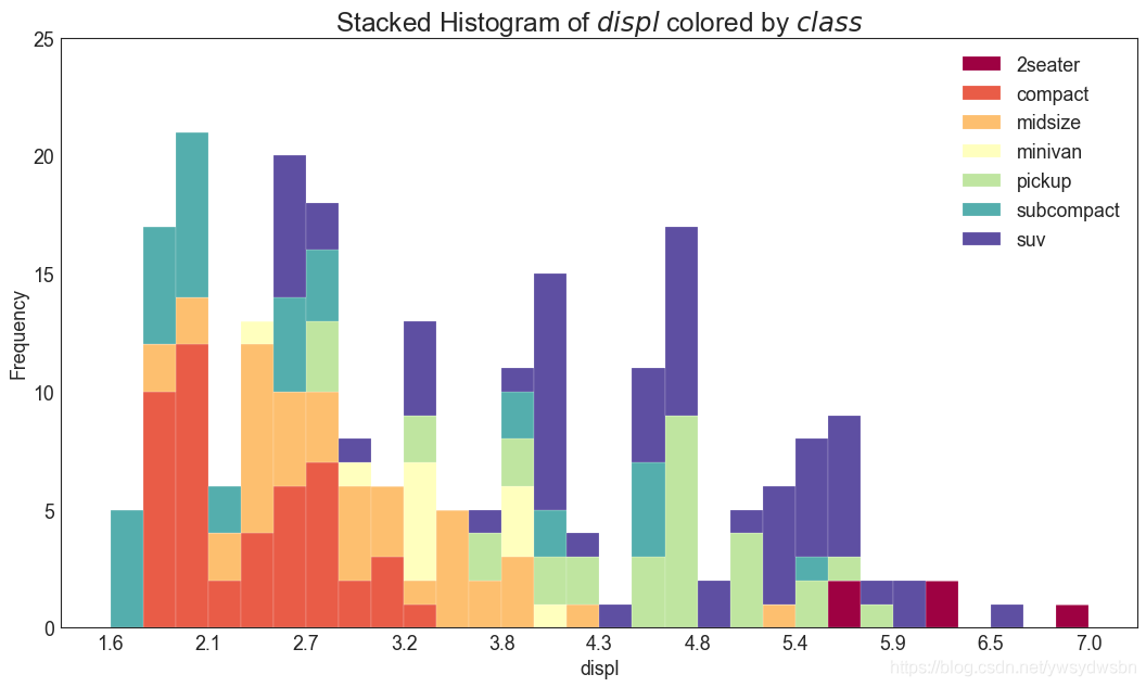
连续变量的直方图
# Import Datadf = pd.read_csv("https://github.com/selva86/datasets/raw/master/mpg_ggplot2.csv")# Prepare datax_var = 'displ'groupby_var = 'class'df_agg = df.loc[:, [x_var, groupby_var]].groupby(groupby_var)vals = [df[x_var].values.tolist() for i, df in df_agg]# Drawplt.figure(figsize=(16,9), dpi= 80)colors = [plt.cm.Spectral(i/float(len(vals)-1)) for i in range(len(vals))]n, bins, patches = plt.hist(vals, 30, stacked=True, density=False, color=colors[:len(vals)])# Decorationplt.legend({group:col for group, col in zip(np.unique(df[groupby_var]).tolist(), colors[:len(vals)])})plt.title(f"Stacked Histogram of ${x_var}$ colored by ${groupby_var}$", fontsize=22)plt.xlabel(x_var)plt.ylabel("Frequency")plt.ylim(0, 25)plt.xticks(ticks=bins[::3], labels=[round(b,1) for b in bins[::3]])plt.show()
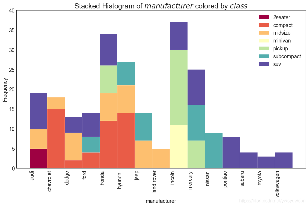
类型变量的直方图
# Import Datadf = pd.read_csv("https://github.com/selva86/datasets/raw/master/mpg_ggplot2.csv")# Prepare datax_var = 'manufacturer'groupby_var = 'class'df_agg = df.loc[:, [x_var, groupby_var]].groupby(groupby_var)vals = [df[x_var].values.tolist() for i, df in df_agg]# Drawplt.figure(figsize=(16,9), dpi= 80)colors = [plt.cm.Spectral(i/float(len(vals)-1)) for i in range(len(vals))]n, bins, patches = plt.hist(vals, df[x_var].unique().__len__(), stacked=True, density=False, color=colors[:len(vals)])# Decorationplt.legend({group:col for group, col in zip(np.unique(df[groupby_var]).tolist(), colors[:len(vals)])})plt.title(f"Stacked Histogram of ${x_var}$ colored by ${groupby_var}$", fontsize=22)plt.xlabel(x_var)plt.ylabel("Frequency")plt.ylim(0, 40)plt.xticks(ticks=bins, labels=np.unique(df[x_var]).tolist(), rotation=90, horizontalalignment='left')plt.show()
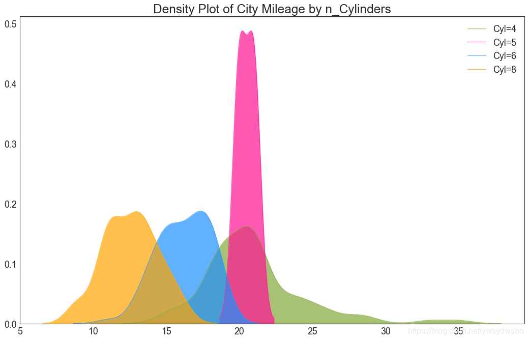
密度图(density plot)
# Import Datadf = pd.read_csv("https://github.com/selva86/datasets/raw/master/mpg_ggplot2.csv")# Draw Plotplt.figure(figsize=(16,10), dpi= 80)sns.kdeplot(df.loc[df['cyl'] == 4, "cty"], shade=True, color="g", label="Cyl=4", alpha=.7)sns.kdeplot(df.loc[df['cyl'] == 5, "cty"], shade=True, color="deeppink", label="Cyl=5", alpha=.7)sns.kdeplot(df.loc[df['cyl'] == 6, "cty"], shade=True, color="dodgerblue", label="Cyl=6", alpha=.7)sns.kdeplot(df.loc[df['cyl'] == 8, "cty"], shade=True, color="orange", label="Cyl=8", alpha=.7)# Decorationplt.title('Density Plot of City Mileage by n_Cylinders', fontsize=22)plt.legend()plt.show()
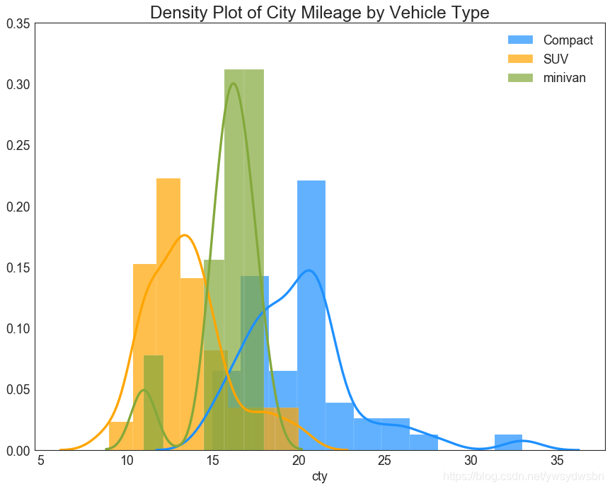
直方密度线图(density curves with histogram)
# Import Datadf = pd.read_csv("https://github.com/selva86/datasets/raw/master/mpg_ggplot2.csv")# Draw Plotplt.figure(figsize=(13,10), dpi= 80)sns.distplot(df.loc[df['class'] == 'compact', "cty"], color="dodgerblue", label="Compact", hist_kws={'alpha':.7}, kde_kws={'linewidth':3})sns.distplot(df.loc[df['class'] == 'suv', "cty"], color="orange", label="SUV", hist_kws={'alpha':.7}, kde_kws={'linewidth':3})sns.distplot(df.loc[df['class'] == 'minivan', "cty"], color="g", label="minivan", hist_kws={'alpha':.7}, kde_kws={'linewidth':3})plt.ylim(0, 0.35)# Decorationplt.title('Density Plot of City Mileage by Vehicle Type', fontsize=22)plt.legend()plt.show()
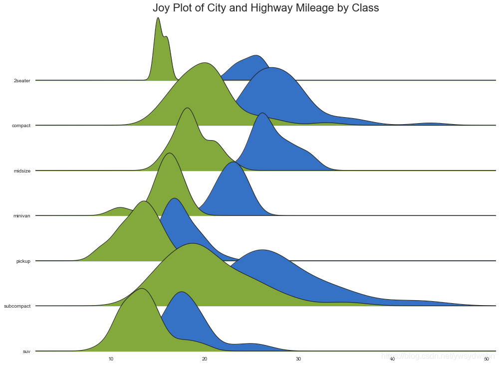
Joy Plot
# 导入资源包:pip install joypyimport joypy# Import Datampg = pd.read_csv("https://github.com/selva86/datasets/raw/master/mpg_ggplot2.csv")# Draw Plotplt.figure(figsize=(16,10), dpi= 80)fig, axes = joypy.joyplot(mpg, column=['hwy', 'cty'], by="class", ylim='own', figsize=(14,10))# Decorationplt.title('Joy Plot of City and Highway Mileage by Class', fontsize=22)plt.show()
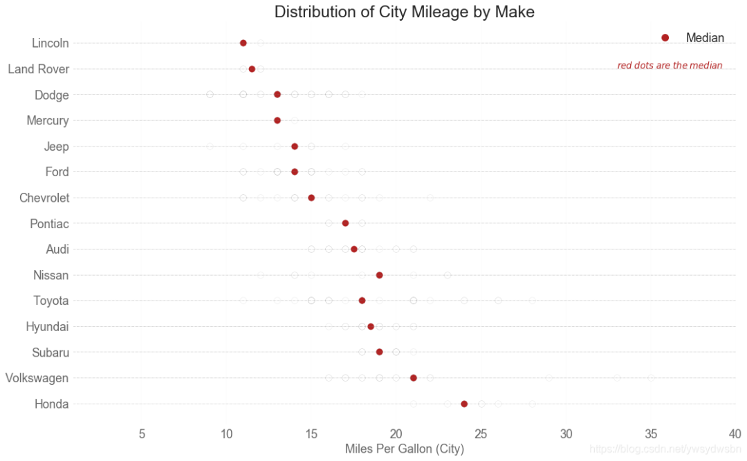
分布式包点图(distributed dot plot)
import matplotlib.patches as mpatches# Prepare Datadf_raw = pd.read_csv("https://github.com/selva86/datasets/raw/master/mpg_ggplot2.csv")cyl_colors = {4:'tab:red', 5:'tab:green', 6:'tab:blue', 8:'tab:orange'}df_raw['cyl_color'] = df_raw.cyl.map(cyl_colors)# Mean and Median city mileage by makedf = df_raw[['cty', 'manufacturer']].groupby('manufacturer').apply(lambda x: x.mean())df.sort_values('cty', ascending=False, inplace=True)df.reset_index(inplace=True)df_median = df_raw[['cty', 'manufacturer']].groupby('manufacturer').apply(lambda x: x.median())# Draw horizontal linesfig, ax = plt.subplots(figsize=(16,10), dpi= 80)ax.hlines(y=df.index, xmin=0, xmax=40, color='gray', alpha=0.5, linewidth=.5, linestyles='dashdot')# Draw the Dotsfor i, make in enumerate(df.manufacturer):df_make = df_raw.loc[df_raw.manufacturer==make, :]ax.scatter(y=np.repeat(i, df_make.shape[0]), x='cty', data=df_make, s=75, edgecolors='gray', c='w', alpha=0.5)ax.scatter(y=i, x='cty', data=df_median.loc[df_median.index==make, :], s=75, c='firebrick')# Annotateax.text(33, 13, "$red \; dots \; are \; the \: median$", fontdict={'size':12}, color='firebrick')# Decorationsred_patch = plt.plot([],[], marker="o", ms=10, ls="", mec=None, color='firebrick', label="Median")plt.legend(handles=red_patch)ax.set_title('Distribution of City Mileage by Make', fontdict={'size':22})ax.set_xlabel('Miles Per Gallon (City)', alpha=0.7)ax.set_yticks(df.index)ax.set_yticklabels(df.manufacturer.str.title(), fontdict={'horizontalalignment': 'right'}, alpha=0.7)ax.set_xlim(1, 40)plt.xticks(alpha=0.7)plt.gca().spines["top"].set_visible(False)plt.gca().spines["bottom"].set_visible(False)plt.gca().spines["right"].set_visible(False)plt.gca().spines["left"].set_visible(False)plt.grid(axis='both', alpha=.4, linewidth=.1)plt.show()
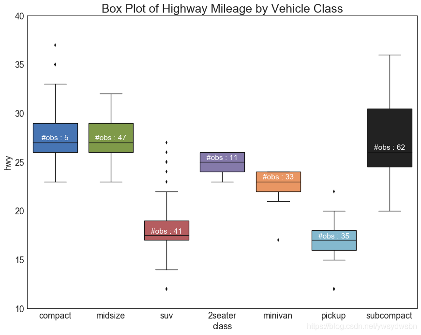
箱型图(box plot)
箱形图是一种可视化分布的好方法,记住中位数、第25个第45个四分位数和异常值。但是,您需要注意解释可能会扭曲该组中包含的点数的框的大小。因此,手动提供每个框中的观察数量可以帮助克服这个缺点。
例如,左边的前两个框具有相同大小的框,即使它们的值分别是5和47。因此,写入该组中的观察数量是必要的。
# Import Datadf = pd.read_csv("https://github.com/selva86/datasets/raw/master/mpg_ggplot2.csv")# Draw Plotplt.figure(figsize=(13,10), dpi= 80)sns.boxplot(x='class', y='hwy', data=df, notch=False)# Add N Obs inside boxplot (optional)def add_n_obs(df,group_col,y):medians_dict = {grp[0]:grp[1][y].median() for grp in df.groupby(group_col)}xticklabels = [x.get_text() for x in plt.gca().get_xticklabels()]n_obs = df.groupby(group_col)[y].size().valuesfor (x, xticklabel), n_ob in zip(enumerate(xticklabels), n_obs):plt.text(x, medians_dict[xticklabel]*1.01, "#obs : "+str(n_ob), horizontalalignment='center', fontdict={'size':14}, color='white')add_n_obs(df,group_col='class',y='hwy')# Decorationplt.title('Box Plot of Highway Mileage by Vehicle Class', fontsize=22)plt.ylim(10, 40)plt.show()
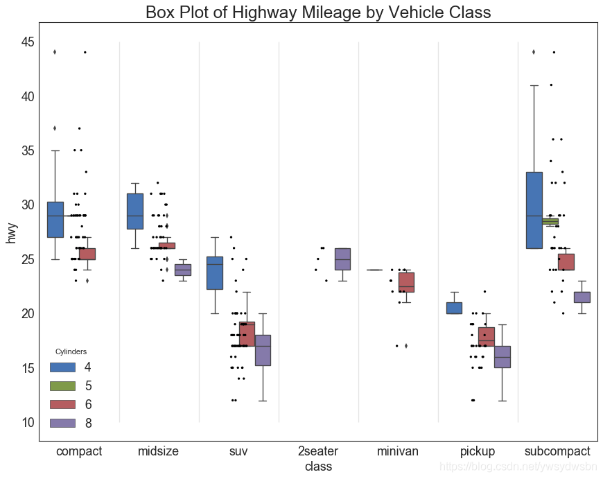
包点+箱型图(dot+box plot)
# Import Datadf = pd.read_csv("https://github.com/selva86/datasets/raw/master/mpg_ggplot2.csv")# Draw Plotplt.figure(figsize=(13,10), dpi= 80)sns.boxplot(x='class', y='hwy', data=df, hue='cyl')sns.stripplot(x='class', y='hwy', data=df, color='black', size=3, jitter=1)for i in range(len(df['class'].unique())-1):plt.vlines(i+.5, 10, 45, linestyles='solid', colors='gray', alpha=0.2)# Decorationplt.title('Box Plot of Highway Mileage by Vehicle Class', fontsize=22)plt.legend(title='Cylinders')plt.show()
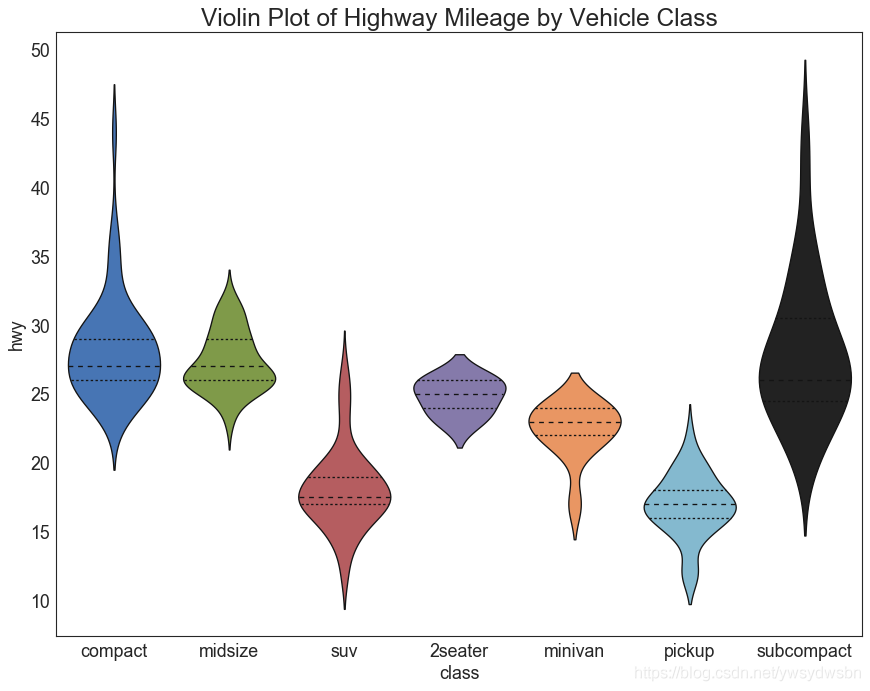
小提琴图(violin plot)
# Import Datadf = pd.read_csv("https://github.com/selva86/datasets/raw/master/mpg_ggplot2.csv")# Draw Plotplt.figure(figsize=(13,10), dpi= 80)sns.violinplot(x='class', y='hwy', data=df, scale='width', inner='quartile')# Decorationplt.title('Violin Plot of Highway Mileage by Vehicle Class', fontsize=22)plt.show()
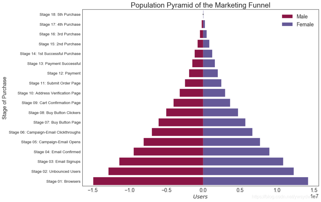
人口金字塔图(population pyramid)
# Read datadf = pd.read_csv("https://raw.githubusercontent.com/selva86/datasets/master/email_campaign_funnel.csv")# Draw Plotplt.figure(figsize=(13,10), dpi= 80)group_col = 'Gender'order_of_bars = df.Stage.unique()[::-1]colors = [plt.cm.Spectral(i/float(len(df[group_col].unique())-1)) for i in range(len(df[group_col].unique()))]for c, group in zip(colors, df[group_col].unique()):sns.barplot(x='Users', y='Stage', data=df.loc[df[group_col]==group, :], order=order_of_bars, color=c, label=group)# Decorationsplt.xlabel("$Users$")plt.ylabel("Stage of Purchase")plt.yticks(fontsize=12)plt.title("Population Pyramid of the Marketing Funnel", fontsize=22)plt.legend()plt.show()
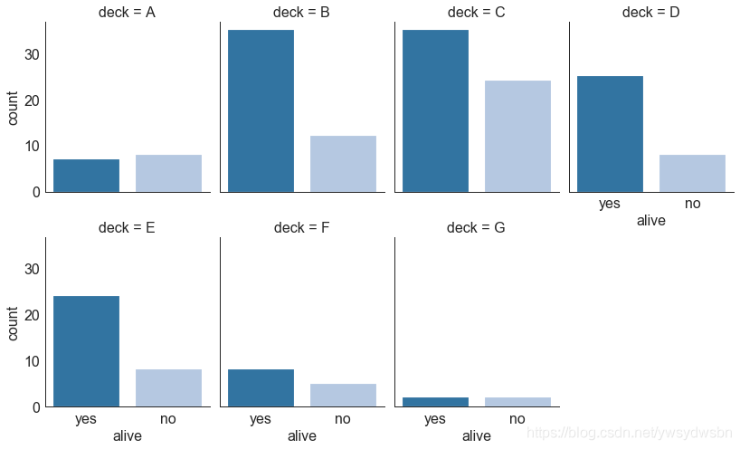
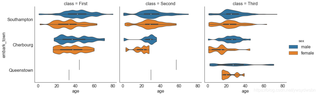
分类图(categorical plot)
# Load Datasettitanic = sns.load_dataset("titanic")# Plotg = sns.catplot("alive", col="deck", col_wrap=4,data=titanic[titanic.deck.notnull()],kind="count", height=3.5, aspect=.8,palette='tab20')fig.suptitle('sf')plt.show()
# Load Datasettitanic = sns.load_dataset("titanic")# Plotsns.catplot(x="age", y="embark_town",hue="sex", col="class",data=titanic[titanic.embark_town.notnull()],orient="h", height=5, aspect=1, palette="tab10",kind="violin", dodge=True, cut=0, bw=.2)
组成(Composition)
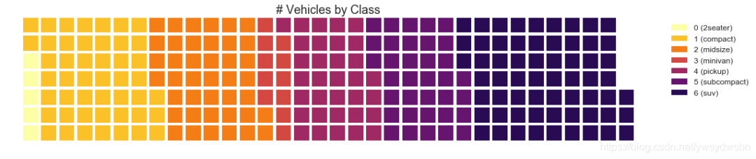
华夫饼图(waffle chart)
#导入资源库:pip install pywaffle# Reference: https://stackoverflow.com/questions/41400136/how-to-do-waffle-charts-in-python-square-piechartfrom pywaffle import Waffle# Importdf_raw = pd.read_csv("https://github.com/selva86/datasets/raw/master/mpg_ggplot2.csv")# Prepare Datadf = df_raw.groupby('class').size().reset_index(name='counts')n_categories = df.shape[0]colors = [plt.cm.inferno_r(i/float(n_categories)) for i in range(n_categories)]# Draw Plot and Decoratefig = plt.figure(FigureClass=Waffle,plots={'111': {'values': df['counts'],'labels': ["{0} ({1})".format(n[0], n[1]) for n in df[['class', 'counts']].itertuples()],'legend': {'loc': 'upper left', 'bbox_to_anchor': (1.05, 1), 'fontsize': 12},'title': {'label': '# Vehicles by Class', 'loc': 'center', 'fontsize':18}},},rows=7,colors=colors,figsize=(16, 9))
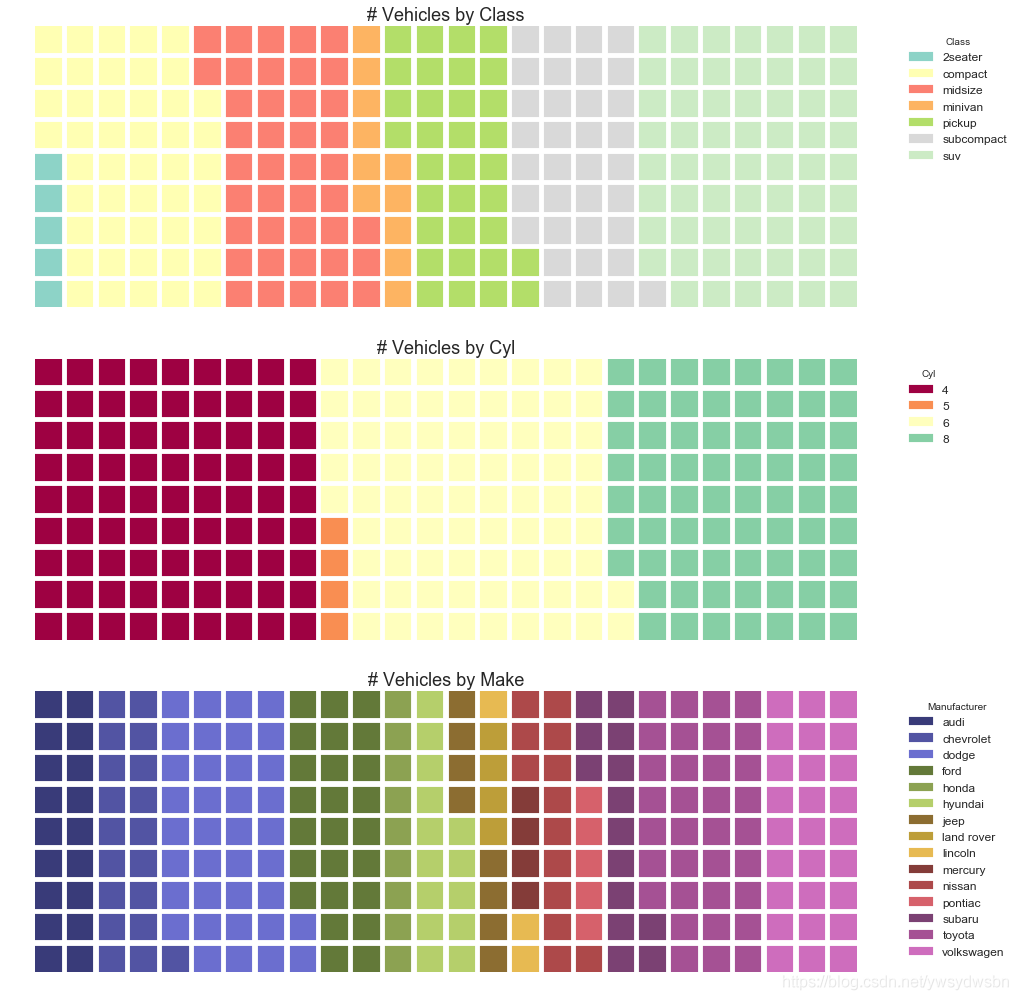
#导入资源包:pip install pywafflefrom pywaffle import Waffle# Import# df_raw = pd.read_csv("https://github.com/selva86/datasets/raw/master/mpg_ggplot2.csv")# Prepare Data# By Class Datadf_class = df_raw.groupby('class').size().reset_index(name='counts_class')n_categories = df_class.shape[0]colors_class = [plt.cm.Set3(i/float(n_categories)) for i in range(n_categories)]# By Cylinders Datadf_cyl = df_raw.groupby('cyl').size().reset_index(name='counts_cyl')n_categories = df_cyl.shape[0]colors_cyl = [plt.cm.Spectral(i/float(n_categories)) for i in range(n_categories)]# By Make Datadf_make = df_raw.groupby('manufacturer').size().reset_index(name='counts_make')n_categories = df_make.shape[0]colors_make = [plt.cm.tab20b(i/float(n_categories)) for i in range(n_categories)]# Draw Plot and Decoratefig = plt.figure(FigureClass=Waffle,plots={'311': {'values': df_class['counts_class'],'labels': ["{1}".format(n[0], n[1]) for n in df_class[['class', 'counts_class']].itertuples()],'legend': {'loc': 'upper left', 'bbox_to_anchor': (1.05, 1), 'fontsize': 12, 'title':'Class'},'title': {'label': '# Vehicles by Class', 'loc': 'center', 'fontsize':18},'colors': colors_class},'312': {'values': df_cyl['counts_cyl'],'labels': ["{1}".format(n[0], n[1]) for n in df_cyl[['cyl', 'counts_cyl']].itertuples()],'legend': {'loc': 'upper left', 'bbox_to_anchor': (1.05, 1), 'fontsize': 12, 'title':'Cyl'},'title': {'label': '# Vehicles by Cyl', 'loc': 'center', 'fontsize':18},'colors': colors_cyl},'313': {'values': df_make['counts_make'],'labels': ["{1}".format(n[0], n[1]) for n in df_make[['manufacturer', 'counts_make']].itertuples()],'legend': {'loc': 'upper left', 'bbox_to_anchor': (1.05, 1), 'fontsize': 12, 'title':'Manufacturer'},'title': {'label': '# Vehicles by Make', 'loc': 'center', 'fontsize':18},'colors': colors_make}},rows=9,figsize=(16, 14))
饼图(pie chart)
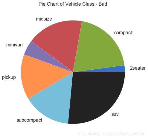
# Importdf_raw = pd.read_csv("https://github.com/selva86/datasets/raw/master/mpg_ggplot2.csv")# Prepare Datadf = df_raw.groupby('class').size()# Make the plot with pandasdf.plot(kind='pie', subplots=True, figsize=(8, 8))plt.title("Pie Chart of Vehicle Class - Bad")plt.ylabel("")plt.show()
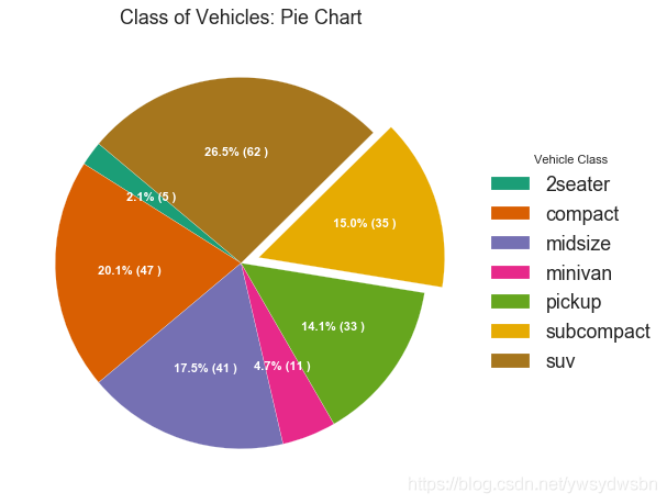
# Importdf_raw = pd.read_csv("https://github.com/selva86/datasets/raw/master/mpg_ggplot2.csv")# Prepare Datadf = df_raw.groupby('class').size().reset_index(name='counts')# Draw Plotfig, ax = plt.subplots(figsize=(12, 7), subplot_kw=dict(aspect="equal"), dpi= 80)data = df['counts']categories = df['class']explode = [0,0,0,0,0,0.1,0]def func(pct, allvals):absolute = int(pct/100.*np.sum(allvals))return "{:.1f}% ({:d} )".format(pct, absolute)wedges, texts, autotexts = ax.pie(data,autopct=lambda pct: func(pct, data),textprops=dict(color="w"),colors=plt.cm.Dark2.colors,startangle=140,explode=explode)# Decorationax.legend(wedges, categories, title="Vehicle Class", loc="center left", bbox_to_anchor=(1, 0, 0.5, 1))plt.setp(autotexts, size=10, weight=700)ax.set_title("Class of Vehicles: Pie Chart")plt.show()
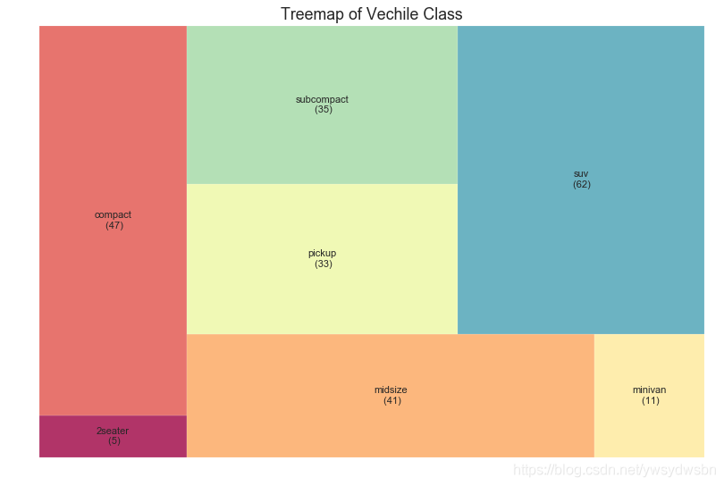
树形图(treemap)
树形图类似于饼图,它可以更好地完成工作而不会误导每个组的贡献。
# 导入资源包:pip install squarifyimport squarify# Import Datadf_raw = pd.read_csv("https://github.com/selva86/datasets/raw/master/mpg_ggplot2.csv")# Prepare Datadf = df_raw.groupby('class').size().reset_index(name='counts')labels = df.apply(lambda x: str(x[0]) + "\n (" + str(x[1]) + ")", axis=1)sizes = df['counts'].values.tolist()colors = [plt.cm.Spectral(i/float(len(labels))) for i in range(len(labels))]# Draw Plotplt.figure(figsize=(12,8), dpi= 80)squarify.plot(sizes=sizes, label=labels, color=colors, alpha=.8)# Decorateplt.title('Treemap of Vechile Class')plt.axis('off')plt.show()
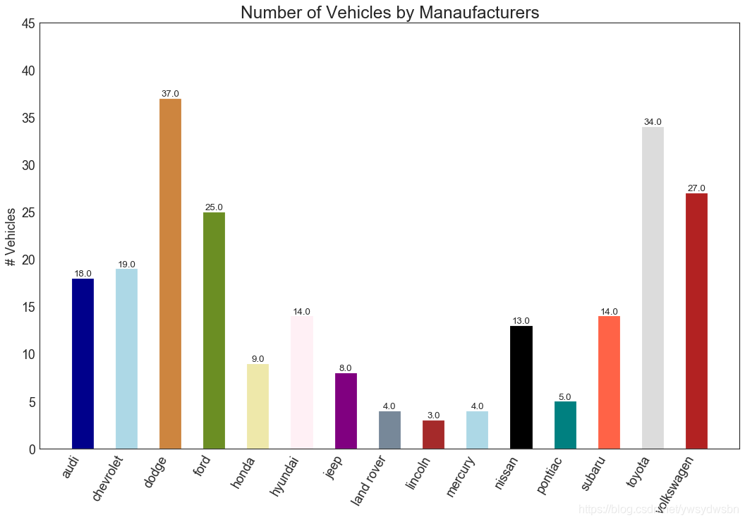
条形图(bar chart)
plt.plot()中设置颜色参数来更改条的颜色。
import random# Import Datadf_raw = pd.read_csv("https://github.com/selva86/datasets/raw/master/mpg_ggplot2.csv")# Prepare Datadf = df_raw.groupby('manufacturer').size().reset_index(name='counts')n = df['manufacturer'].unique().__len__()+1all_colors = list(plt.cm.colors.cnames.keys())random.seed(100)c = random.choices(all_colors, k=n)# Plot Barsplt.figure(figsize=(16,10), dpi= 80)plt.bar(df['manufacturer'], df['counts'], color=c, width=.5)for i, val in enumerate(df['counts'].values):plt.text(i, val, float(val), horizontalalignment='center', verticalalignment='bottom', fontdict={'fontweight':500, 'size':12})# Decorationplt.gca().set_xticklabels(df['manufacturer'], rotation=60, horizontalalignment= 'right')plt.title("Number of Vehicles by Manaufacturers", fontsize=22)plt.ylabel('# Vehicles')plt.ylim(0, 45)plt.show()
「❤️ 感谢大家」
如果你觉得这篇内容对你挺有有帮助的话:
点赞支持下吧,让更多的人也能看到这篇内容(收藏不点赞,都是耍流氓 -_-) 欢迎在留言区与我分享你的想法,也欢迎你在留言区记录你的思考过程。 觉得不错的话,也可以阅读近期梳理的文章(感谢各位的鼓励与支持🌹🌹🌹): 计算机下SSL安全网络通信(420+👍) 梦魇回生的博客:https://gain-wyj.cn/(680+👍) 【震惊】手把手教你用python做绘图工具(580+👍) 【算法分析】——快速幂算法(160+👍) 数据可视化:利用Python和Echarts制作“用户消费行为分析”可视化大屏🚀🚀🚀(210+👍) 手把手教你进行pip换源(230+👍) 用python实现前向分词最大匹配算法(220+👍) 教你用python操作摄像头以及对视频流的处理(240+👍) 汇总超全的Matplotlib可视化最有价值的 50 个图表(附完整 Python 源代码)(一)(240+👍) 小程序云开发项目的创建与配置(240+👍)


点分享

点点赞

点在看

文章转载自做一个柔情的程序猿,如果涉嫌侵权,请发送邮件至:contact@modb.pro进行举报,并提供相关证据,一经查实,墨天轮将立刻删除相关内容。
