


本文主要利用ggplot2对多变量箱线图进行绘制,其中包括基础箱线图、分组变量下的箱线图以及分面箱线图,同时对图形进行简要修饰。
一、数据来源
所使用的数据来自国家统计局[1]官方网站上关于2011-2020年我国31个省份人均地区生产总值(未包含港澳台数据),在此基础上,参考相关文献(李超等,2015)[2]将31个省份分为东部地区、东北地区、中部地区、西部地区四大地理分区,以便进行分组箱线图以及分面箱线图的绘制。数据可在国家统计局官网自行下载,也可关注公众号在后台回复【20211229】获取,具体绘图code可参考本推文。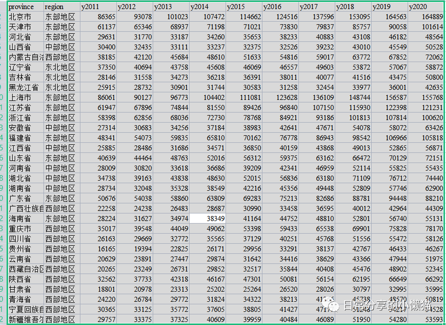
二、数据的导入与数据处理
1.加载相关package与导入数据(未安装相关包需要先进行安装)
#install.packages("ggplot2")
#install.packages("reshape2")
#install.packages("RColorBrewer")
library(ggplot2)
library(reshape2)
library(RColorBrewer)
setwd("C:\\Users\\Acer\\Desktop")#设置工作路径,将csv数据放到此路径下
data <- read.csv("人均GDP.csv")#读入数据
head(data)#查看数据前几行
# province region y2011 y2012 y2013 y2014 y2015 y2016 y2017 y2018 y2019 y2020
#1 北京市 东部地区 86365 93078 101023 107472 114662 124516 137596 153095 164563 164889
#2 天津市 东部地区 61137 65346 68937 71198 71021 73830 79837 85757 90058 101614
#3 河北省 东部地区 29631 31770 33187 34260 35653 38233 40883 43108 46182 48564复制
2.将“宽数据”转换为“长数据”:由于ggplot2能够识别的数据形式原因,需要将年份(y2011-y2020)变量的数值融合为一列,只保留省份(province)与地区(region)变量,融合后的数据新增一列年份与年份对应的数值。【注:如果不是为了绘制分组或者分面箱线图则一般不需要这一步。或者也可以提前在Excel中将数据整理为面板形式的数据,即为ggplot2能够识别的长数据】
names(data)#查看列名
# [1] "province" "region" "y2011" "y2012" "y2013" "y2014" "y2015" "y2016" "y2017" "y2018" "y2019" "y2020"
mydata <- melt(data, #需要转换的数据集名称
id.vars=c("province", "region"), #保留的主字段
variable.name="year",#转换后分类维度
value.name="Per.GDP")#转换后的度量值名称
head(mydata)#查看转换后的数据
# province region year Per.GDP
#1 北京市 东部地区 y2011 86365
#2 天津市 东部地区 y2011 61137
#3 河北省 东部地区 y2011 29631
str(mydata)#查看数据结构
#'data.frame': 310 obs. of 4 variables:
# $ province: chr "北京市" "天津市" "河北省" "山西省" ...
# $ region : chr "东部地区" "东部地区" "东部地区" "中部地区" ...
# $ year : Factor w/ 10 levels "y2011","y2012",..: 1 1 1 1 1 1 1 1 1 1 ...
# $ Per.GDP : int 86365 61137 29631 30400 38185 37350 28146 25915 86061 61947 ...
levels(mydata$year)
#[1] "y2011" "y2012" "y2013" "y2014" "y2015" "y2016" "y2017" "y2018" "y2019" "y2020"复制
3.修改因子水平:以便绘图时按照指定的因子水平顺序进行绘制
mydata$region <- factor(mydata$region,levels = c("西部地区", "东北地区", "中部地区","东部地区"))
mydata$year <- factor(mydata$year, levels = c("y2011", "y2012", "y2013", "y2014", "y2015", "y2016", "y2017", "y2018", "y2019", "y2020"),
labels = c("2011", "2012", "2013", "2014", "2015", "2016", "2017", "2018", "2019", "2020"))
str(mydata)#可以发现region和year都修改为了因子型变量并指定了顺序。此外,对year变量的标签名也进行了修改。
#'data.frame': 310 obs. of 4 variables:
# $ province: chr "北京市" "天津市" "河北省" "山西省" ...
# $ region : Factor w/ 4 levels "西部地区","东北地区",..: 4 4 4 3 1 2 2 2 4 4 ...
# $ year : Factor w/ 10 levels "2011","2012",..: 1 1 1 1 1 1 1 1 1 1 ...
# $ Per.GDP : int 86365 61137 29631 30400 38185 37350 28146 25915 86061 61947 ...复制
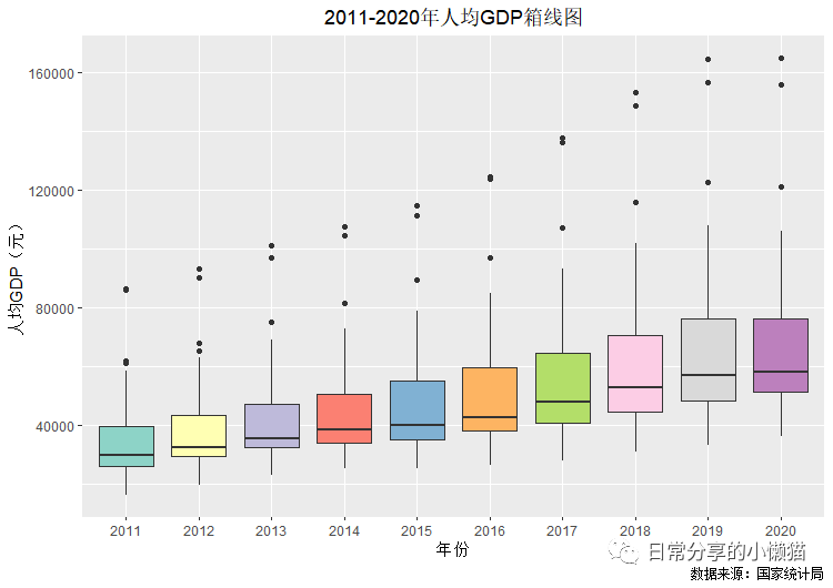
三、基础箱线图
1.基础箱线图
ggplot(mydata, aes(x = year, y = Per.GDP)) +
geom_boxplot()复制

2.对基础箱线图做进一步的修改
ggplot(mydata, aes(x = year, y = Per.GDP)) +
geom_boxplot( fill = brewer.pal(10, "Set3")) + #对箱线图的颜色进行填充,调用RColorBrewer中的颜色
labs(x= "年份", y = "人均GDP(元)", title = "2011-2020年人均GDP箱线图",
fill = "地区", caption = "数据来源:国家统计局") + #设置x轴、y轴、图标题
theme(plot.title = element_text(hjust = 0.5)) #将图标题居中复制
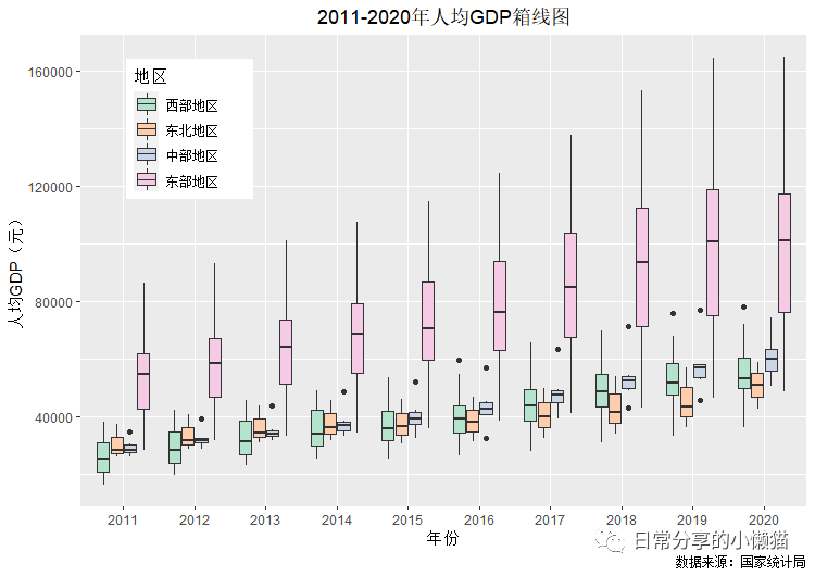
四、分组箱线图
1.基础分组箱线图
ggplot(mydata, aes(x = year, y = Per.GDP, fill = region)) +
geom_boxplot()复制
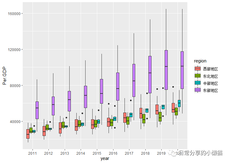
2.对分组基础箱线图做进一步的修改
ggplot(mydata, aes(x = year, y = Per.GDP, fill = region)) +
geom_boxplot()+
scale_fill_brewer(palette = "Pastel2") + #利用RColorBrewer中Pastel2配色对分组变量进行填充
labs(x= "年份", y = "人均GDP(元)", title = "2011-2020年人均GDP箱线图",
fill = "地区", caption = "数据来源:国家统计局") +
theme(plot.title = element_text(hjust = 0.5),
legend.position = c(0.15, 0.8)) #legend.position用来设置图例放置的位置(绘图区域内)复制
五、分面箱线图
1.使用facet_wrap()函数进行分面
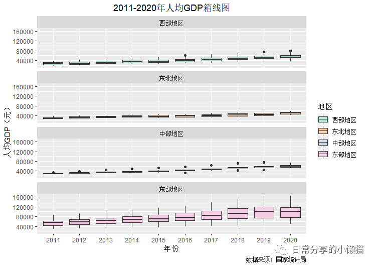
ggplot(mydata, aes(x = year, y = Per.GDP, fill = region)) +
geom_boxplot()+
facet_wrap(~region, ncol = 1) + #使用facet_wrap函数,其中~region表示根据region变量横向排列,ncol用来控制列数
scale_fill_brewer(palette = "Pastel2") +
labs(x= "年份", y = "人均GDP(元)", title = "2011-2020年人均GDP箱线图",
fill = "地区", caption = "数据来源:国家统计局") +
theme(plot.title = element_text(hjust = 0.5))复制
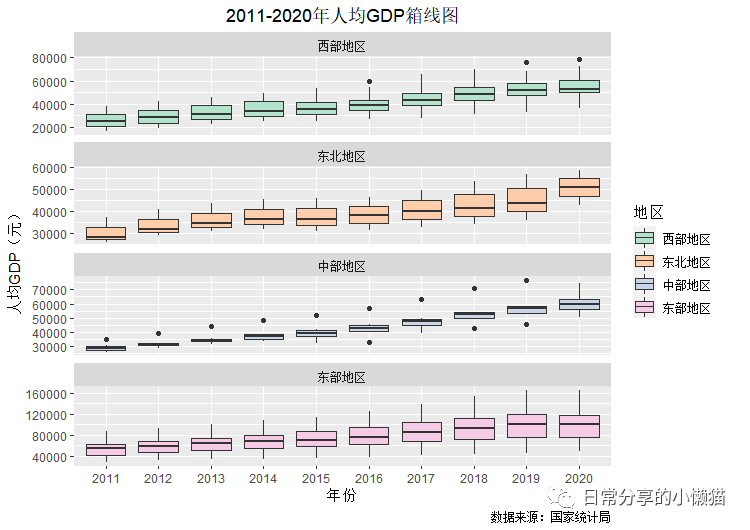
2.对分面箱线图做进一步的修改——使用自由标度。观察可以发现上面每一个分面的y轴都是0~160000,这种情况下,除了东部地区的箱线图外,其余地区的箱线图效果不好,因此可以通过使用自由标度让每一个分面的箱线图根据自身数值范围进行自由选择。方法为在facet_wrap函数中添加scales = "free_y"。此外,对分面的标题大小也进行调整。具体如下:
ggplot(mydata, aes(x = year, y = Per.GDP, fill = region)) +
geom_boxplot()+
facet_wrap(~region, ncol = 1, scales = "free_y") + #在facet_wrap函数中添加scales = "free_y"
scale_fill_brewer(palette = "Pastel2") +
labs(x= "年份", y = "人均GDP(元)", title = "2011-2020年人均GDP箱线图",
fill = "地区", caption = "数据来源:国家统计局") +
theme(plot.title = element_text(hjust = 0.5),
strip.text = element_text(size = 12))#调整分面标题文本大小复制
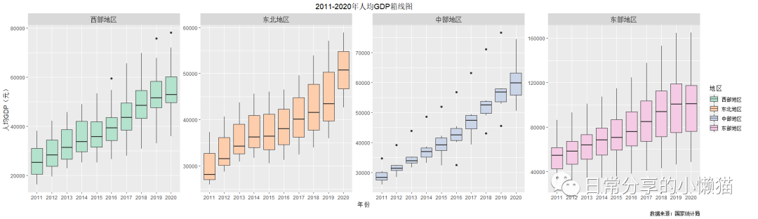
3.设置ncol = 4
ggplot(mydata, aes(x = year, y = Per.GDP, fill = region)) +
geom_boxplot()+
facet_wrap(~region, ncol = 4, scales = "free_y") +
scale_fill_brewer(palette = "Pastel2") +
labs(x= "年份", y = "人均GDP(元)", title = "2011-2020年人均GDP箱线图",
fill = "地区", caption = "数据来源:国家统计局") +
theme(plot.title = element_text(hjust = 0.5),
strip.text = element_text(size = 12))复制
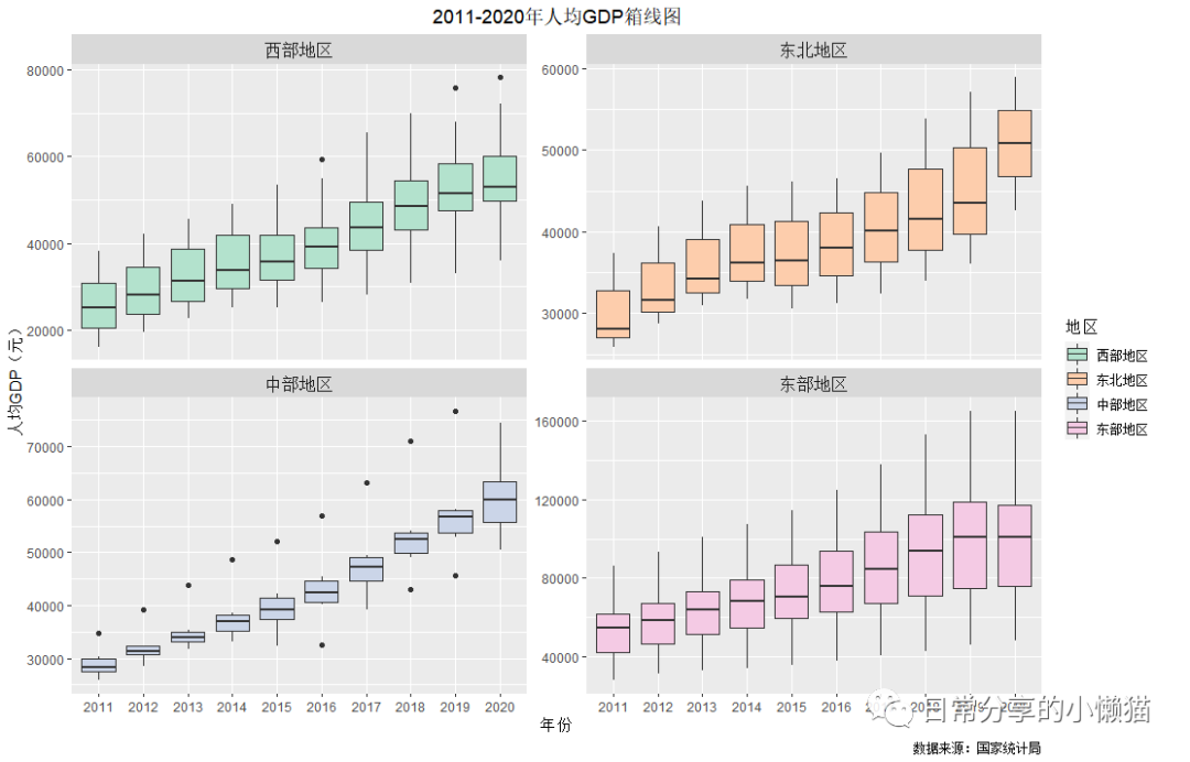
4.设置ncol = 2
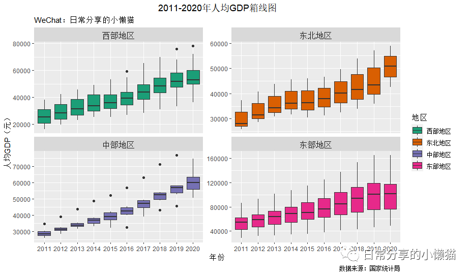
ggplot(mydata, aes(x = year, y = Per.GDP, fill = region)) +
geom_boxplot()+
facet_wrap(~region, ncol = 2, scales = "free_y") +
scale_fill_brewer(palette = "Pastel2") +
labs(x= "年份", y = "人均GDP(元)", title = "2011-2020年人均GDP箱线图",
fill = "地区", caption = "数据来源:国家统计局") +
theme(plot.title = element_text(hjust = 0.5),
strip.text = element_text(size = 12))复制
5.也可以进一步调整颜色
ggplot(mydata, aes(x = year, y = Per.GDP, fill = region)) +
geom_boxplot()+
facet_wrap(~region, ncol = 2, scales = "free_y") +
scale_fill_brewer(palette = "Dark2"配色) + #利用"Dark2"配色
labs(x= "年份", y = "人均GDP(元)", title = "2011-2020年人均GDP箱线图", subtitle = "WeChat:日常分享的小懒猫",
fill = "地区", caption = "数据来源:国家统计局") +
theme(plot.title = element_text(hjust = 0.5),
strip.text = element_text(size = 12))复制
绘图合集

六、其他
本文以基础多变量箱线图、分组变量箱线图以及分面箱线图为例,对不同类型的箱线图进行了展示,但关于图形的调整涉及图例、配色、主题、标签等许多内容,本文主要涉及箱线图的绘制,对图形的调整涉及不多,如何对图形进行更多的调整可以继续关注后续所推出的内容。
参考资料
国家统计局: https://data.stats.gov.cn/index.htm
[2]李超,倪鹏飞,万海远: 中国住房需求持续高涨之谜:基于人口结构视角[J].经济研究,2015,50(05):118-133.
评论

 0 点赞
0 点赞