箱线图(Boxplot) 主要用于展示连续型数据的分布状况,包括数据的上下四分位数,中位数、异常值等信息。本文主要展示如何利用ggplot2绘制带误差线的箱线图,效果如下: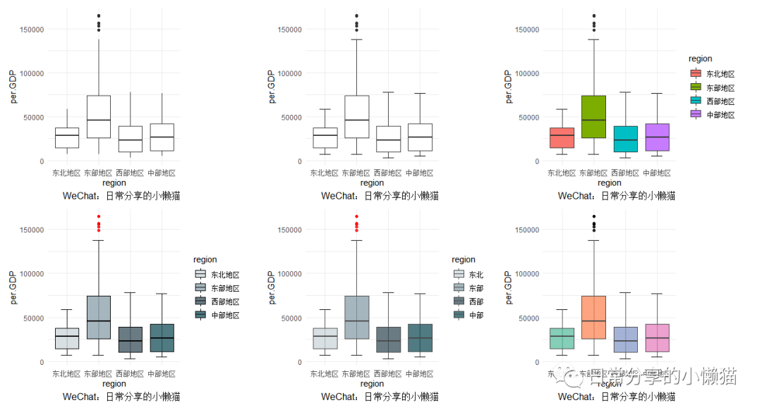
1、数据准备
以国家统计局[1]官方网站上2001-2020年我国31个省份人均GDP(未包含港澳台数据)为基础,参考(李超等,2015)[2]将31个省份分为东部、东北、中部、西部地区四大地理分区,绘制2001-2020年不同年份地理分区人均GDP均值箱线图。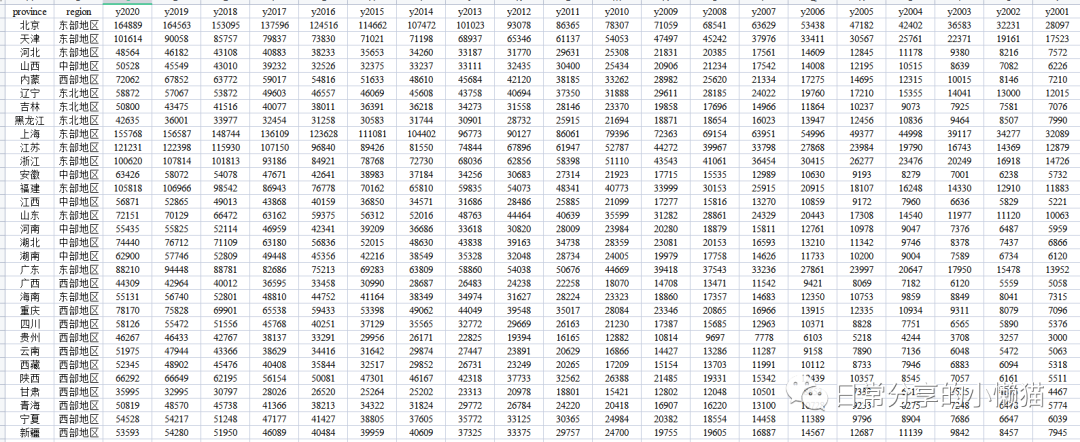
per.GDP <- readxl::read_xlsx("C:\\Users\\Acer\\Desktop\\方法学习\\R学习\\常用数据\\GGDP.xlsx")
head(per.GDP)
# A tibble: 6 x 22
# province region y2020 y2019 y2018 y2017 y2016 y2015 y2014 y2013 y201#2 y2011 y2010 y2009 y2008 y2007 y2006 y2005 y2004 y2003
# <chr> <chr> <dbl> <dbl> <dbl> <dbl> <dbl> <dbl> <dbl> <dbl> <dbl> <dbl> <dbl> <dbl> <dbl> <dbl> <dbl> <dbl> <dbl> <dbl>
#1 北京 东部地区 164889 164563 153095 137596 124516 114662 107472 101023 93078 86365 78307 71059 68541 63629 53438 47182 42402 36583
#2 天津 东部地区 101614 90058 85757 79837 73830 71021 71198 68937 65346 61137 54053 47497 45242 37976 33411 30567 25761 22371
#3 河北 东部地区 48564 46182 43108 40883 38233 35653 34260 33187 31770 29631 25308 21831 20385 17561 14609 12845 11178 9380
#4 山西 中部地区 50528 45549 43010 39232 32526 32375 33237 33111 32435 30400 25434 20906 21234 17542 14008 12195 10515 8639
#5 内蒙 西部地区 72062 67852 63772 59017 54816 51633 48610 45684 42120 38185 33262 28982 25620 21334 17275 14695 12315 10015
#6 辽宁 东北地区 58872 57067 53872 49603 46557 46069 45608 43758 40694 37350 31888 29611 28185 24022 19760 17210 15355 14041
# ... with 2 more variables: y2002 <dbl>, y2001 <dbl>
per.GDP <- reshape2::melt(per.GDP, id.vars = c("province", "region"), variable.name = "year", value.name = "per.GDP")
per.GDP$year <- factor(per.GDP$year, levels = paste("y", 2001:2020, sep = ""), labels = 2001:2020)
head(per.GDP)
# province region year per.GDP
#1 北京 东部地区 2020 164889
#2 天津 东部地区 2020 101614
#3 河北 东部地区 2020 48564
#4 山西 中部地区 2020 50528
#5 内蒙 西部地区 2020 72062
#6 辽宁 东北地区 2020 58872
str(per.GDP)
#'data.frame': 620 obs. of 4 variables:
# $ province: chr "北京" "天津" "河北" "山西" ...
# $ region : chr "东部地区" "东部地区" "东部地区" "中部地区" ...
# $ year : Factor w/ 20 levels "2001","2002",..: 20 20 20 20 20 20 20 20 20 20 ...
# $ per.GDP : num 164889 101614 48564 50528 72062 ...复制
图形绘制
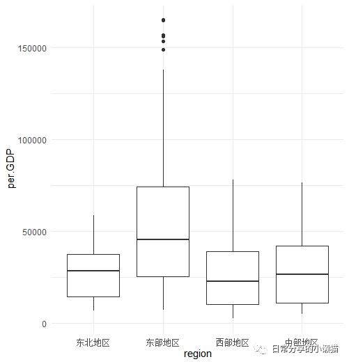
2.1 基础图形
library(ggplot2)
theme_set(theme_minimal()) #设置主题
ggplot(per.GDP, aes(region, per.GDP)) +
geom_boxplot()复制
2.2 添加误差线。
width
为误差线的宽度
boxplot.2 <-
ggplot(per.GDP, aes(region, per.GDP)) +
stat_boxplot(geom = "errorbar", width = 0.35) +
geom_boxplot()
# geom = "errorbar":Error bars;width:Bars width复制

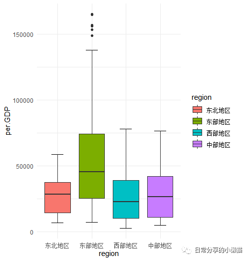
2.3 填充颜色,
fill
映射
ggplot(per.GDP, aes(region, per.GDP, fill = region)) +
stat_boxplot(geom = "errorbar", width = 0.35) +
geom_boxplot()复制
2.4 修改填充颜色。
cols <- c("#CFD8DC", "#90A4AE", "#455A64", "#255A64")
ggplot(per.GDP, aes(region, per.GDP, fill = region)) +
stat_boxplot(geom = "errorbar", width = 0.35) +
geom_boxplot(alpha = 0.8, colour = "black", outlier.colour = "red") +
scale_fill_manual(values = cols)复制

2.5 修改图例标签
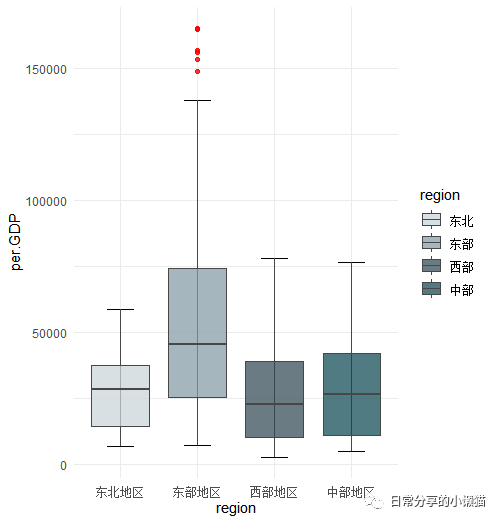
boxplot.5 <-
ggplot(per.GDP, aes(region, per.GDP, fill = region)) +
stat_boxplot(geom = "errorbar", width = 0.35) +
geom_boxplot(alpha = 0.8, colour = "#474747", outlier.colour = "red") +
scale_fill_manual(values = cols,labels = c("东北", "东部", "西部", "中部"))复制
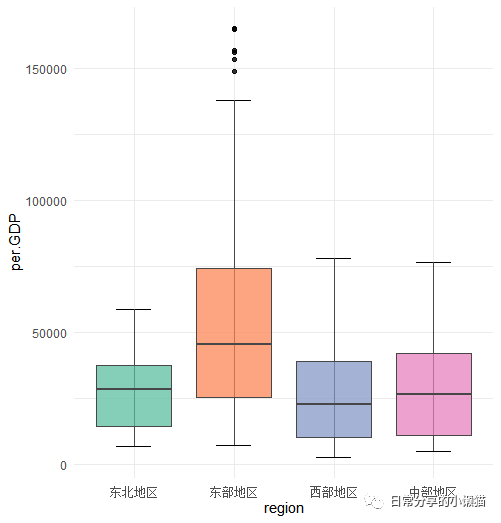
2.6 去除图例
ggplot(per.GDP, aes(region, per.GDP, fill = region)) +
stat_boxplot(geom = "errorbar", width = 0.35) +
geom_boxplot(alpha = 0.8, colour = "#474747", outlier.colour = 1) +
scale_fill_brewer(palette = "Set2") +
theme(legend.position = "none") #去除图例复制
其他
关于对箱线图的分面可进一步参考R语言绘图|箱线图(多变量、分组、分面)。其他绘图方法可进一步阅读公众号其他文章。
如有帮助请多多点赞哦!
参考资料
国家统计局: https://data.stats.gov.cn/index.htm
[2]李超,倪鹏飞,万海远: 中国住房需求持续高涨之谜:基于人口结构视角[J].经济研究,2015,50(05):118-133.
文章转载自日常分享的小懒猫,如果涉嫌侵权,请发送邮件至:contact@modb.pro进行举报,并提供相关证据,一经查实,墨天轮将立刻删除相关内容。